The Challenge
Day 15 was a narrow Italian street, with the challenge of creating a convincing sense of depth without becoming too concerned with perfect perspective. I was to begin with the large shapes and the direction of the street, then choose only a few architectural details to describe properly while allowing the rest to remain loose or disappear into shadow. Stronger lines and darker washes were to stay towards the foreground, becoming lighter and less definite as the street receded. A single connected area of strong shadow would hopefully do more work than lots of small details and, inevitably, I was reminded not to draw every window, brick and drainpipe and to leave some of the paper untouched.
The Sketch
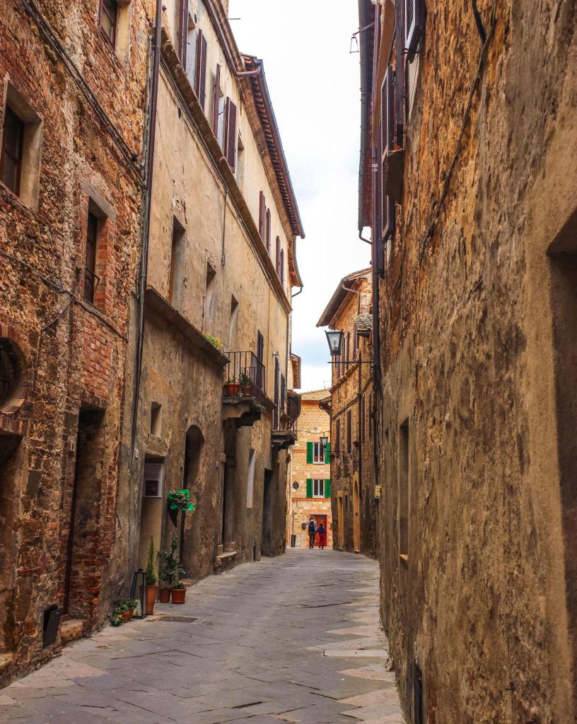
This felt like a useful step forward. I concentrated on getting the street to lead the eye towards the small building and figures at the end rather than trying to construct perfect perspective. I also began to leave parts of the architecture deliberately unresolved. The right-hand wall in particular contains surprisingly little information, yet still seems to work as a building. I was less restrained with the road, where I put grey washes down and then apparently decided they needed explaining with quite a few additional black marks. The upper-right building also became rather enthusiastic, with the roof, balcony and windows all competing for attention. I still find it difficult to believe that leaving something unfinished can sometimes make it look more convincing, but I am beginning to see it happen.
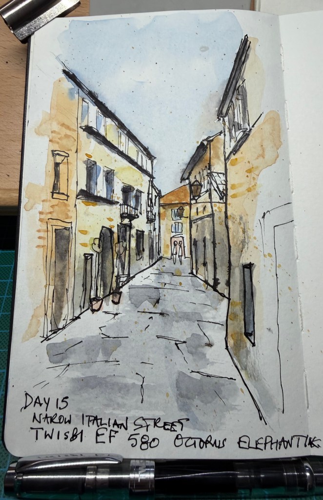
The Verdict -The depth is excellent. The eye goes straight down the street towards the little building and figures at the end, and the converging architecture works without feeling mechanically constructed. The left-hand buildings are particularly successful: there are enough windows, balconies, doors and bits of masonry to establish their character without describing every damned thing. More importantly, parts of the drawing are finally being allowed to remain unfinished. The road is slightly too busy; the grey washes already describe the uneven surface and perhaps a third to half of the additional black marks could have been omitted. There is also a small battle taking place in the upper-right building, where several strong elements compete for attention. And the familiar complaint remains, although it is getting smaller: some foreground windows and doors have received one line too many — no longer ten lines too many, just one or two.
Score: 8.5/10. I certainly didn’t agree with the Reasonable Tyrant and would have given myself a few marks less, those bold lines at the bottom of the buildings.
Reasonable Tyrant’s instruction: If the wash has already said it, the pen doesn’t need to say it again.


Leave a Reply