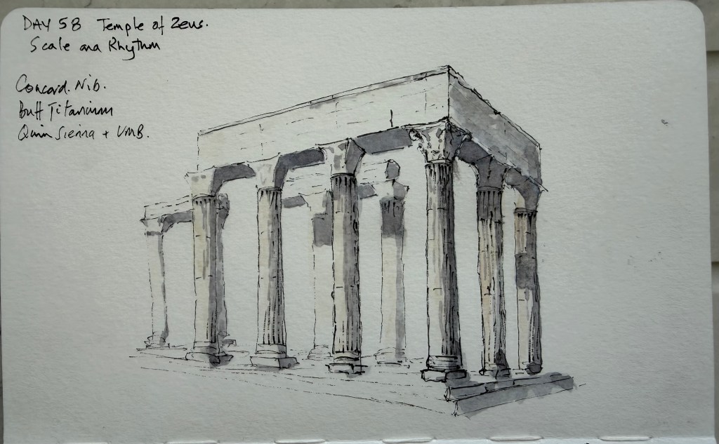
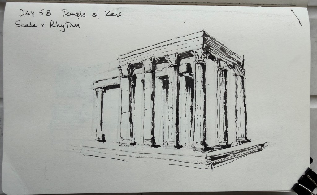
Today’s exercise was Scale & Rhythm, using the Temple of Olympian Zeus in Athens. I started with a quick preliminary in ink, using the Sailor Naginata Concord. The aim was simply to establish the proportions, perspective and rhythm of the enormous columns without getting drawn into the architectural detail. For the final drawing I used the Concord again, with Buff Titanium and a grey mixed from Quinacridone Sienna and Ultramarine Blue. The preliminary showed me that the Concord is particularly good at describing the columns, but less suited to creating large areas of solid shadow. Rather than trying to force it to do that job, I allowed the wash to establish the larger tonal areas in the final. The second row of columns was particularly useful. Rather than drawing each one completely, I allowed some of them to disappear into the background. The contrast between the darker front row and the lighter rear columns gives the building both depth and scale. The right-hand entablature was another useful lesson. It is largely in shadow, but trying to describe all of that shadow with the Concord made the preliminary rather busy. In the final I was more selective and let the wash do more of the work.
The exercise was deliberately quick, and I think that helped. There was less time to start correcting everything and more emphasis on seeing the main structure and deciding what could be left out.
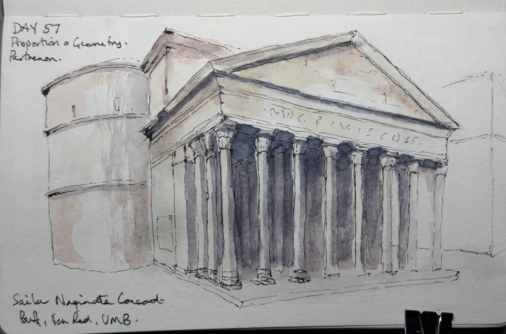
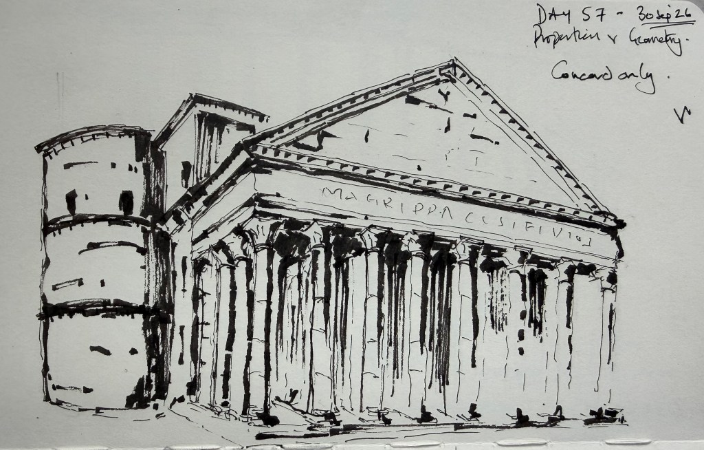
Today’s exercise was Proportion & Geometry, using the Pantheon in Rome. After yesterday’s focus on rhythm and repetition, I wanted to concentrate on the larger geometric relationships within the building rather than the individual architectural details. I used the Sailor Naginata Concord throughout, with Buff Titanium, Venetian Red and Ultramarine Blue washes. I started with a fairly detailed preliminary in ink. This became particularly useful when I realised that I had got the perspective of the curved rotunda wrong. I used heavier lines in that area while working out the correction, rather than trying to make the preliminary look like a finished drawing. For the final I deliberately reduced the amount of ink and allowed the wash to describe more of the form. The main aim was to make the relationship between the cylindrical rotunda, the rectangular portico and the triangular pediment read clearly.
The Concord worked well for this. Its slightly broken line allowed me to suggest the columns and architectural details without having to describe each one completely. The darker wash behind the columns also helped establish the depth of the portico without relying on heavy line work. There are still things I could improve. The perspective and proportions aren’t completely resolved in places, and some of the column bases and architectural details became a little fussy. The right-hand side also loses some definition.
But the preliminary and final made a useful pair. The first helped me understand the geometry; the second was about deciding how much of that information actually needed to appear on the page. I’m increasingly finding that the difficult part isn’t seeing all the detail. It’s deciding what to leave out.
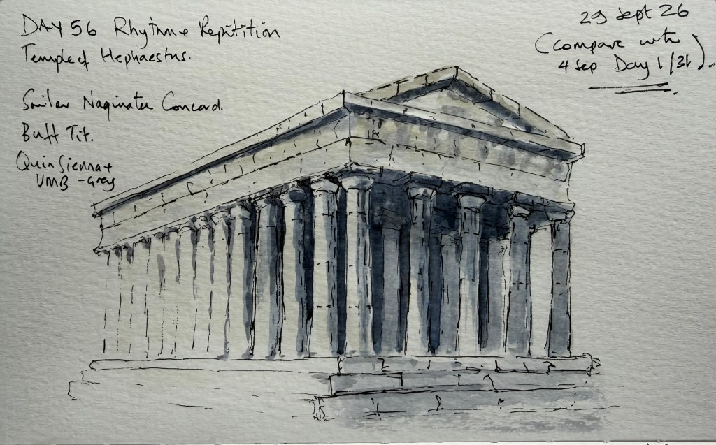
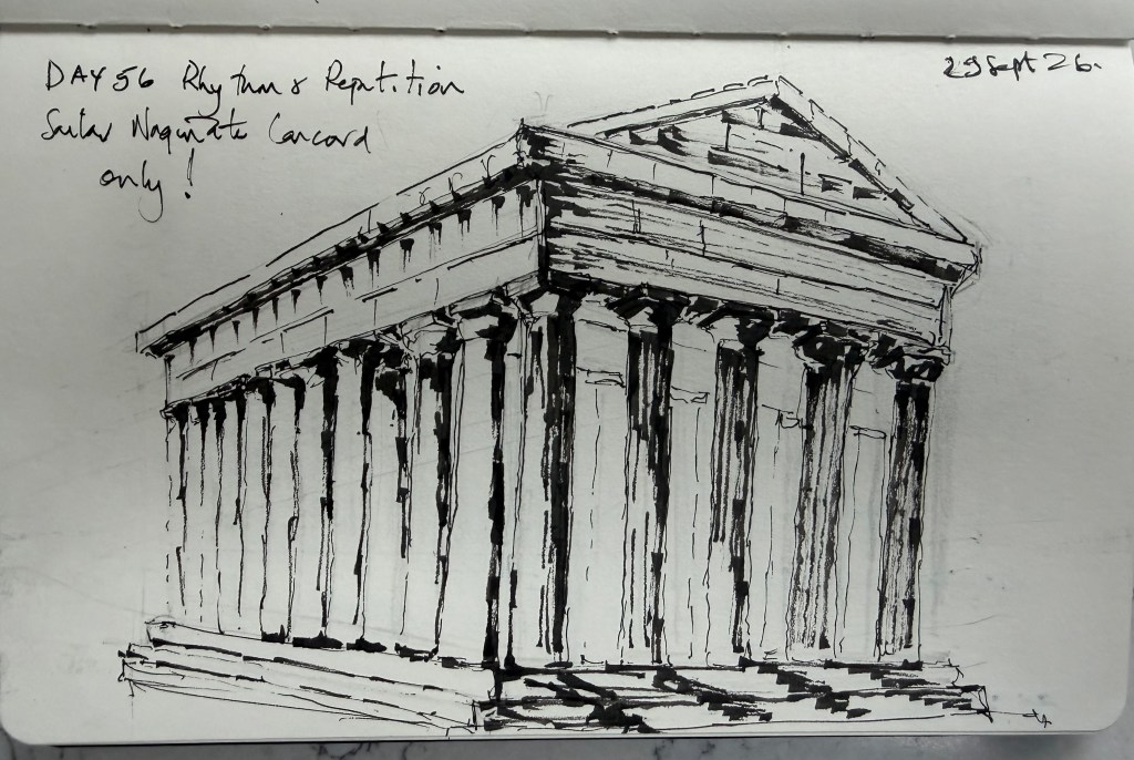
Today’s exercise was Rhythm & Repetition, using the Temple of Hephaestus in Athens. I wanted to concentrate on the repeated columns and, rather than trying to draw each one in exactly the same way, use the rhythm of the colonnade to establish the structure of the building. I used the Sailor Naginata Concord throughout, with Buff Titanium and a grey mixed from Quinacridone Sienna and Ultramarine Blue. I increased the intensity of the mix as the shadows became deeper. I started with a fairly detailed preliminary in ink. It was deliberately quite inky, and although it helped me work out the structure and spacing, it also showed me how easily I can use too much line when trying to describe repeated architectural elements. For the final drawing I reduced the amount of ink and allowed the wash to do more of the work. The cool grey behind the columns was particularly useful. In the preliminary, the light spaces behind the columns competed with the columns themselves; adding the wash in the final gave the columns a clearer relationship with the recess behind them.
The Concord worked very well for this exercise. Its slightly uneven and broken line means that the columns don’t all look identical, while the repetition of the verticals still gives the building a strong rhythm. There are still areas I could improve. Some of the capitals and the darker areas beneath the entablature became rather congested, and I could have been more selective with the darkest marks. The upper part of the building is also probably more heavily described than it needs to be. But overall I’m pleased with this one. The preliminary and final also made a useful pair: the first worked through the architecture, while the second was more about deciding what could be left out.
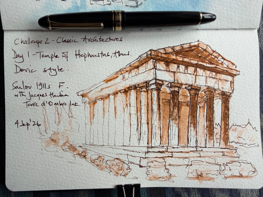
Looking back at my earlier drawing of the same building, I can see that I’ve become much more comfortable allowing repeated elements to become simpler rather than trying to describe every one of them.
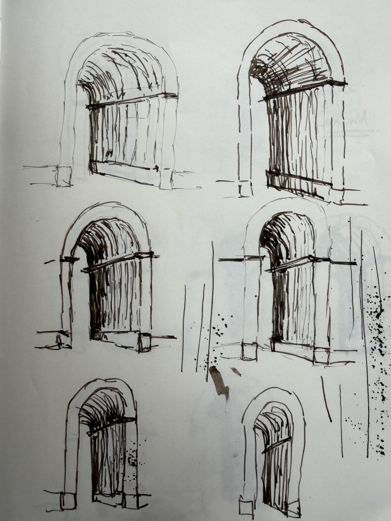
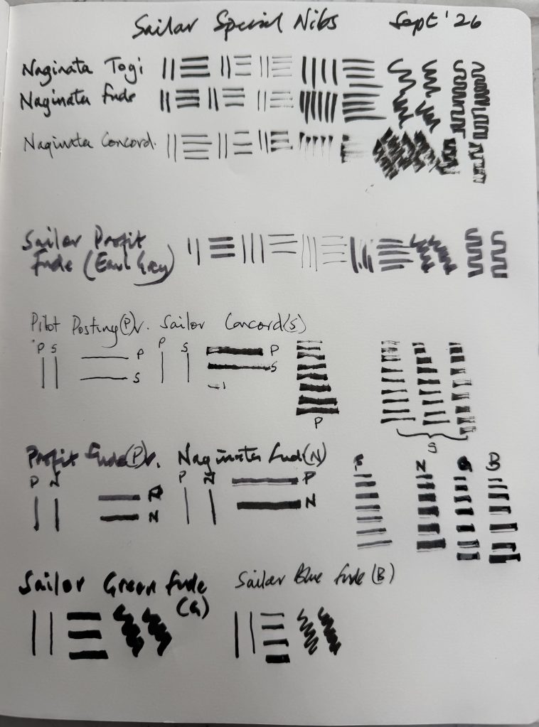
I’ve recently been experimenting with three Sailor nibs for architectural sketching: the Naginata Togi, Naginata Fude and Naginata Concord. I wanted to see how differently they behaved when drawing the same subject, so I started with a series of small studies of arches. By the way, this has evolved into a post after the experimenting, so all work is a tad rough and ready!
The first thing I discovered was that the three nibs have quite different characteristics.
The Naginata Togi has an impressive range of line widths. By changing the angle of the nib I could move from very fine lines to much broader marks. I found, however, that I had to think quite consciously about the position of the nib to get the variation I wanted. At very steep angles it also became noticeably scratchy, so I stopped pushing it.
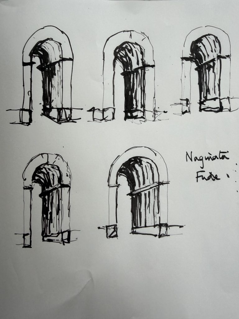
The Naginata Fude was much more immediate. It has a huge range and can produce a fine line or a very broad, solid stroke. It also puts down a lot of ink very quickly, which makes it particularly effective for deep recesses and strong shadows. The downside is that it is very easy to put down more ink than you intended.
The Naginata Concord was the surprise for me. Its line is less precise and often slightly uneven or discontinuous. Rather than giving me a perfectly controlled architectural edge, it tends to suggest the edge and then let it disappear. I found that I really liked this quality.
It felt much closer to the sort of loose architectural line I’m trying to develop.
I also made some marks using the pens with their nibs right and upside down.
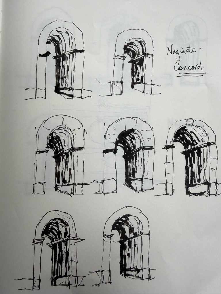
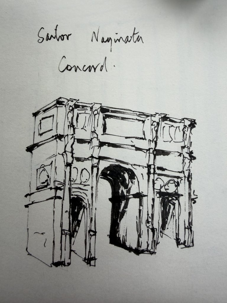
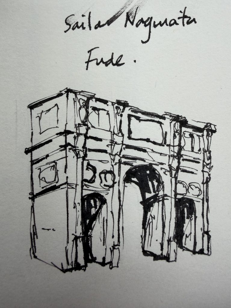
I then moved on to the Arch of Constantine in Rome, using its three arches as the subject.
The Concord was used on its own first. I found it relatively easy to handle and liked the way the broken line kept the drawing open. It didn’t feel as though I was trying to make every architectural edge precise.
The Fude produced a much stronger drawing. The deepest recesses became dark very quickly and the line had considerably more weight. It was dramatic, but also demonstrated how easily the Fude can take over if I am not careful.
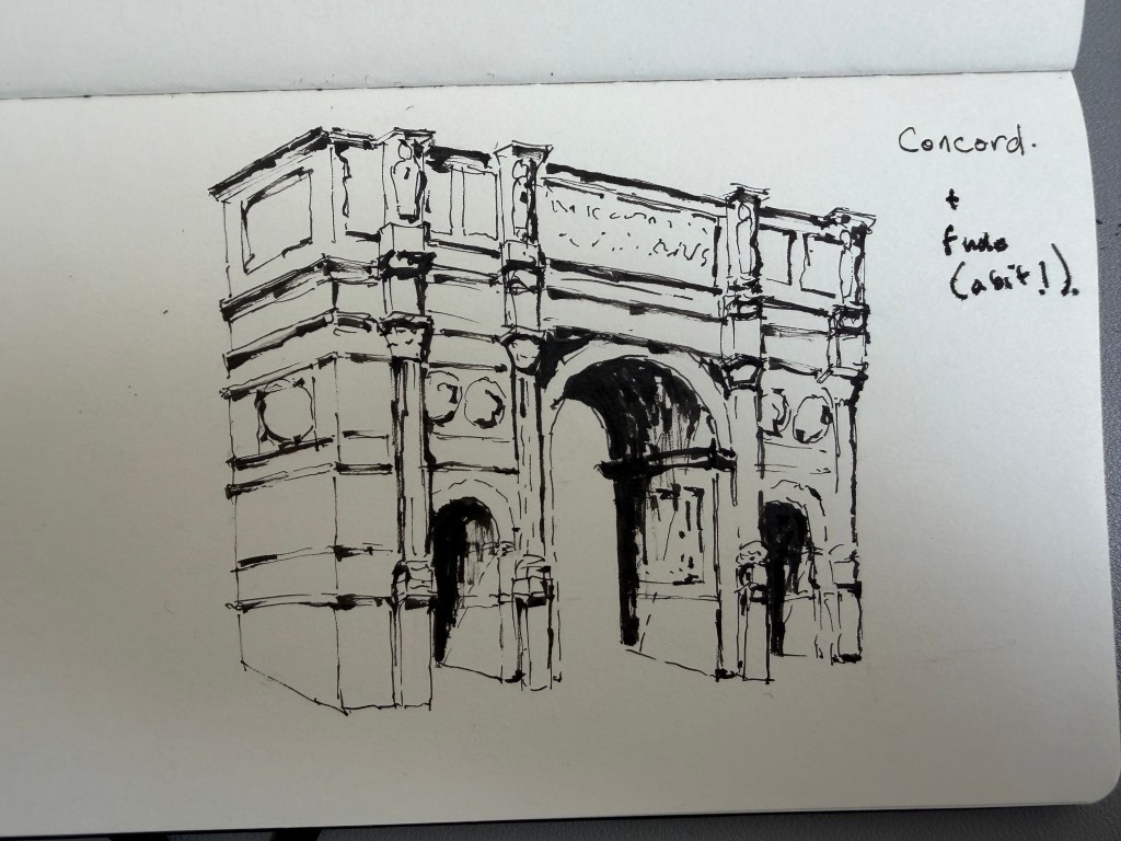
I then combined the two.
The Concord became the main drawing line, while the Fude was used selectively for the deepest recesses and strongest marks. I preferred this balance to using the Fude throughout.
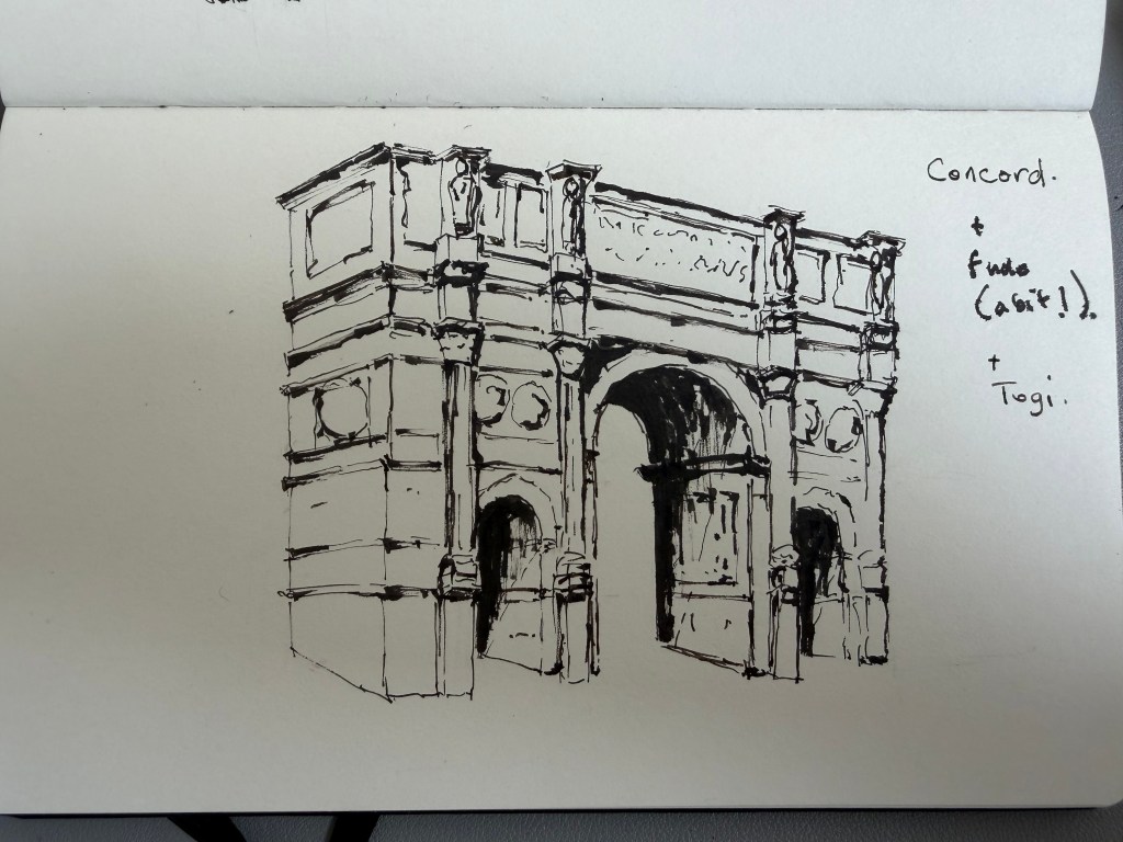
Finally, I added the Naginata Togi.
The Togi was used sparingly for a few finer details rather than as another major drawing line.
This final version probably tells me more about the three nibs than any of the individual tests.
For me, the Concord provides the character of the drawing, the Fude provides the strongest darks and greater weight, while the Togi is useful for fine, precise details.
The interesting thing is that the nib with the greatest technical range isn’t necessarily the one I find most enjoyable to draw with. The slightly uneven and discontinuous quality of the Concord is actually what I find most appealing for loose architectural sketching.
I still want to draw the three nibs themselves, particularly in profile, so that I can record the physical differences as well as the marks they make. That will probably be the next part of the experiment.
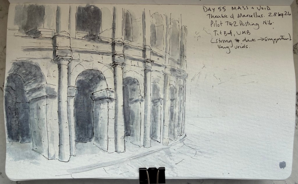
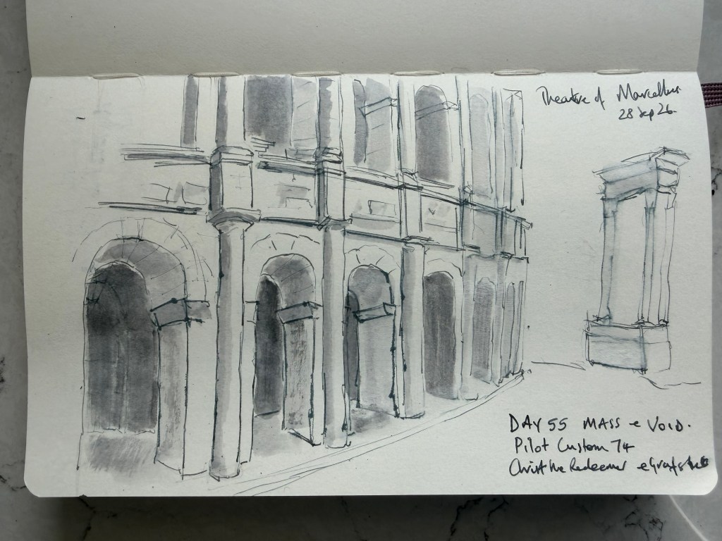
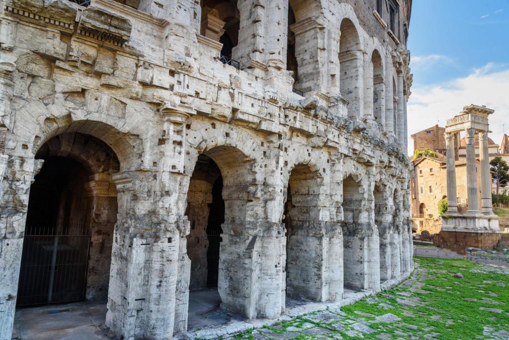
Today I worked on mass and void, using the Theatre of Marcellus in Rome. The aim was to think about the relationship between the solid structure of the building and the empty spaces within it, rather than trying to describe every architectural detail. I used a Pilot Custom 74 with Posting Nib, with Buff Titanium and Ultramarine Blue washes. The strongest part of the exercise was the treatment of the arches. I deliberately allowed the nearest voids to be darker and more defined, with the more distant openings becoming progressively lighter and less certain. The large area of untouched paper on the right also became part of the composition rather than something that needed filling.
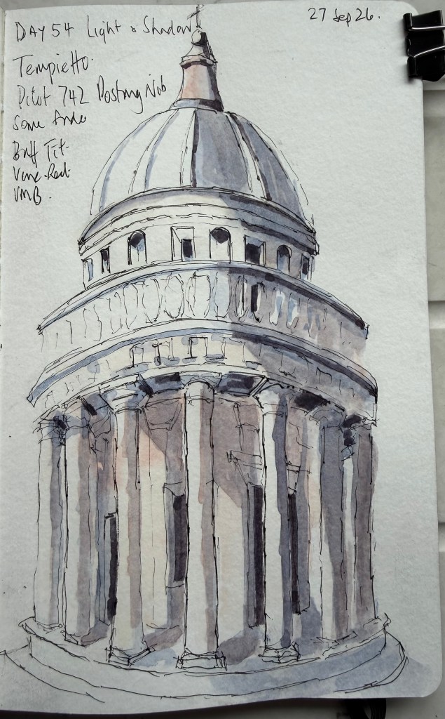
This was a useful contrast to yesterday’s Light & Shadow exercise. Yesterday I was trying to make the wash describe the form of the architecture. Today the wash was used much more simply, to establish the larger masses and voids. The architecture itself isn’t completely resolved, and the paper also buckled slightly under yesterday’s wash, which doesn’t help the perspective in the photograph! But that wasn’t the main purpose of today’s exercise. The important thing was learning to let the empty spaces carry as much weight as the things I actually draw.
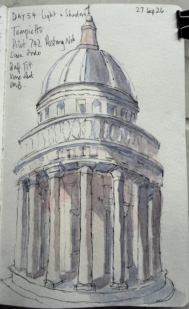
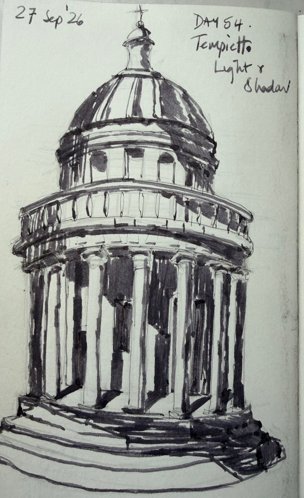
Today I worked on light and shadow using the Tempietto in Rome. This turned out to be one of my boldest attempts so far. I used the Sailor Profit Fude for the preliminary and the Pilot Custom 742 Posting Nib for the main drawing, with Buff Titanium and cool grey washes, and experimented with the Fude for some of the deepest shadows. The drawing of the Tempietto itself could certainly be better. Some of the proportions and architectural details let the finished sketch down. But I’m very pleased with what happened with the light and shade. For the first time, I felt that the wash was genuinely doing more than adding colour — it was describing the form of the building. The cool grey shadows establish the recesses, turn the columns, and give the portico real depth. The Fude also taught me something useful. I pushed some of the darkest areas a little too far, and once they’re on the paper they can’t be taken back. Another reminder that knowing when to stop is as important as knowing what to add.
I’m happy with this one. The score may be 7/10, but I feel the learning jump was considerably bigger than the score suggests.
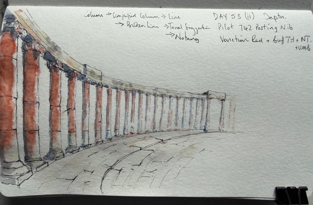
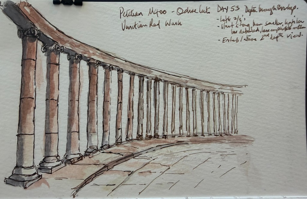
Today’s exercise was about creating depth through repetition: a long colonnade receding into the distance. My first attempt was rushed, and although the perspective worked, I wasn’t happy with the result. I was struggling with the repeated columns — how much should actually be drawn as they became smaller and further away? Looking back at the drawing, I realised I was trying to draw what I thought a row of columns should look like rather than what I was actually seeing. So I started again.
This time I deliberately reduced the information as the columns receded: fully described columns in the foreground, simplified columns further back, then lines, broken lines and finally little more than tonal suggestions. That made a significant difference. The repetition stopped becoming a problem and started becoming the thing that created the depth. The second attempt also reminded me of something I keep coming back to with ink and wash: knowing when to stop. The Venetian Red wash became heavier than I intended in places, but trying to correct it would probably have made things worse. The first attempt was a useful failure; the second felt much more like me again.
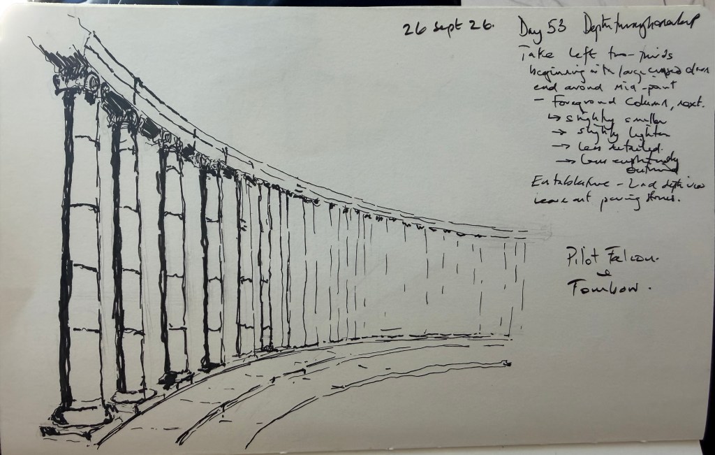
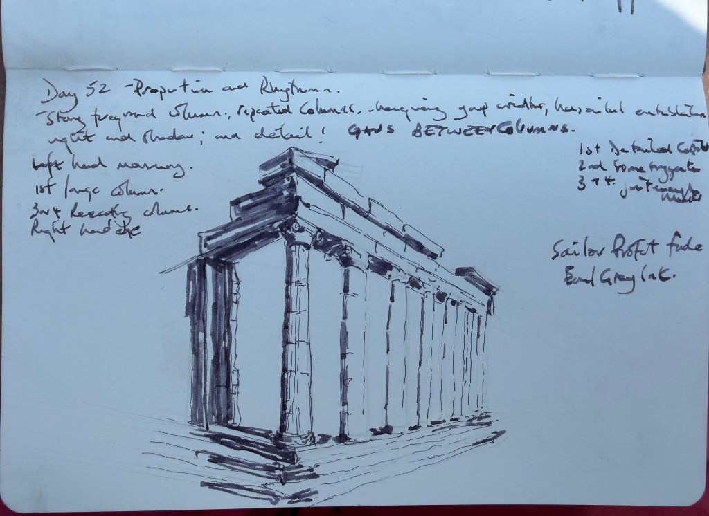
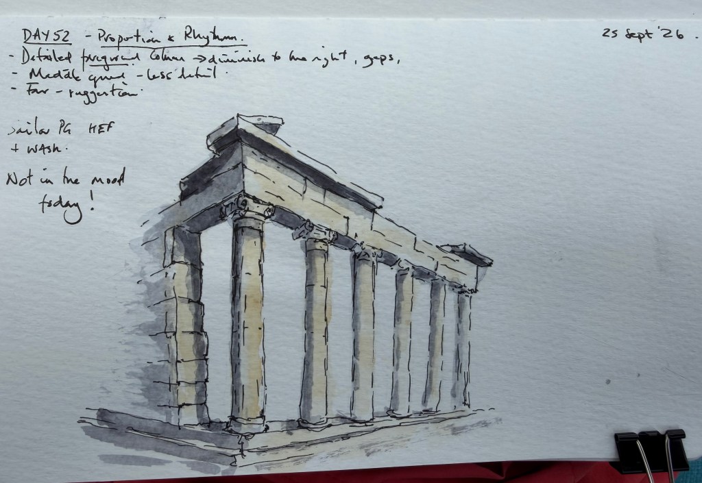
Today’s study looked at the relationship between repeated classical elements, concentrating on the columns and the spaces between them. I didn’t feel it today, maybe because it is the final day of my holiday or I felt rushed, but as soon as I placed the first column I felt it wasn’t right. The reference was chosen for its strong perspective, with the columns progressively diminishing into the distance. The preliminary established the main structure and the changing rhythm of the columns before moving on to the finished sketch. The foreground columns were given more detail and stronger definition, while the columns further away were progressively simplified. The warm ochre/buff wash was similarly reduced in strength with distance, with cooler tones used selectively for the shadows. The open spaces between the columns were deliberately left light to retain the sense of daylight passing through the colonnade. I prefer the preliminary.
The exercise was less about drawing each column accurately and more about using proportion, repetition and diminishing detail to create depth.
Score — 6.5/10
A useful architectural study, but not one of the more resolved finished sketches.
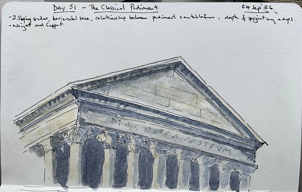
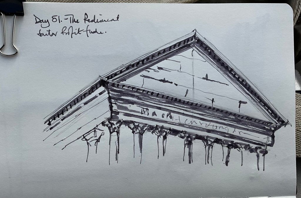
Today’s study focused on the classical pediment, looking at the relationship between the triangular pediment, the entablature beneath it and the supporting columns. The preliminary was made with the Sailor Fude, using broad strokes to establish the main structure, projection and areas of shadow. It proved useful as a way of working out the architecture before starting the finished sketch. The final drawing concentrated on the main mouldings and projecting edges, with selected details rather than attempting to reproduce everything using the Sailor Pro Gear HEF and buff titanium, some ochre and ultramarine blue. The inscription in the tympanum is suggested rather than copied, while the shadows between the columns have been used to establish the depth of the colonnade.
The challenge was less about drawing a pediment accurately and more about deciding which parts of the architecture need to be described and which can simply be suggested. The Fude preliminary and the finished sketch also made an interesting comparison: broad, dark marks for establishing the structure, followed by a more restrained combination of pen and wash.
Score – 8/10 Very happy with this though I do feel there is much room for improvement.
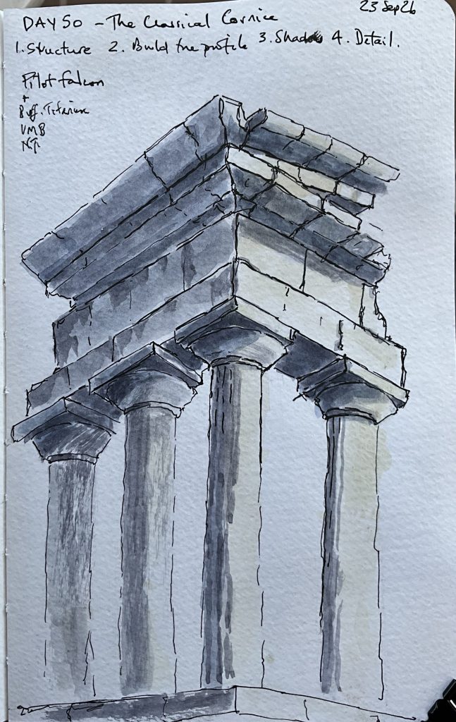
Today’s challenge was to look at the classical cornice — not simply as decoration, but as a structural element projecting from the building. I wanted to concentrate on four things: structure, profile, shadow and detail. I began with a preliminary drawing using the Sailor Fude. I still haven’t quite learned to love the appearance of the Fude, but today I found a very good reason for having it in the toolbox. It behaved almost like charcoal: broad, immediate marks that allowed me to establish the big shapes, projections and shadows without worrying about making a finished drawing.
I then moved to my more familiar pen, The Pilot Falcon, for the final sketch. The interesting thing was that the preliminary had already done the thinking for me. The final drawing became much more about explaining the structure — the projecting cornice, the layers of moulding, the deep shadows beneath it and the relationship between the entablature and the columns.
Day 50 Scored 8/10 – which is apparently ‘hangable’, not sure this one will be though.