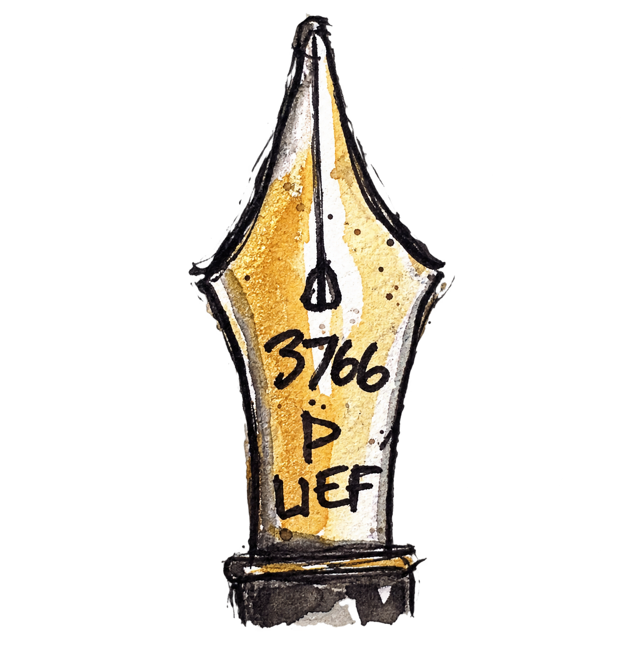
I’ve recently been experimenting with three Sailor nibs for architectural sketching: the Naginata Togi, Naginata Fude and Naginata Concord. I wanted to see how differently they behaved when drawing the same subject, so I started with a series of small studies of arches. By the way, this has evolved into a post after the experimenting, so all work is a tad rough and ready!
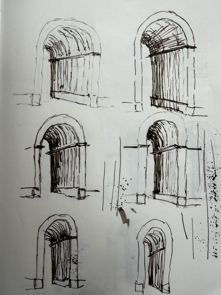
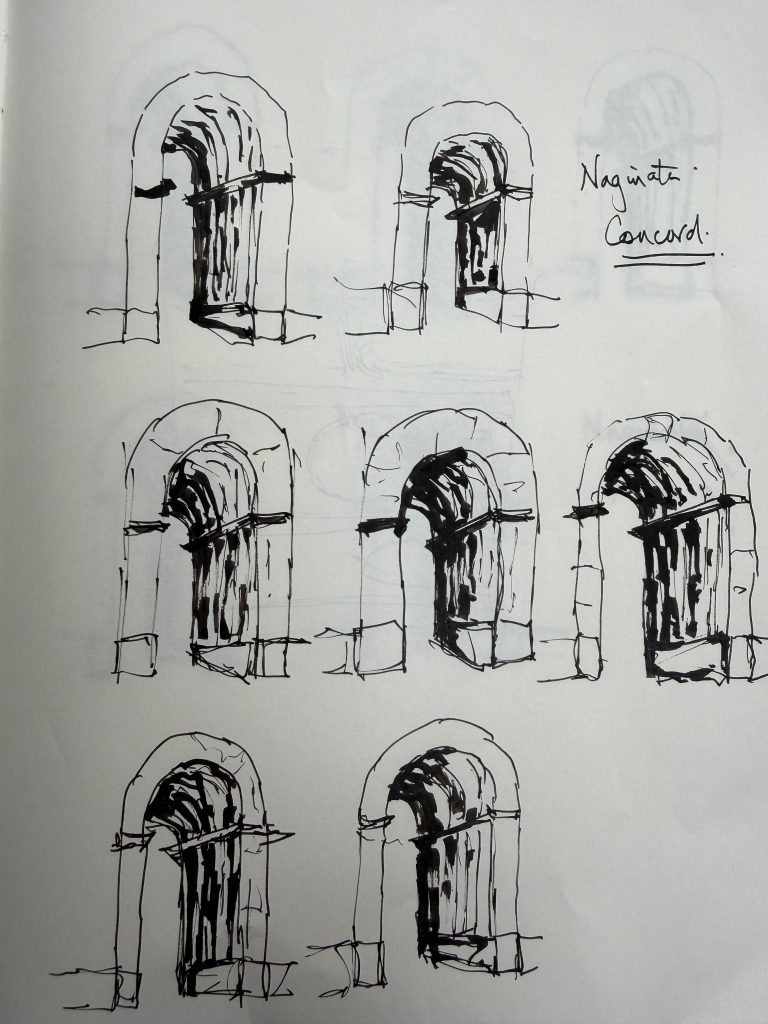
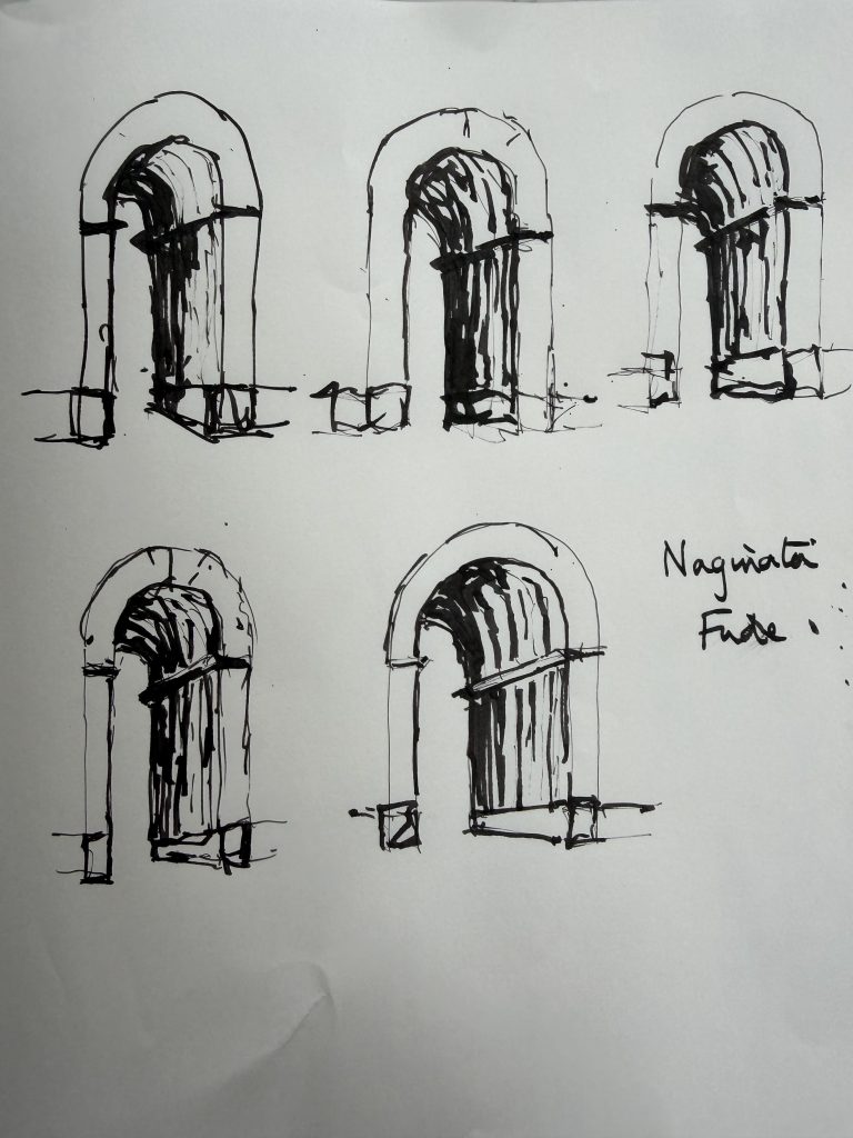
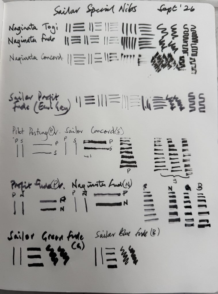
The first thing I discovered was that the three nibs have quite different characteristics.
The Naginata Togi has an impressive range of line widths. By changing the angle of the nib I could move from very fine lines to much broader marks. I found, however, that I had to think quite consciously about the position of the nib to get the variation I wanted. At very steep angles it also became noticeably scratchy, so I stopped pushing it.
The Naginata Fude was much more immediate. It has a huge range and can produce a fine line or a very broad, solid stroke. It also puts down a lot of ink very quickly, which makes it particularly effective for deep recesses and strong shadows. The downside is that it is very easy to put down more ink than you intended.
The Naginata Concord was the surprise for me. Its line is less precise and often slightly uneven or discontinuous. Rather than giving me a perfectly controlled architectural edge, it tends to suggest the edge and then let it disappear. I found that I really liked this quality.
It felt much closer to the sort of loose architectural line I’m trying to develop.
I also made some marks using the pens with their nibs right and upside down.
I then moved on to the Arch of Constantine in Rome, using its three arches as the subject.
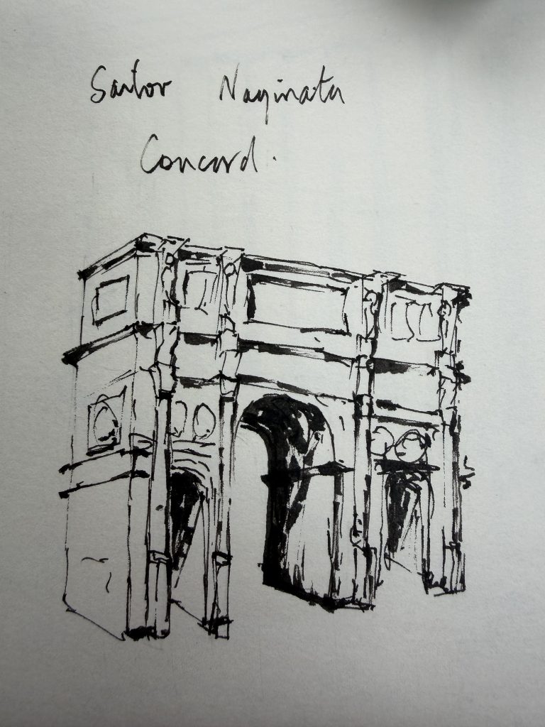
The Concord was used on its own first. I found it relatively easy to handle and liked the way the broken line kept the drawing open. It didn’t feel as though I was trying to make every architectural edge precise.
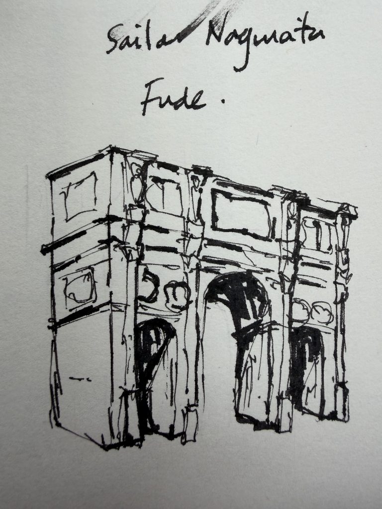
The Fude produced a much stronger drawing. The deepest recesses became dark very quickly and the line had considerably more weight. It was dramatic, but also demonstrated how easily the Fude can take over if I am not careful.
I then combined the two.
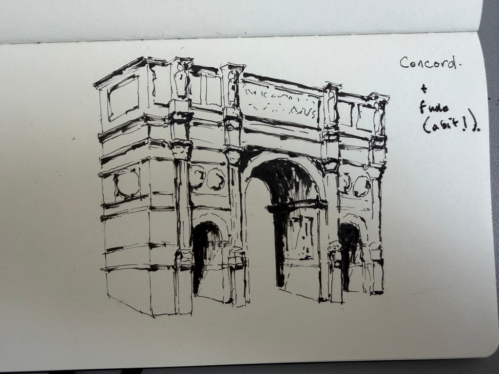
The Concord became the main drawing line, while the Fude was used selectively for the deepest recesses and strongest marks. I preferred this balance to using the Fude throughout.
Finally, I added the Naginata Togi.
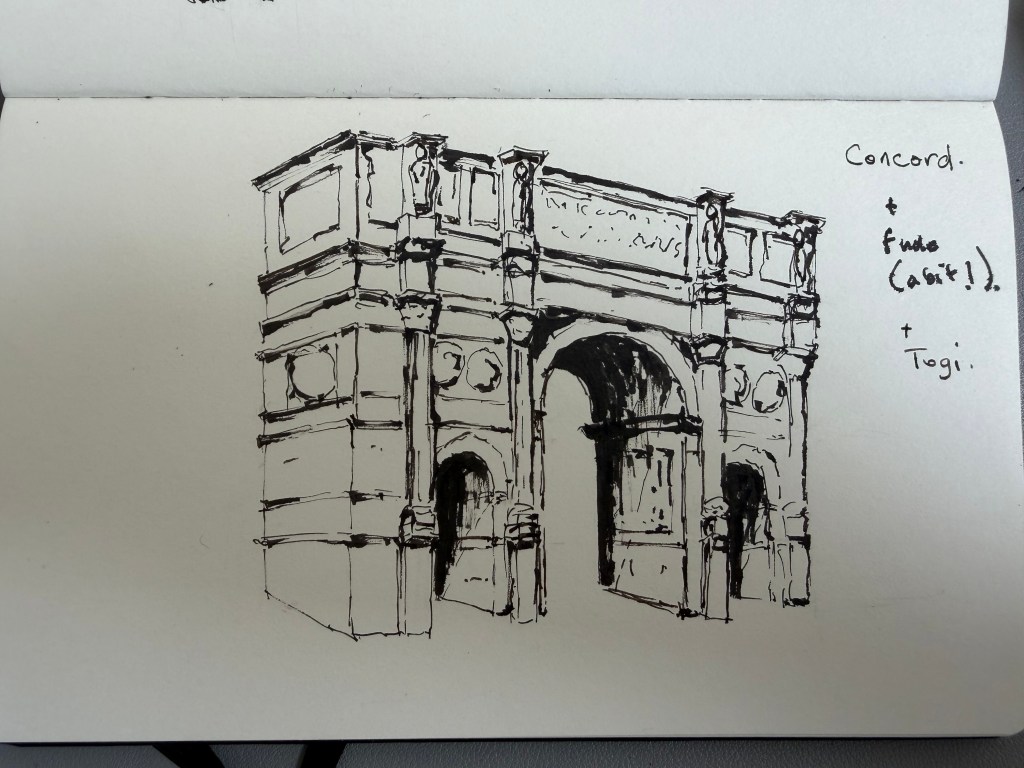
The Togi was used sparingly for a few finer details rather than as another major drawing line.
This final version probably tells me more about the three nibs than any of the individual tests.
For me, the Concord provides the character of the drawing, the Fude provides the strongest darks and greater weight, while the Togi is useful for fine, precise details.
The interesting thing is that the nib with the greatest technical range isn’t necessarily the one I find most enjoyable to draw with. The slightly uneven and discontinuous quality of the Concord is actually what I find most appealing for loose architectural sketching.
I still want to draw the three nibs themselves, particularly in profile, so that I can record the physical differences as well as the marks they make. That will probably be the next part of the experiment.


Leave a comment