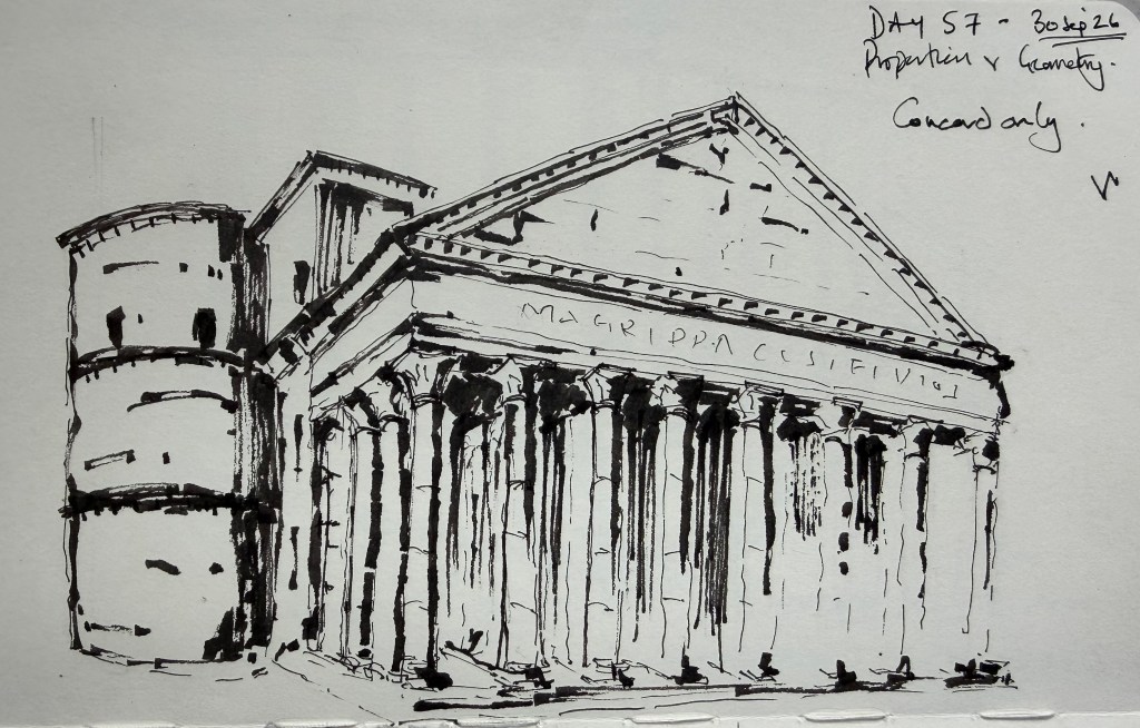
Today’s exercise was Proportion & Geometry, using the Pantheon in Rome. After yesterday’s focus on rhythm and repetition, I wanted to concentrate on the larger geometric relationships within the building rather than the individual architectural details. I used the Sailor Naginata Concord throughout, with Buff Titanium, Venetian Red and Ultramarine Blue washes. I started with a fairly detailed preliminary in ink. This became particularly useful when I realised that I had got the perspective of the curved rotunda wrong. I used heavier lines in that area while working out the correction, rather than trying to make the preliminary look like a finished drawing. For the final I deliberately reduced the amount of ink and allowed the wash to describe more of the form. The main aim was to make the relationship between the cylindrical rotunda, the rectangular portico and the triangular pediment read clearly.
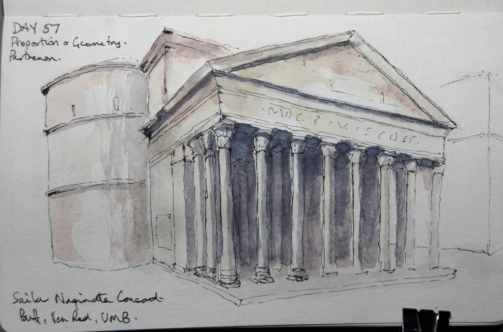
The Concord worked well for this. Its slightly broken line allowed me to suggest the columns and architectural details without having to describe each one completely. The darker wash behind the columns also helped establish the depth of the portico without relying on heavy line work. There are still things I could improve. The perspective and proportions aren’t completely resolved in places, and some of the column bases and architectural details became a little fussy. The right-hand side also loses some definition.
But the preliminary and final made a useful pair. The first helped me understand the geometry; the second was about deciding how much of that information actually needed to appear on the page. I’m increasingly finding that the difficult part isn’t seeing all the detail. It’s deciding what to leave out.
Score — 7/10


Leave a comment