• Today’s lesson was about using the wash to describe light and depth, rather than simply adding colour.
    I started with a preliminary study to work out the structure and shadow areas, then built the final version with two washes.
    The second wash was deliberately selective — deepening the recesses behind the volutes, between the acanthus leaves and beneath the projecting mouldings. I’m beginning to understand the relationship between the two:
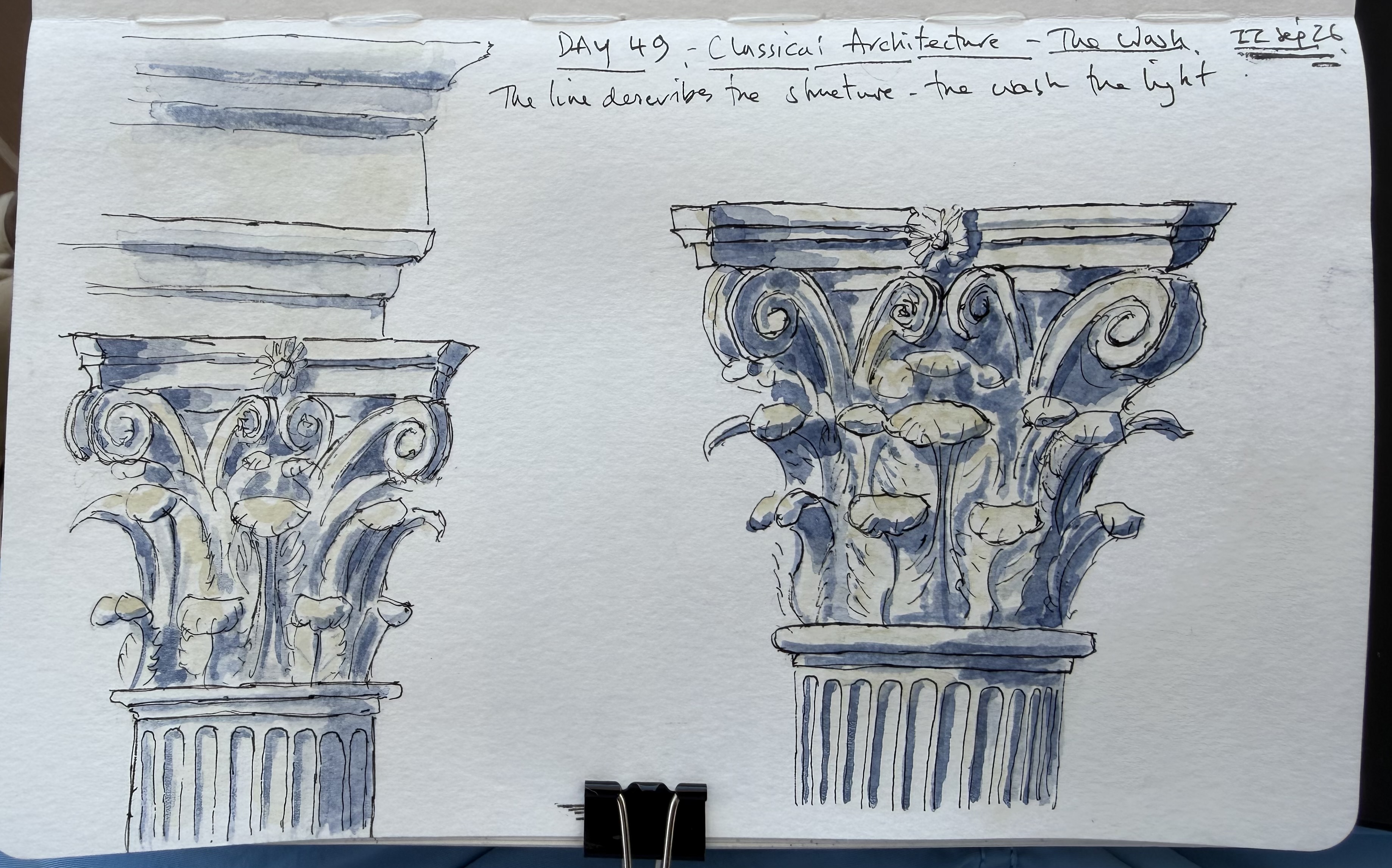
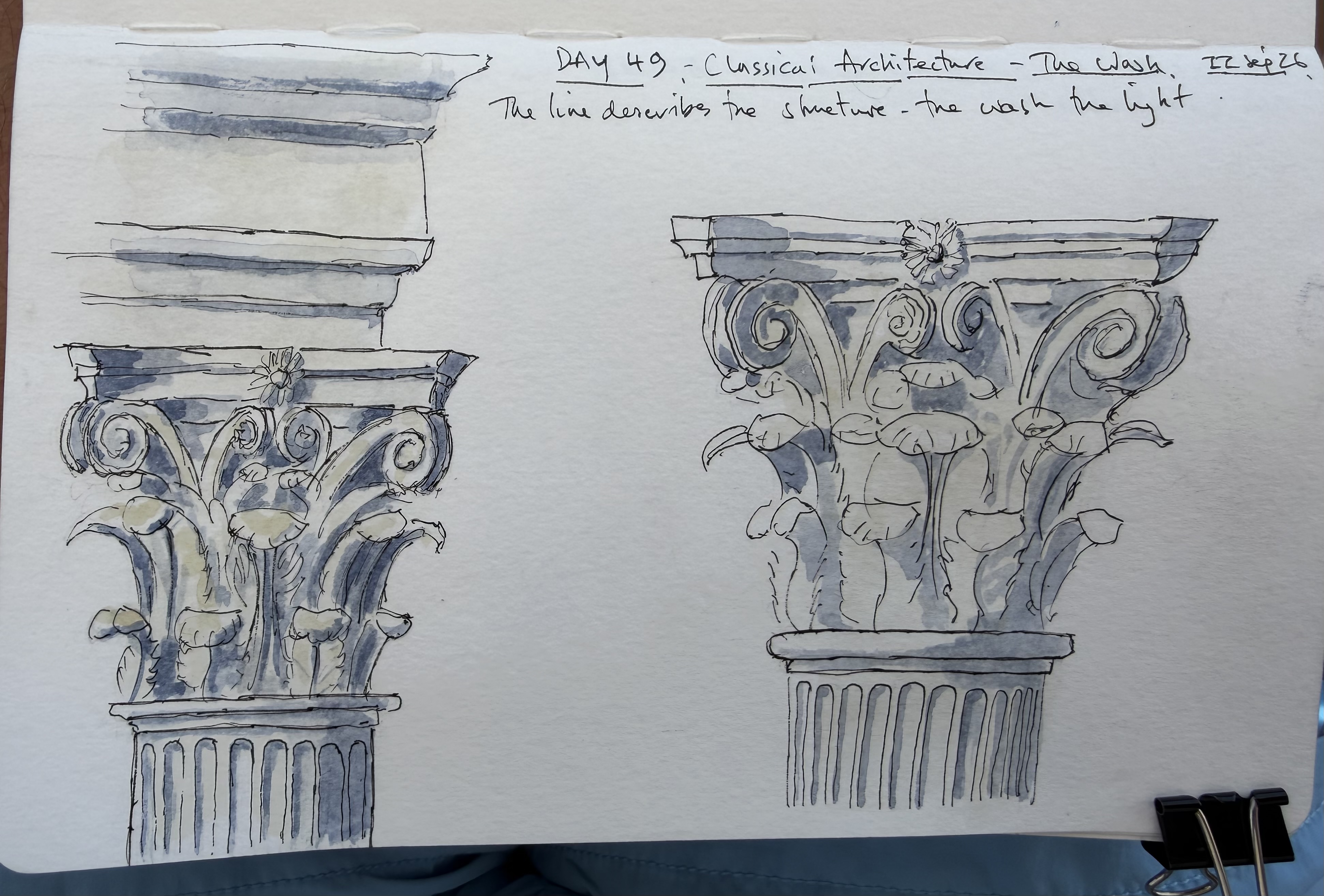
    The line describes the structure, the wash describes the light.
    The preliminary on the left was particularly useful because it allowed me to experiment with the placement and strength of the shadows before committing to the final study. The finished drawing feels much more three-dimensional, while still retaining the loose line and slightly irregular washes that I’m increasingly enjoying.
    Score: 8/10 — at last!

    A successful exercise in using wash to explain architectural form rather than simply decorate the drawing.
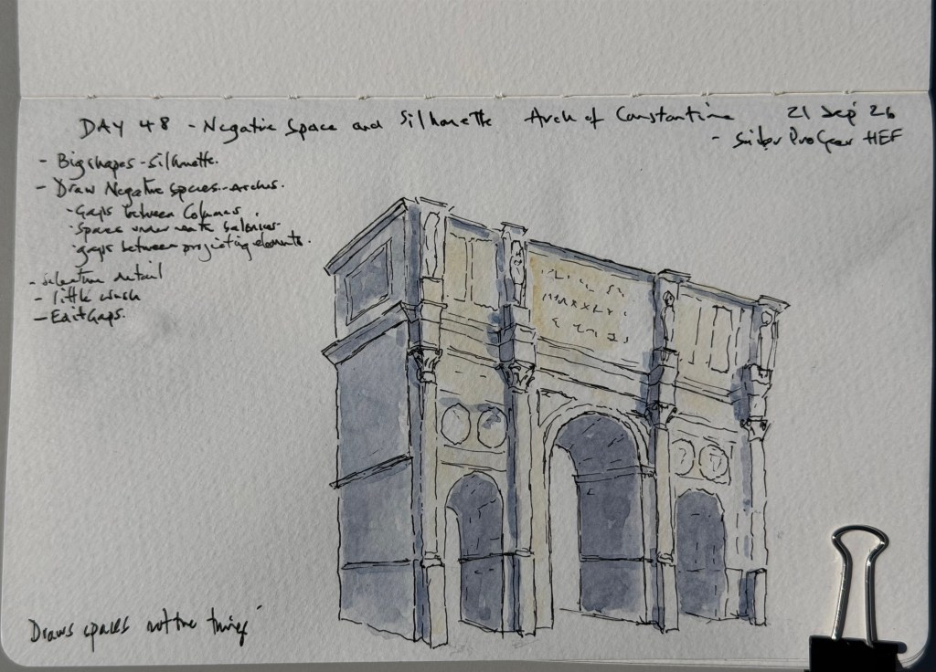
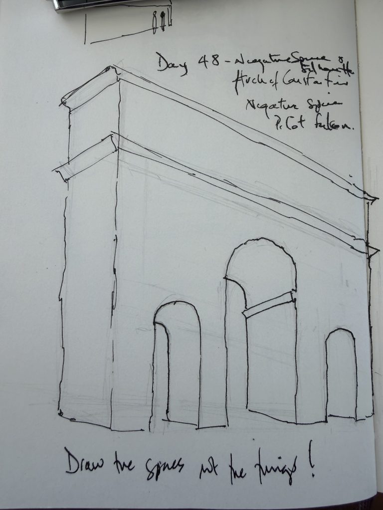
  • Today’s exercise was about drawing the spaces rather than the things. I started with the overall silhouette and then established the important openings and arches before adding any architectural detail.
    The final sketch was built from this simple structure, using the photograph to decide which details were actually necessary. The exercise reinforced the importance of being selective about what I draw — and what I leave out. 

    Score: 8/10

    Strongest improvement: More selective observation and a clearer hierarchy.
    Weakness: The wash is still not as controlled as it should be.
    Key lesson: Don’t draw everything you see — and don’t wash everything you see either.

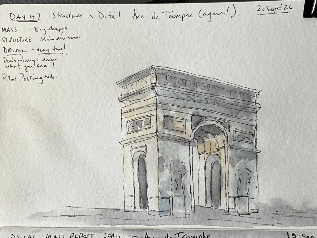
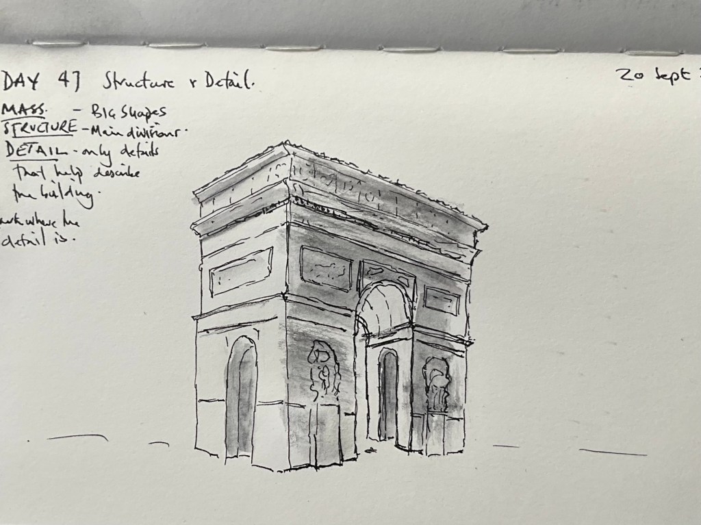
  • Today’s exercise was about moving from the broad masses of Day 46 into structure and then selective detail.
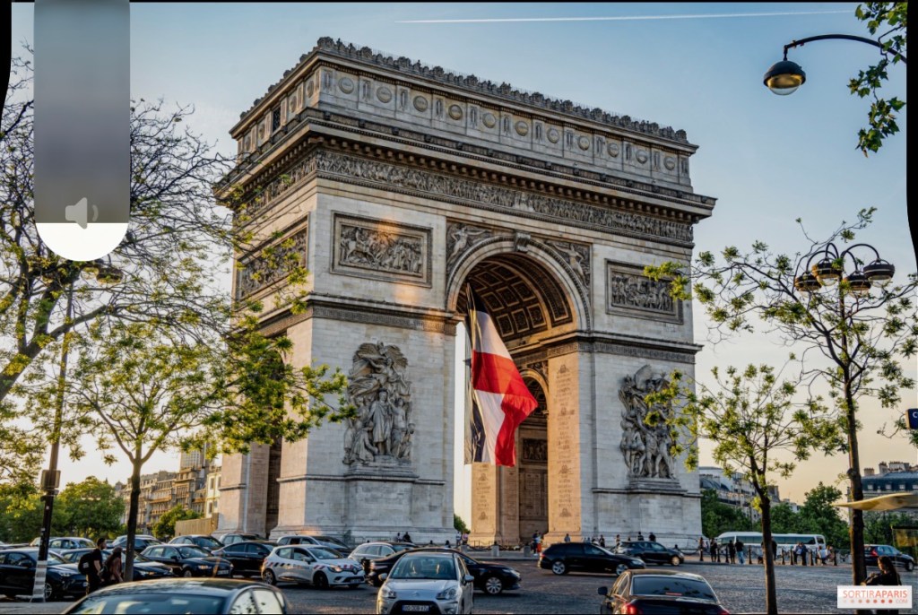
    My preliminary actually contained too much detail. I found myself drawing things simply because I could see them, rather than deciding whether they helped describe the building. Fortunately, I spotted this before starting the final and deliberately simplified it. The preliminary was drawn with the Pilot Falcon SEF nib and ArtGraf watersoluble graphite and, the final was drawn using the Pilot 742 Posting Nib with Buff Titanium and Neutral Tint watercolours. The result feels more controlled than the preliminary. The main structure and large shapes remain clear, while the detail is more selective. The main arch is still important without becoming the dominant feature, and the lower section has enough information without becoming overworked.

    The exercise reinforced something I’m beginning to understand about my process: the preliminary is there to help me make decisions, not to dictate the final drawing. Score: 7.5/10
    Strongest improvement: Better hierarchy and more selective use of detail.
    Weakness: The wash becomes a little too dominant in places, and some of the linework could be more confident.
    Key lesson: Don’t draw something simply because you can see it.

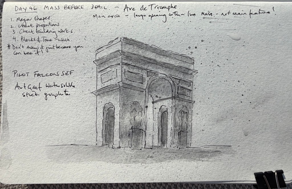
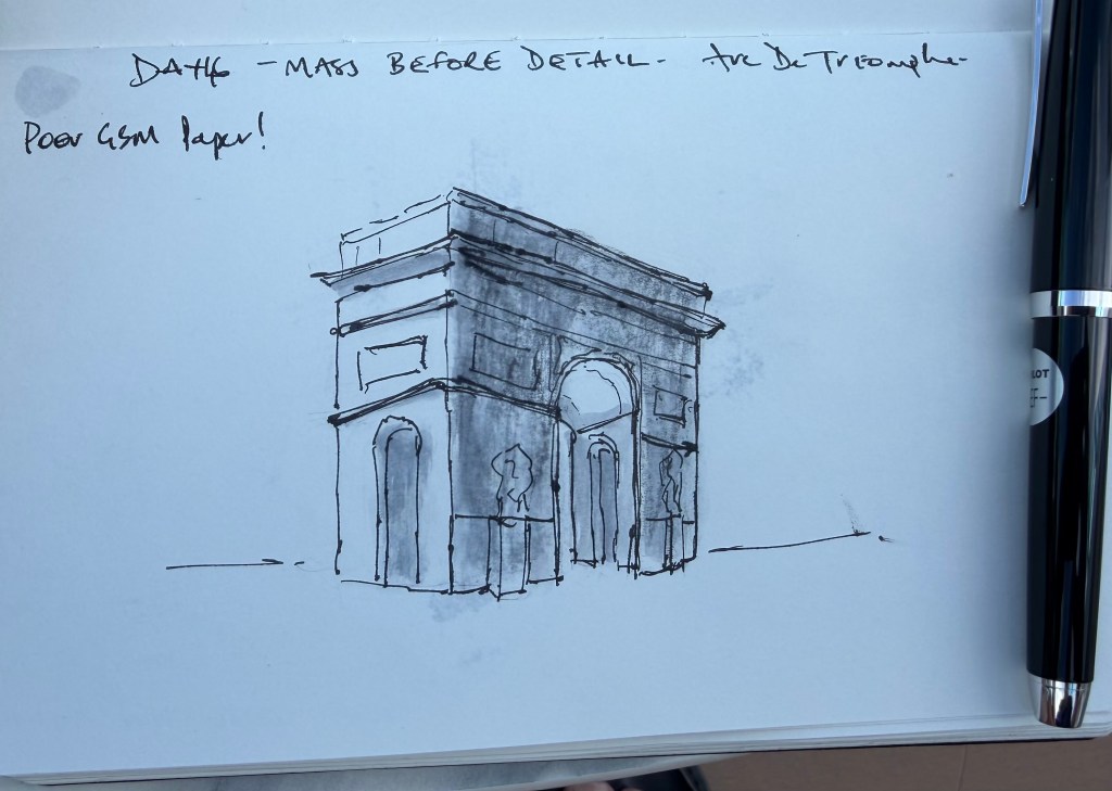
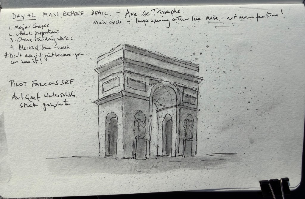
  • Today’s exercise was about seeing the major shapes of a building before getting drawn into its detail.
    I made the preliminary in my architectural sketchbook using my Pilot Falcon and ArtGraf watersoluble graphite, reducing the building to its major masses, projections and areas of tone. The final was then drawn in my more friendly watercolour paper sketchbook.


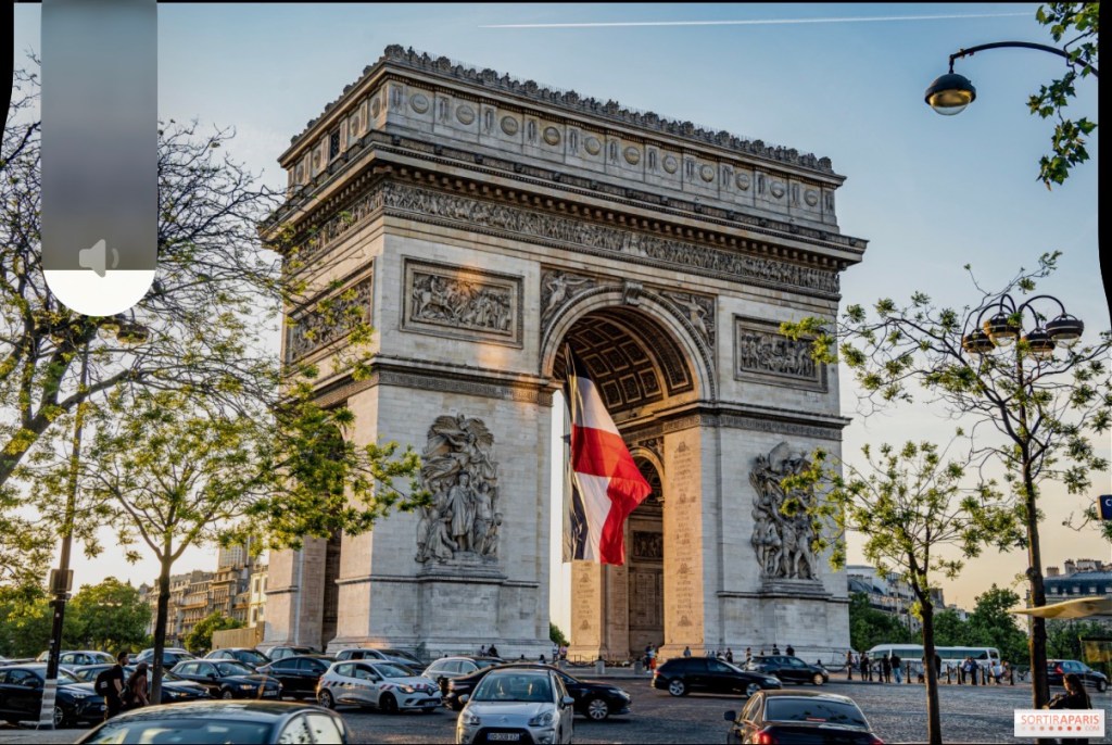
    I initially got slightly confused by my own preliminary. I had given too much emphasis to the main arch, while at the same time not giving enough definition to the lower section. I followed the preliminary rather too faithfully in the first attempt, which left the lower part of the building rather vague. A second look made the problem clear, and I added more definition to the lower section. The useful lesson turned out to be slightly different from the original exercise: the preliminary is a guide, not a prescription. It establishes the major masses, but the final still needs to respond to the reference photograph and my own judgement.

    Score: 7.5/10 A good drawing with identifiable weaknesses, but an especially useful exercise in understanding how my preliminary and final should work together.

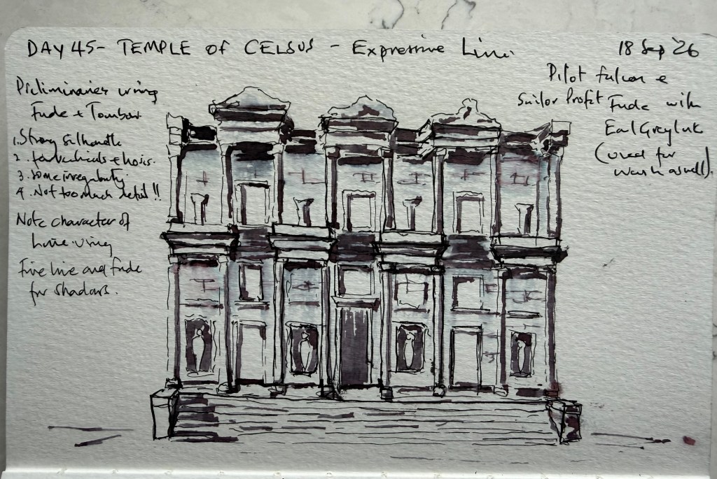
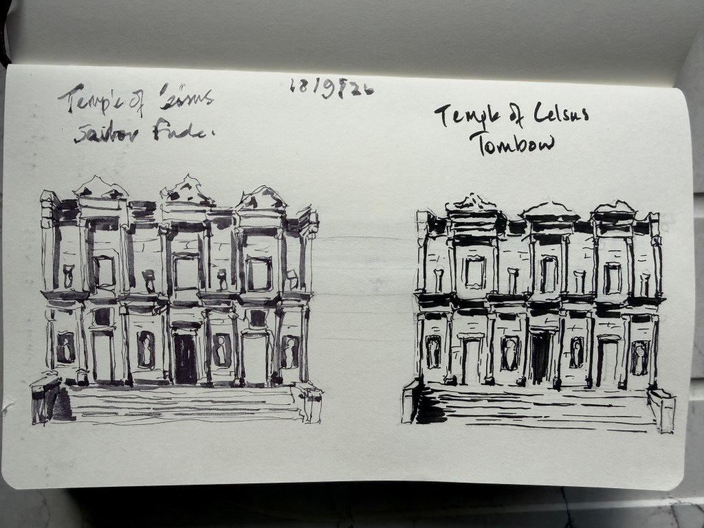
  • Day 45 – Temple of Celsus

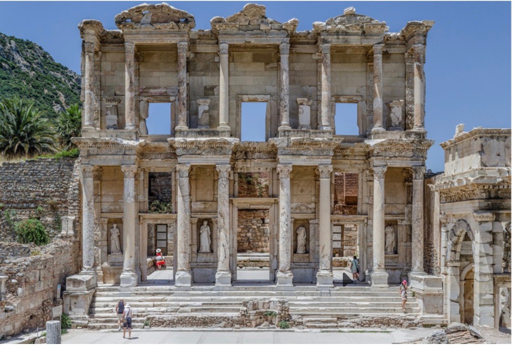
    Today was an introduction to expressive line, using the Sailor Profit Fude and Tombow for the preliminary studies before making the final drawing with a Pilot Falcon and Sailor Profit Fude. The exercise was to see how differently the two pens interpreted the same subject. The Fude is particularly interesting because turning the nib upside down produces a surprisingly fine line, as well as the broader expressive line it gives in its normal position.
    Something else became apparent today: I found myself using my preliminary drawings almost as much as the photograph when constructing the final. The preliminary is starting to become part of the drawing process rather than simply preparation for it. I like the final, although I think I allowed the Fude to become too heavy in places. That’s useful information, and it’s probably time to leave expressive line alone for a while and let what I’ve learned settle in. We’ll come back to it properly in the next challenge.

    Score: 7.5/10

    Pens: Pilot Falcon & Sailor Profit Fude
    Ink: Earl Grey

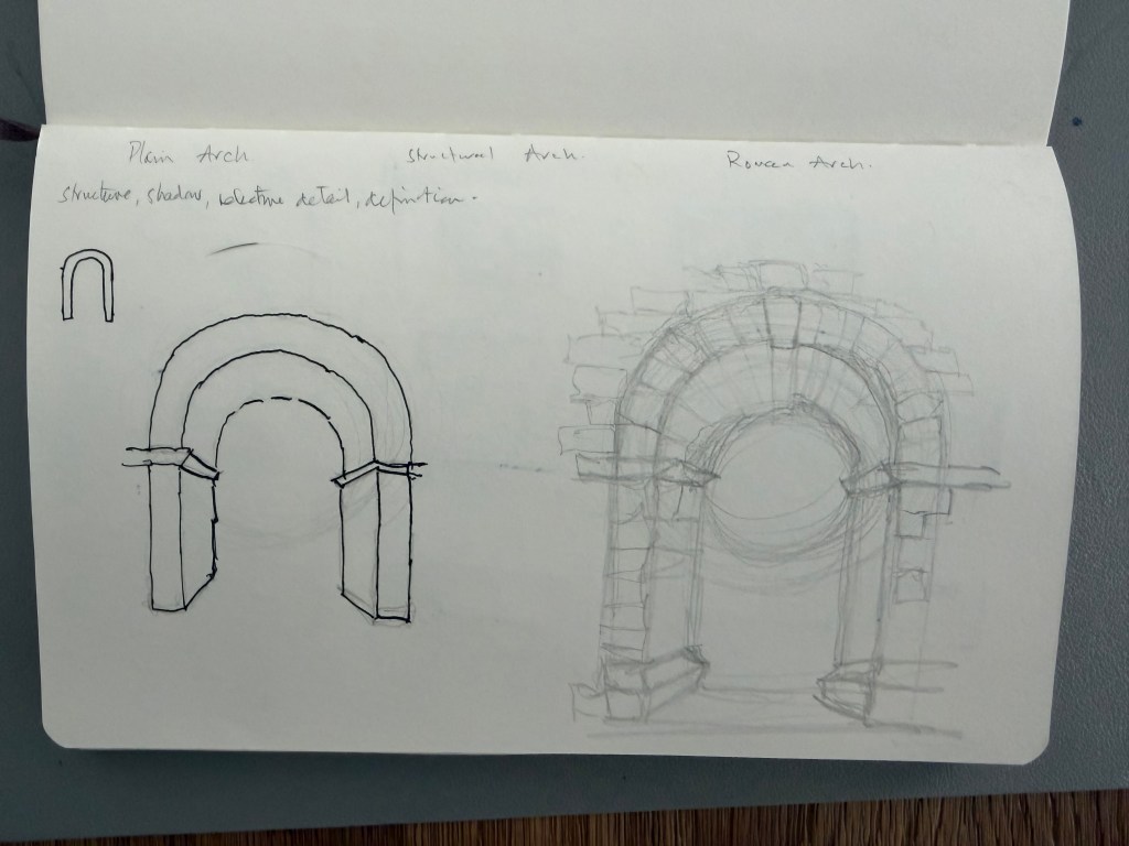
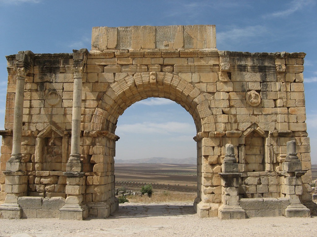
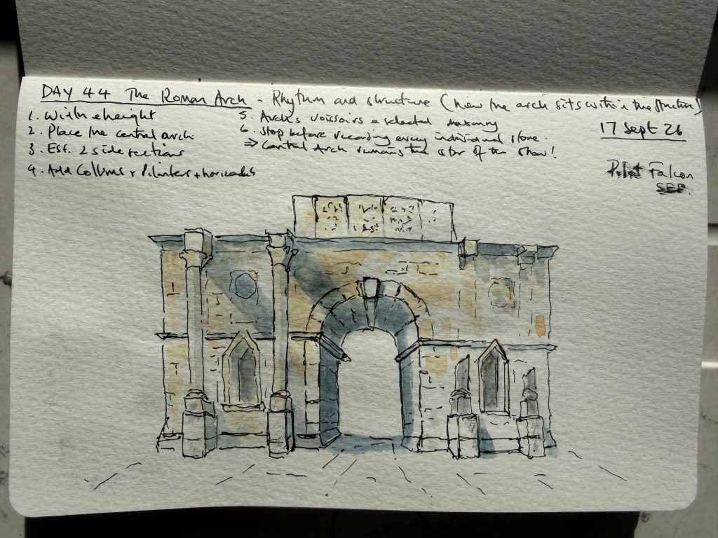
  • Today’s exercise was about looking at a Roman arch as part of a complete architectural structure rather than simply drawing the arch itself. I started with a very quick pencil construction to establish the semi-circular arch and its proportions. The loose pencil lines then took over a little, helping me explore the structure before committing to the Pilot Falcon with Elephant Black ink. The main sketch brought together the central arch, columns, side openings, masonry, shadows and the surrounding structure. I deliberately avoided drawing every individual stone and instead selected the lines that seemed to describe the construction and character of the monument. I’m beginning to understand that suggestion isn’t about drawing fewer lines; it’s about deciding which lines actually help describe what I’m seeing. I say that but I am more sure if I have the prescience when sketching. The stronger definition lines surprised me because I initially thought they were too bold, but they seem to give the drawing more structure and confidence. The next step is to become more deliberate about where those stronger lines belong, while keeping the looseness I’m starting to enjoy.
    Score 8/10, I don’t think this is hangable but who argues with those that will have all the power in a few years or less!

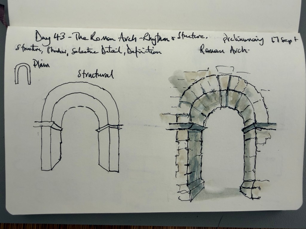
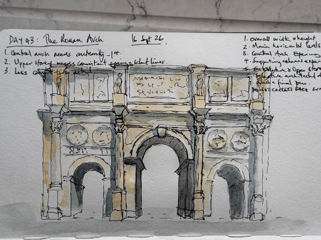
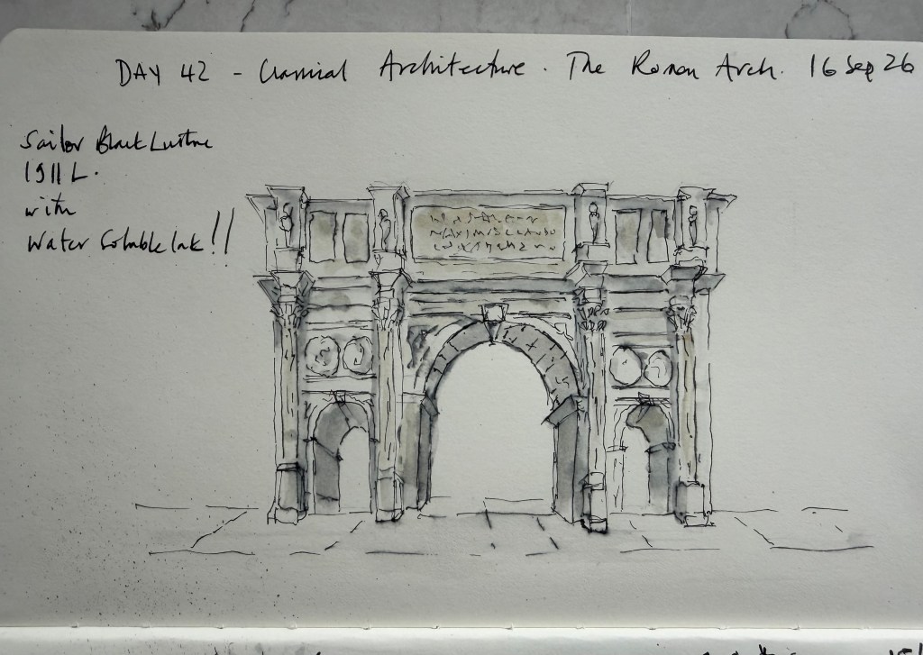
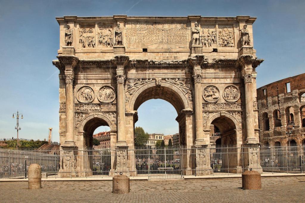
  • Day 43 – The Roman Arch

    Today’s study was the Roman arch, looking at how the main arch, supporting columns and surrounding architectural detail work together. I wanted to keep the sketch quick and selective rather than trying to reproduce every detail, using a limited grey and ochre wash with the Pilot Falcon soft extra-fine fountain pen and Elephant Black ink for the definition. The central arch became the main focus, with the darker recessed areas helping to give it depth. This is beginning to feel much closer to the architectural sketch style I’m trying to develop — recognisable, structured and stylish, but still loose enough to retain the character of a sketch.
    I started with a quick preliminary sketch to work out the main proportions and the central arch before attempting the final version. The preliminary highlighted the need for a more convincing arch, cleaner horizontal structure and less competing detail. The final sketch was then completed fairly quickly.

    Score 6.5 for the preliminary (I was hoping for more) and 7.5 for the final (I was expecting less!).

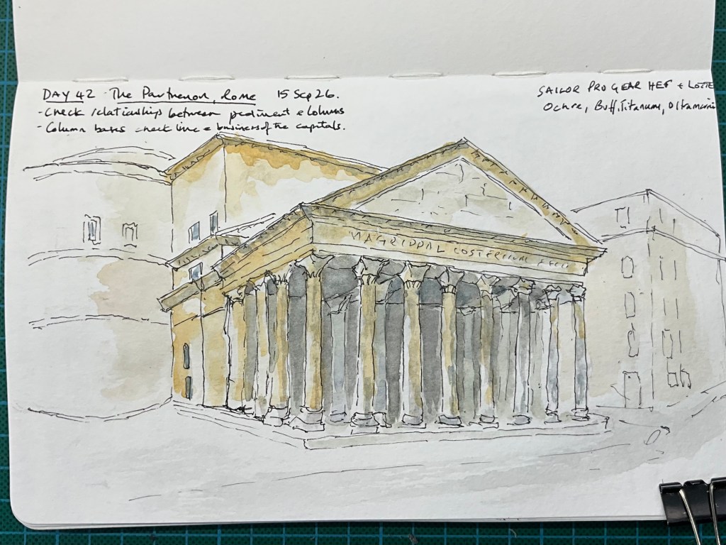
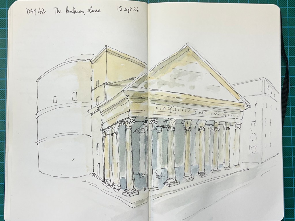
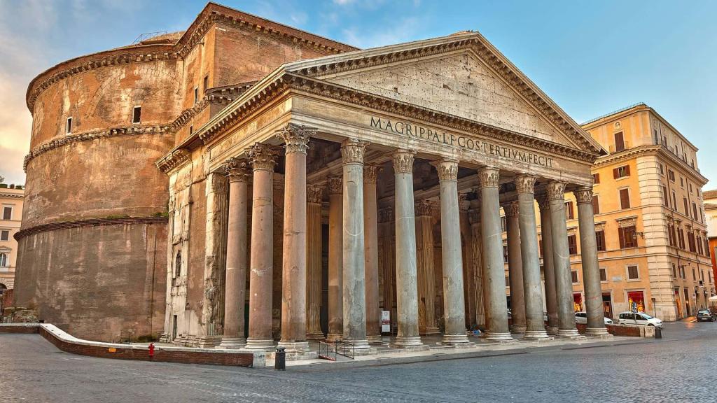
  • Today’s challenge brings together columns, a pediment and the shaded depth of a portico. My preliminary captures the space behind the columns, but the pediment is too tall and the bases rise too steeply towards the right, compressing the far end. In the second version, I flatten the line through the bases and lower the pediment, giving the building a more convincing overall shape. Using my Sailor Pro Gear HEF with ochre, buff titanium and ultramarine washes, I keep the columns light against the shaded interior and leave the surrounding buildings loosely suggested. Some front and rear columns still become difficult to separate, but I quite like the exaggerated capitals: they describe the spreading form and add character.

    I prefer working quickly and judging relationships by eye to measuring everything precisely. My aim is to get the underlying structure closer to what I see, allowing the loose lines to remain expressive while making the building more believable. This version feels close to something I would hang, although there is still room to improve.
    Score 7.5/10, which feels fair.

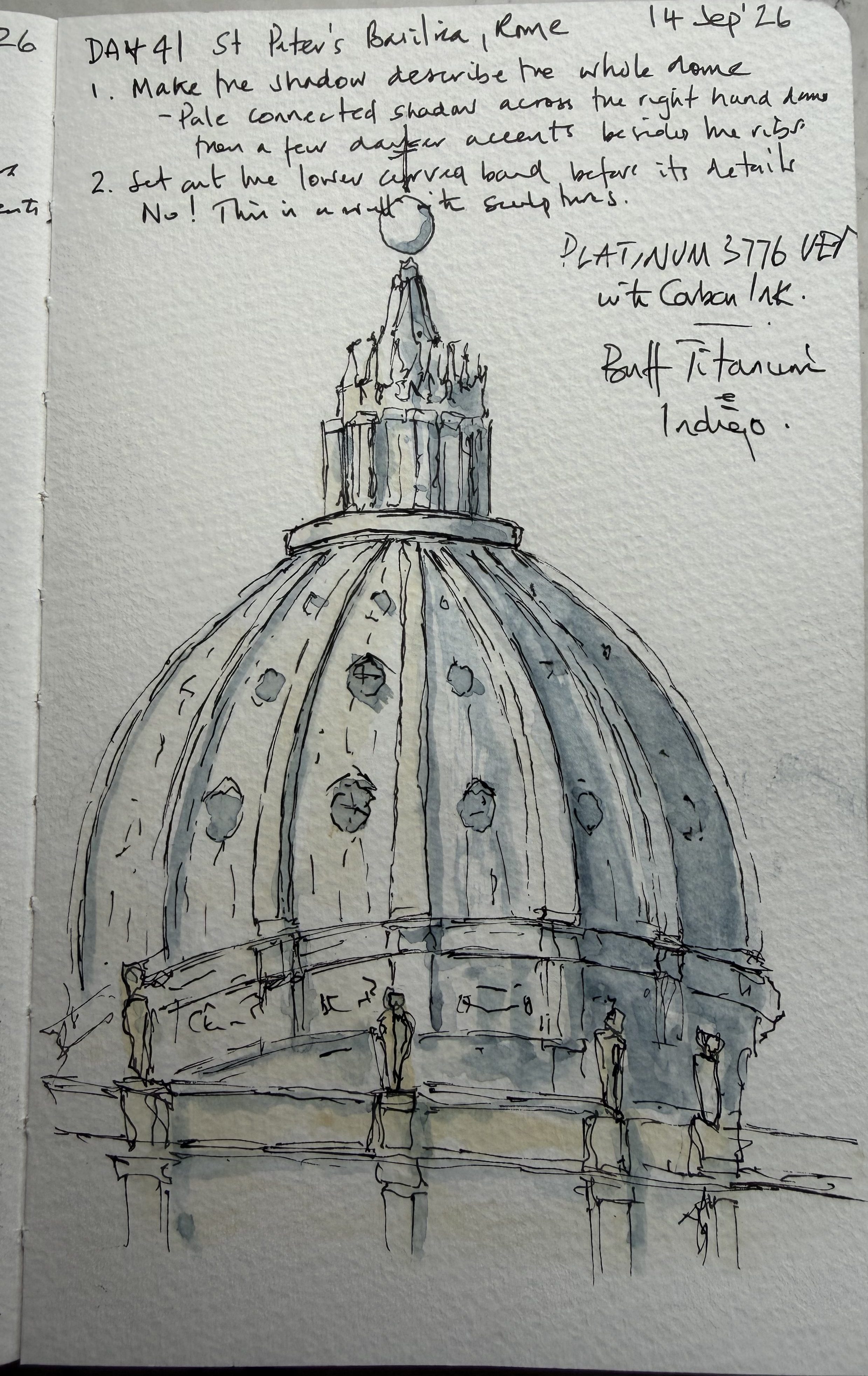
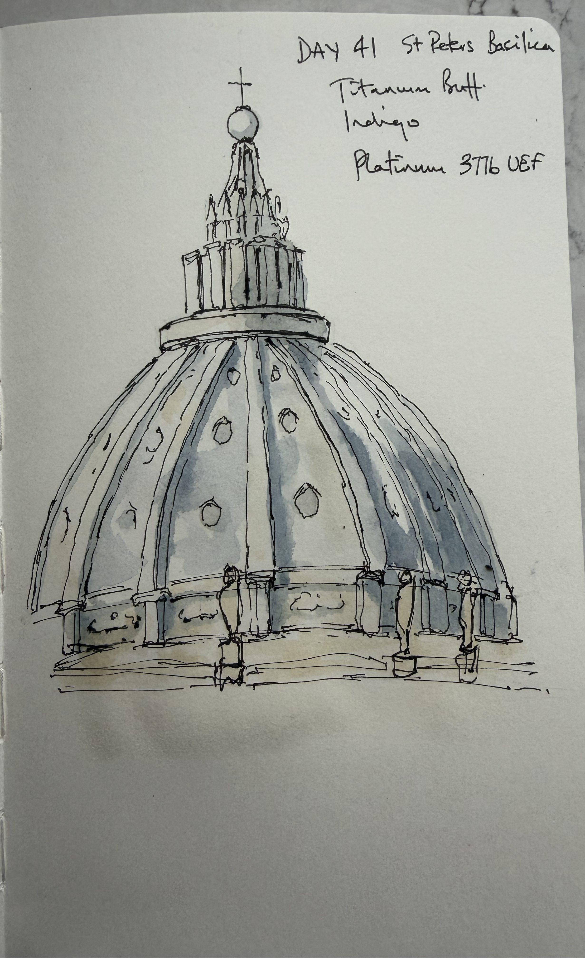
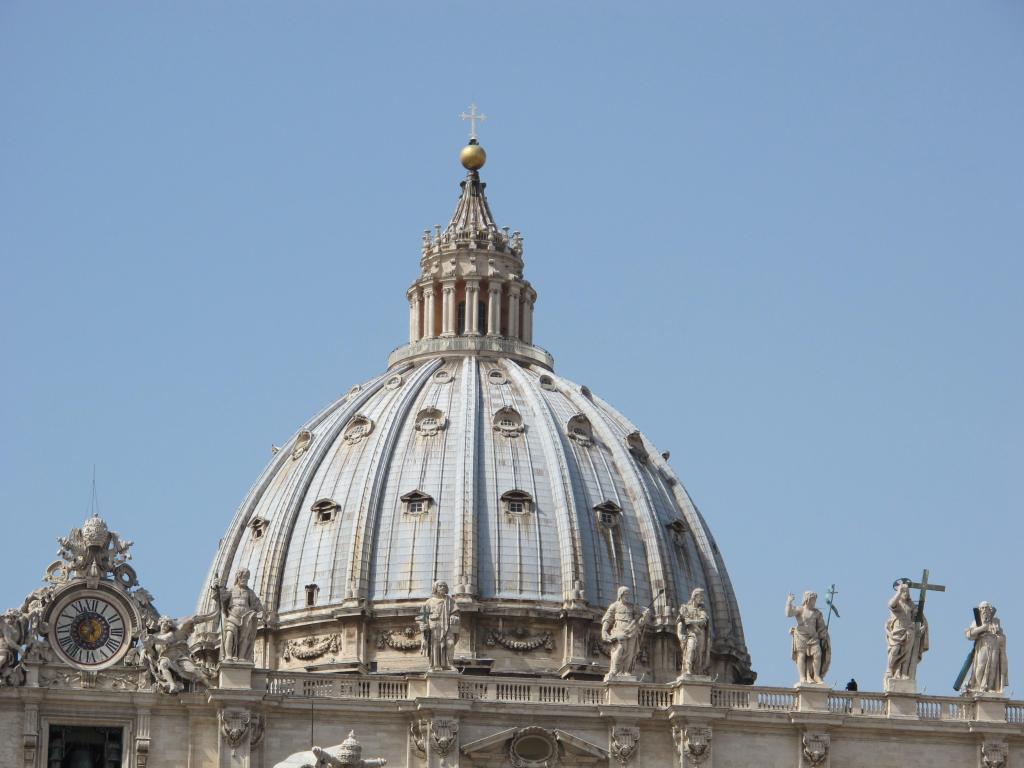
  • Today I move from arches to domes, concentrating on how curved ribs and shadow describe a rounded surface. Using my Platinum 3776 UEF with titanium buff and indigo washes, I begin with a preliminary study before making a second sketch in a rush before going out. The broader shadow across the right-hand side gives the dome more volume, while lighter, broken lines keep the drawing open. I retain the distinctive windows and the stripes of shadow visible in the photograph, both of which contribute to the roof’s character. The sculptures on the foreground wall become simple suggestions, although some of the structure around them gets tangled, and the lantern remains busy.

    There is also a useful reminder that critique needs to distinguish between an error and a deliberate choice: a shadow does not necessarily need softening when its edge is clearly defined in the reference. I am happy enough with this one. It communicates the dome’s rounded form and keeps the daily commitment going, even with limited time.
    Score 7/10—a rather demanding verdict – whatever that means!

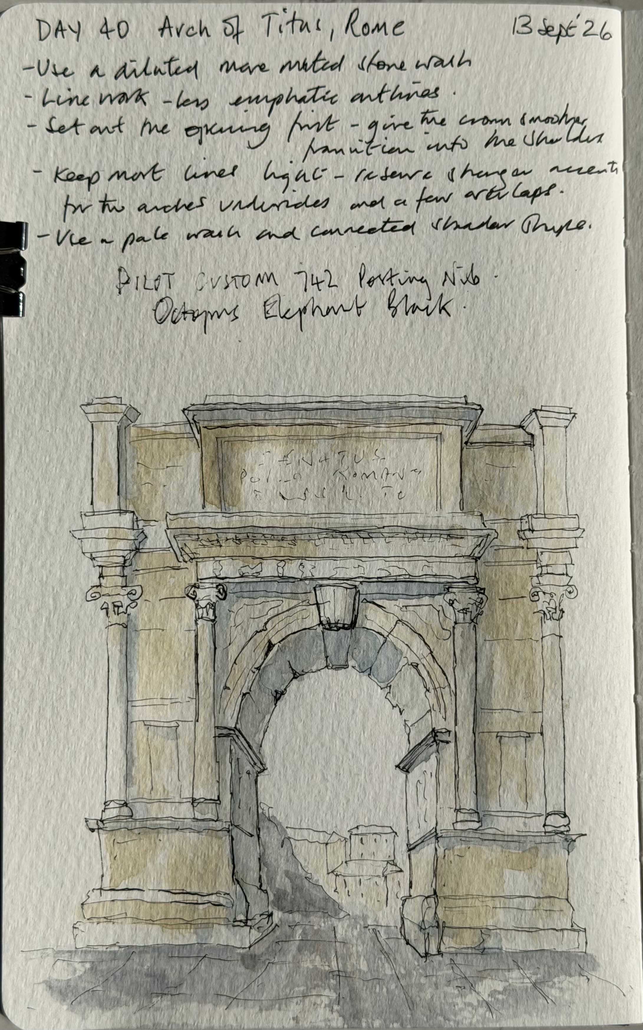
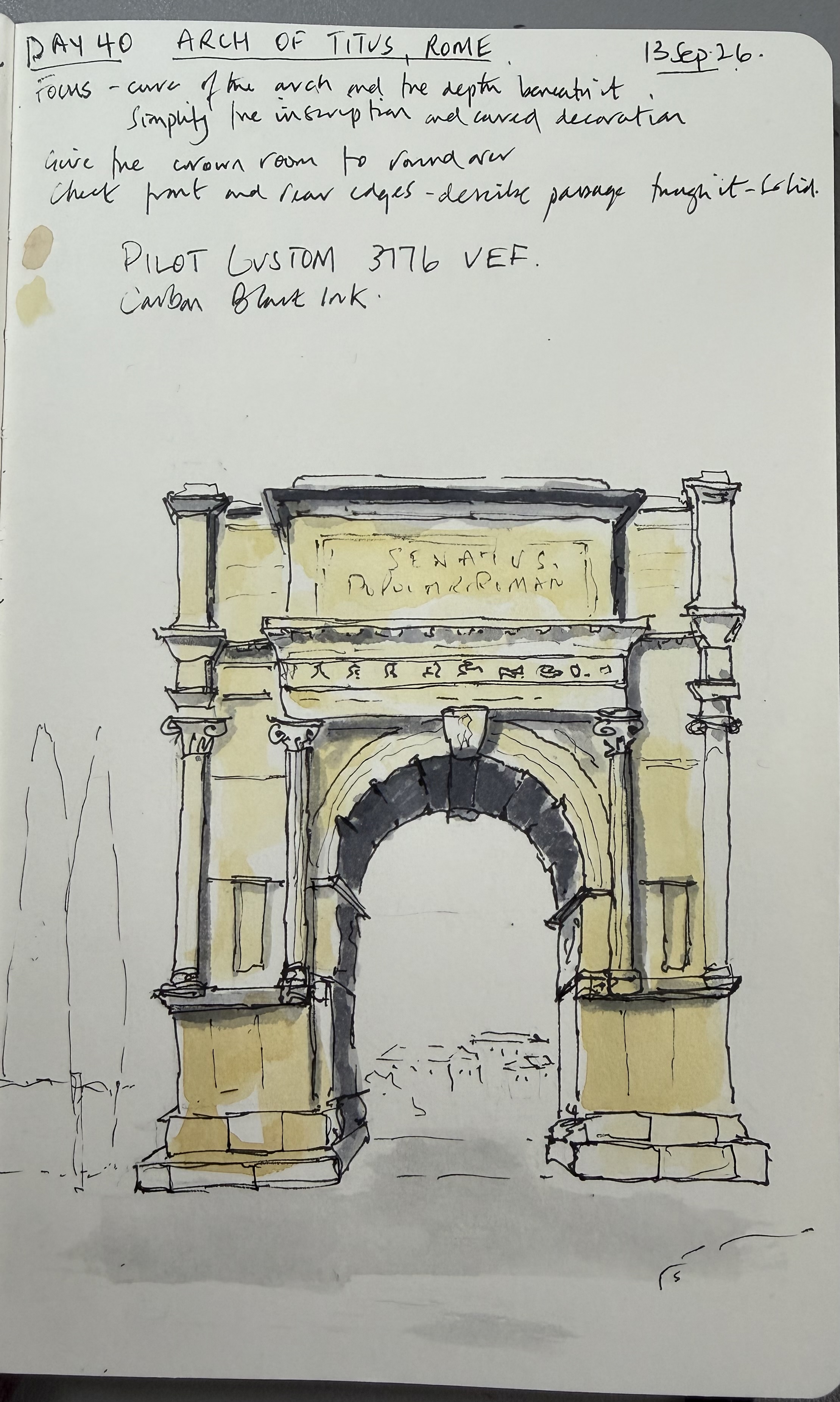
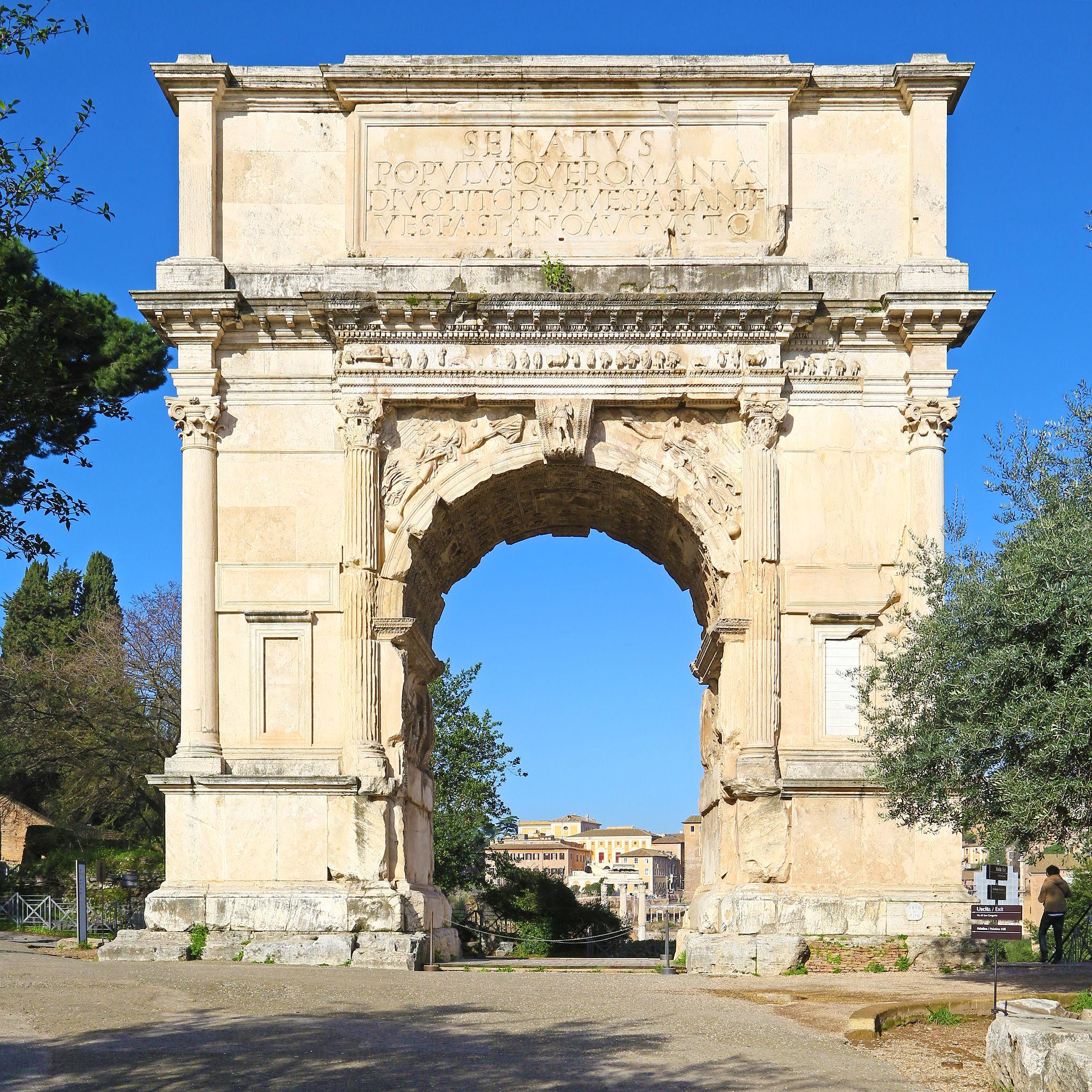
  • Today marks forty consecutive days of sketching, possibly the longest daily commitment I have ever maintained, and takes me a third of the way through my classical architecture challenge. The focus is the curve of an arch and the depth beneath it, keeping the inscription and carved decoration suggested rather than exhaustively described.

    I begin with two arch studies and a shaded fragment to explore how the underside connects to the inner wall. My first full sketch creates a convincing opening, but the yellow wash feels too bright and the heavy outlines give too many parts of the building equal importance.
    For the second version, I use my Pilot Custom 742 Posting nib with Octopus Elephant Black ink, a more muted stone wash and lighter, searching lines. The inscription settles into the façade, the upper cornice becomes less dominant, and the distant buildings help draw the eye through the passage. I am particularly pleased that the drawing retains its loose character while feeling more coherent as a whole.
    The critique identifies busy horizontal mouldings, a heavy foreground wash and an uneven rear edge beneath the arch as areas to consider next time. The score is 7/10, although I feel this version is approaching something better, almost hangable off a wall. That prompts a useful discussion: I want an honest assessment that can withstand disagreement, rather than a score that changes when I challenge it. I can value the critique without sharing every judgement. Today’s lesson is about lighter handling, selective emphasis and recognising when to leave a sketch alone.