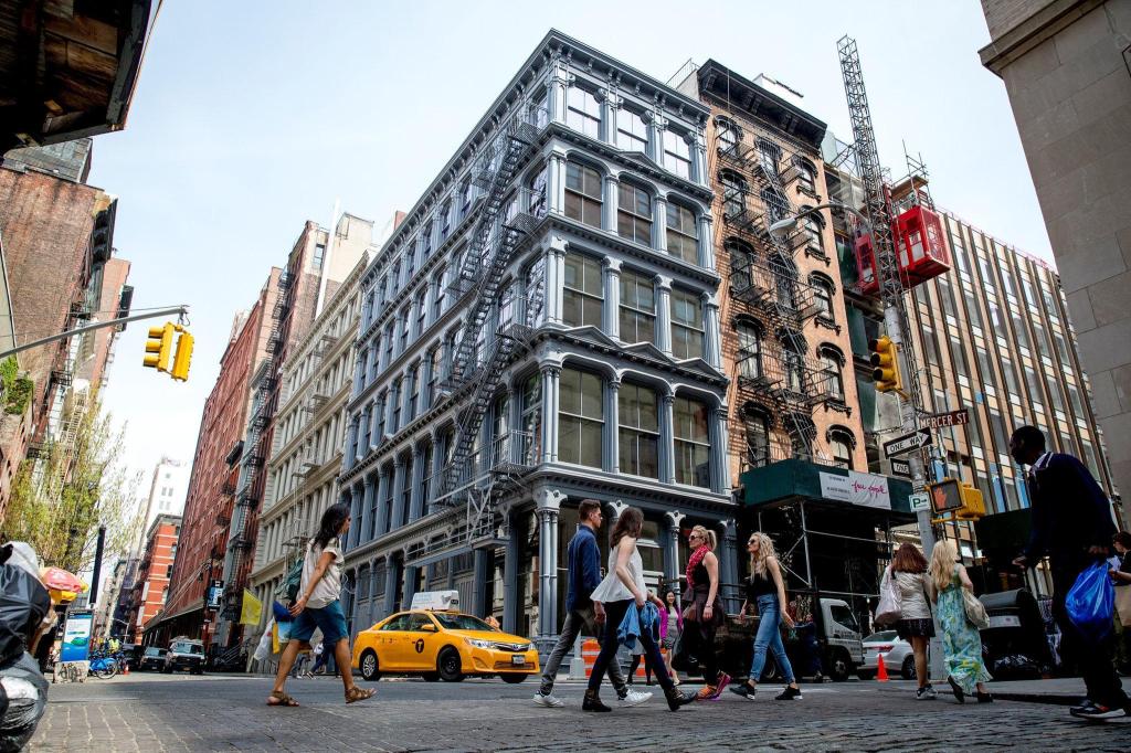
• I was given three photographs of New York, told to choose whichever one I wanted and received the entire challenge: “Make an urban sketch of this place.”No advice about composition, what to leave out, where to put the darks, which pen to use or whether to add colour. I chose a street corner with plenty of windows and fire escapes — apparently because after twenty-eight days I still enjoy making life difficult for myself.
    I used my Platinum 3776 UEF with Platinum Carbon Black ink and added a limited wash. I simplified the surrounding buildings considerably and added a few figures, including one in blue to give the sketch a small focal point. The annoying part is that I knew I’d gone too far before I received the critique. There was a point when the drawing was finished, but unfortunately I failed to inform my pen. I carried on adding shadows, windows, bits of fire escape and a few more explanatory lines to the main building. Nothing disastrous, but the final ten minutes probably didn’t make the drawing any better.
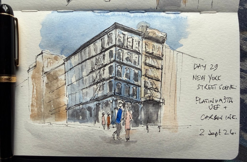
    The Verdict – the sketch successfully edited a very complicated scene rather than simply copying it. The surrounding buildings were allowed to disappear, the people helped turn it into a street scene rather than a drawing of a building, and the restrained colour worked well. The main criticism was exactly the one I was already expecting: I need to recognise when the sketch is finished while the pen is still in my hand.

    Score: 9.2/10

    One day left.
  • Timber Framed Architecture

    Since starting this website I have rather thrown myself into it, completing a sketching challenge every day and putting together a record of the courses, workshops and sketches I have completed along the way. One of the main reasons I started sketching was to record the places I visit on holidays and through work — although, having recently retired, I’m hoping the latter is unlikely ever to trouble me again.
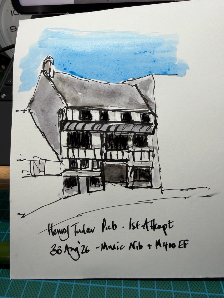
    Given that the website, and my daily commitment to urban sketching, only started a few weeks ago, I have naturally managed to increase my stress levels by deciding that I really ought to practise timber-framed buildings before a holiday just outside Shrewsbury, where we also intend to visit Ludlow and Much Wenlock.
    I was born and raised in Chester, where you can hardly move for black-and-white timber-framed buildings. Some are genuinely old and some are later Tudor Revival, but together they are a huge part of the character of the city. Learning to sketch the crooked, leaning and wonderfully characterful buildings of Shrewsbury and the surrounding area should therefore put me in good stead for eventually turning my attention to my home city.
    There is, however, one small problem, they are very difficult to get right!
    My journey so far is below:

    The Problem
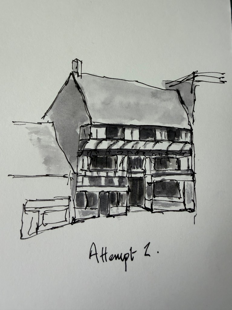
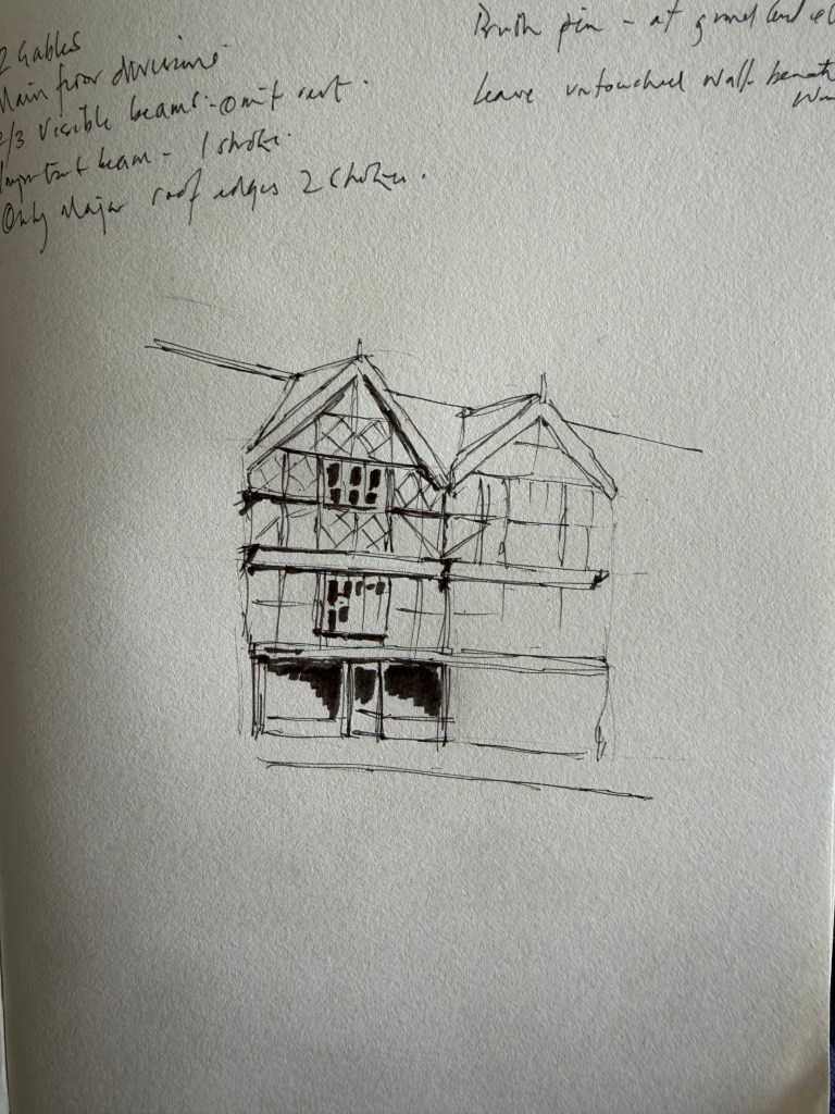
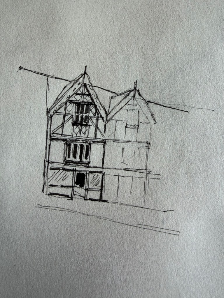
    Attempts 1 & 2

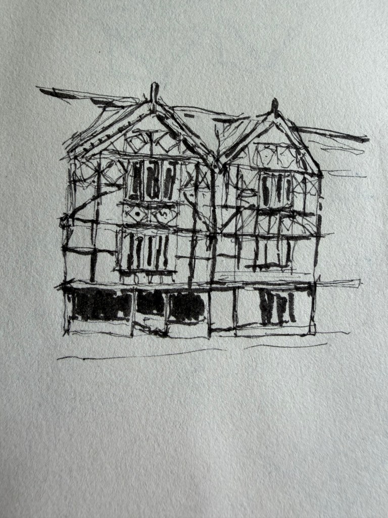
    Trying Too Hard
    Attempts 2–4.

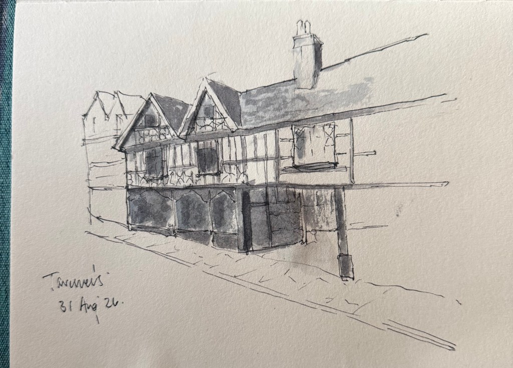
    Something Starts to Click
    31 August


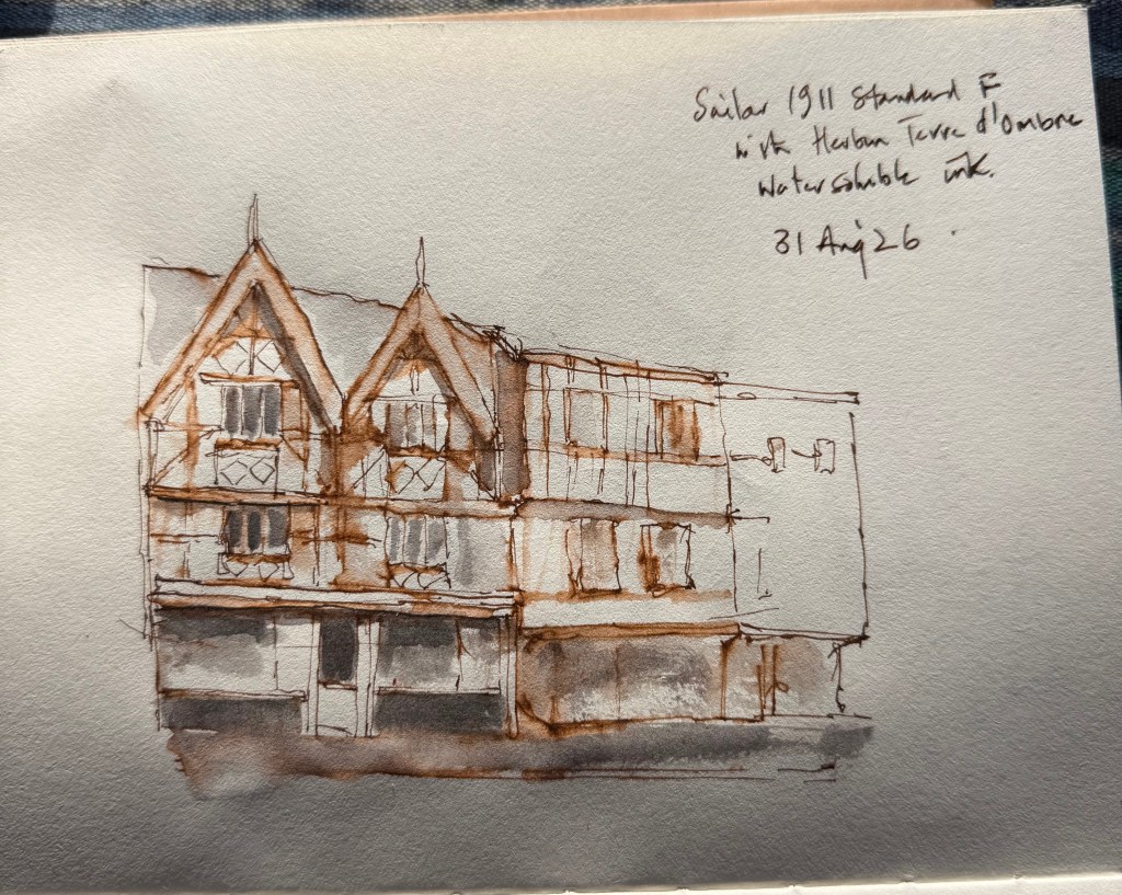
    The brown street sketches.
    I’m beginning to like these — although I’m not entirely sure whether I’m improving or whether I just like the colour.

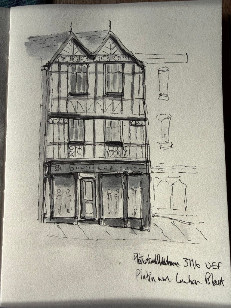
    Platinum 3776 UEF Shrewsbury sketch — more controlled and architecturally convincing; we preferred the brown one for its looseness, but this showed another solution.


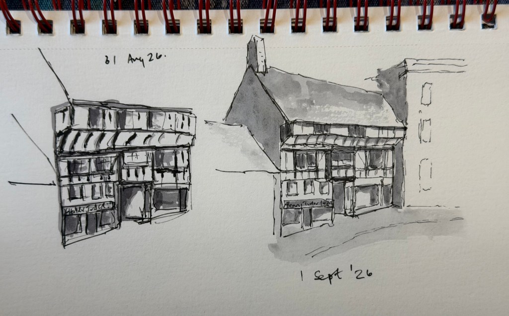
    Back to Henry Tudor via a long street scene and final comparison.

    I am by no means there, but there has been substantial improvement.

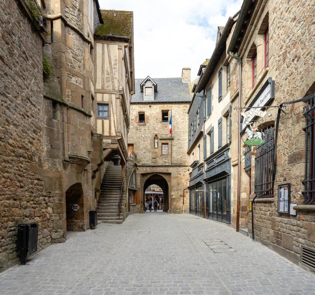
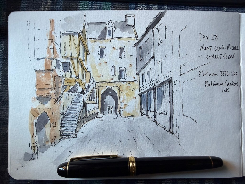
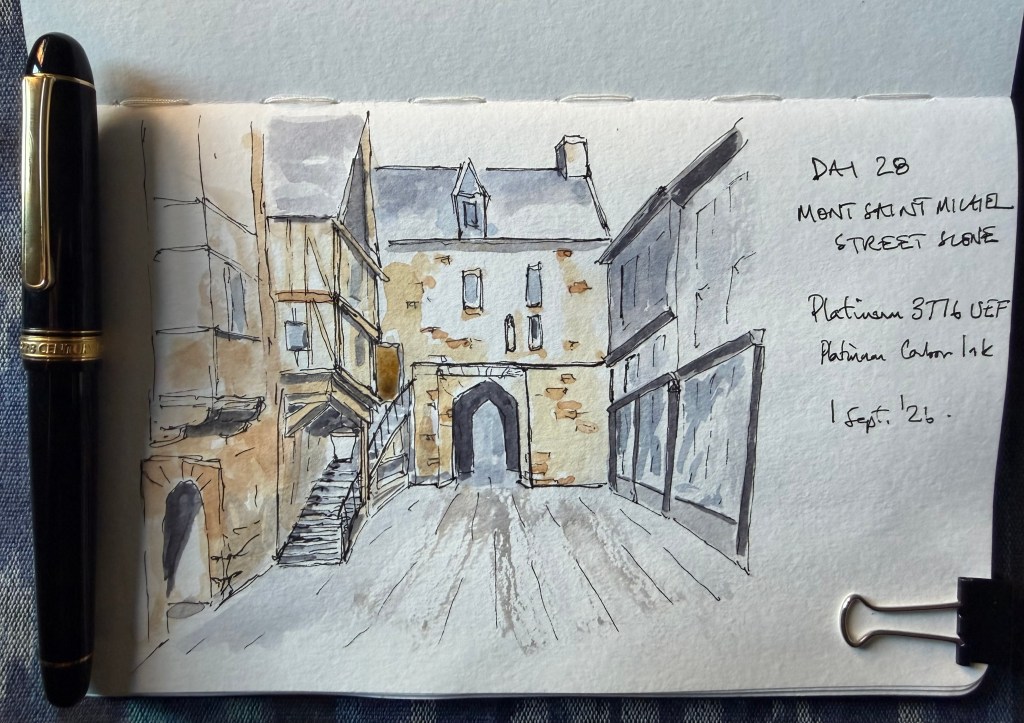
  • Today I’m simply given a selection of photographs of Mont-Saint-Michel and told to make an urban sketch. No advice about composition, detail, colour, darks or what to leave out. I choose a street scene rather than the spectacular views of the abbey — give me the slightest hint of timber framing at the moment and apparently I’ll ignore an entire medieval castle. I use my Platinum 3776 UEF with Platinum Carbon Black and add a restrained wash of grey, ochre and brown.

    I’m pleased with the first attempt and, mainly to see whether I can repeat it, decide to draw the same scene again. This turns out to be rather more uncomfortable than expected. Having produced one drawing I like, I spend much of the second wondering whether I’m about to produce a worse version of it. Strangely, the second drawing feels harder to make but is ultimately the stronger of the two, not my assessment. There is less information, particularly in the central and right-hand buildings, and much more of the paper is allowed to do the work. The street is largely left untouched apart from a loose sweep of grey, whereas in the first version I paint most of it.

    The Verdict – Both drawings work and, importantly, they look as though they were made by the same person. The first has more immediate energy, a stronger arch and two tiny figures that give the scene scale, but it becomes slightly congested on the left and across the road. The second is more selective. The central building is described with remarkably little information, the right-hand building is allowed to almost disappear and the largely untouched paper makes a much better street. If the best elements of both could be combined, the result would be stronger still — but recognising what those elements are is probably part of the exercise.

    Attempt 1: 8.7/10
    Attempt 2: 9.1/10 — chosen for Day 28.

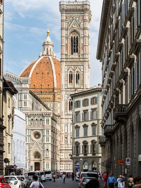
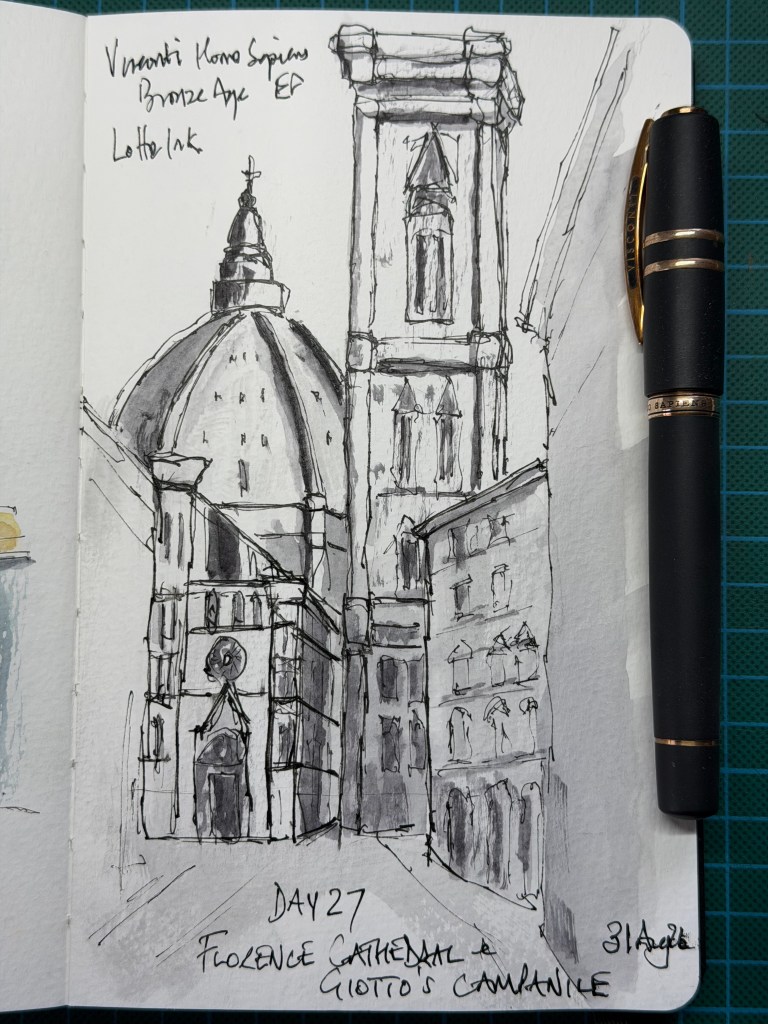
  • Today I’m given several photographs of Florence and a very short brief: draw Florence, not the decoration. I choose a view where the dome and Giotto’s Campanile are squeezed between the surrounding buildings and draw straight in with my Visconti Homo Sapiens Bronze Age EF and Lotte ink. Italian architecture apparently requires an Italian fountain pen designed in Florence.


    I easily resist colour this time and use only grey wash, concentrating on the dome, campanile and the scale of the cathedral against the much smaller buildings around it. There is an extraordinary amount of architectural decoration here, but most of it never makes it onto the page. Inevitably I still go a little too far in places. The top of the campanile becomes heavier than I intended and I start explaining rather too much around the lower cathedral and the building on the right. The interesting thing is that I know this before the critique arrives. Knowing when to stop and actually stopping, however, are apparently two different skills. A course or workshop can teach me what to look for, but only practice — followed by considerably more practice — is going to make those decisions instinctive.

    The Verdict – The composition makes the cathedral feel monumental without relying on its extraordinary decoration. The dome, campanile and surrounding buildings are enough to make the scene unmistakably Florence, while the loose grey washes, broken architectural lines and disappearing edges give the drawing atmosphere. The top of the campanile is slightly overworked and parts of the lower cathedral become congested, but these are increasingly errors of knowing when to stop rather than not knowing what to do. Most importantly, the drawing feels personal and was produced with very little guidance.

    Score: 9.0/10

  • Day 26 – The Shard

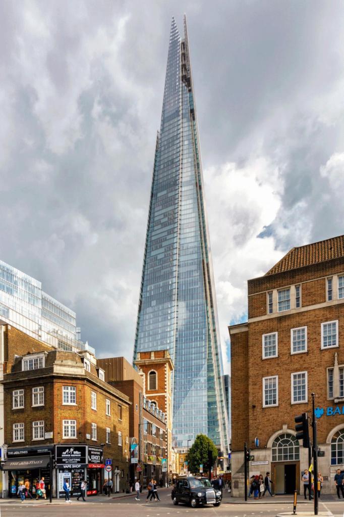
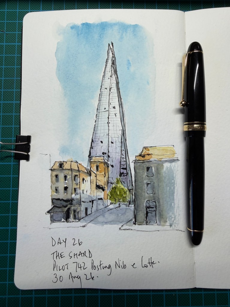
    Today I’m given an urban view of The Shard and just one real instruction: make The Shard unmistakably the subject without necessarily giving it the most ink. Everything else — what to include, what to leave out, how much detail to draw and whether to use colour — is left to me.

    I use my Pilot Custom 742 with Posting nib and Lotte ink and, despite being a self-confessed monotone sort of person, somehow end up reaching for the watercolours. The Shard itself is kept relatively lightly drawn, with just enough lines to suggest its glass structure, while the smaller buildings below are much looser. The large blue wash behind the tower wasn’t particularly planned, but it helps push the Shard forward, while small areas of ochre and green give the street below some life. Perhaps colour isn’t quite as dangerous as I thought.

    The Verdict – The Shard dominates without being given the heaviest drawing, which answers the challenge particularly well. The scruffy buildings on the left are arguably the strongest part, with wandering rooflines, abbreviated windows and disappearing edges. The limited colour works because it organises the sketch rather than simply colouring things in. The blue background could have a little more variation and the right-hand building is slightly too well behaved, while there are still a few unnecessary explanatory lines on the Shard itself. Most importantly, though, the drawing feels increasingly personal despite receiving less instruction.

    Score: 8.9/10 I really don’t know how this score has been calculated? If I was this good surely I would be the next Bob Ross.

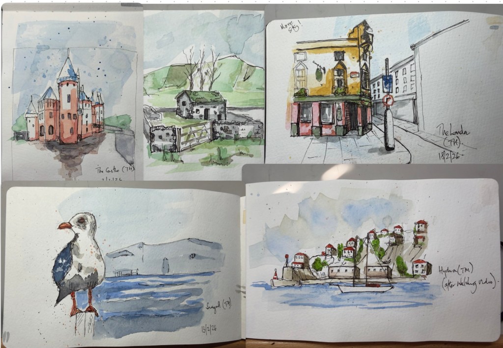
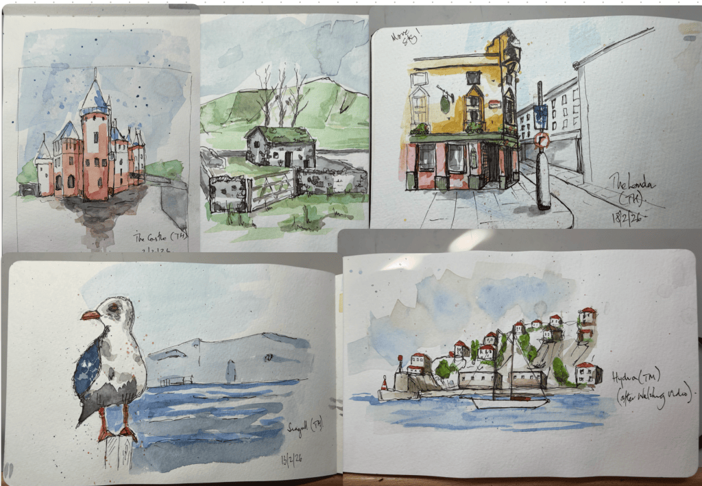
  • I started this in February 2026 and I had not completed it before starting my first workshop with Sketchloose later that month – talk about being unprepared!
    The course is at a beginner’s level and as well as Toby talks you through each exercise when it comes to actually doing the sketch and applying the watercolour, it is probably similar to asking someone to do brain surgery after watching a how to do it video on YouTube, but without the jeopardy.
    I must admit I usually made several attempts of each challenge before I was happy to post my work back for Toby’s comments.
    Toby must either be writing at such speed that the computer cannot keep up with him or he is doing his reviews at 2am, or his spelling is simply atrocious; I think it is the former! Once you have deciphered his response, his comments are spot on and positive. What I like about his reviews is that he is not training you to copy his style but point out things that will make your version better.
    The course is not just about sketching an urban scene, I sketched a seagull and a coastal line as well. This makes you think a bit more than just doing rectangles and straight lines; I liked this aspect of the course.
    This is a good little introductory course to sketching and as daunting as it was at the time, I could see progress in my work though I don’t think I have improved much since!
    My course work is below; this is largely just the work submitted. I have several pages of draft castles, pubs and seagulls.

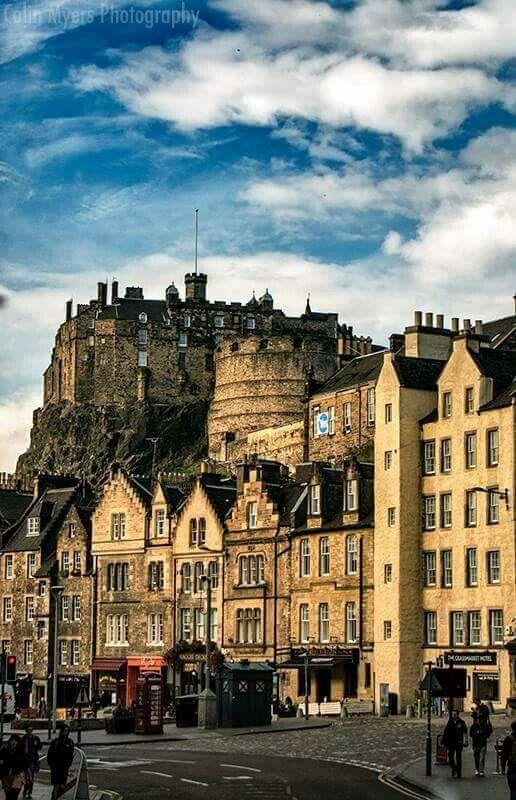
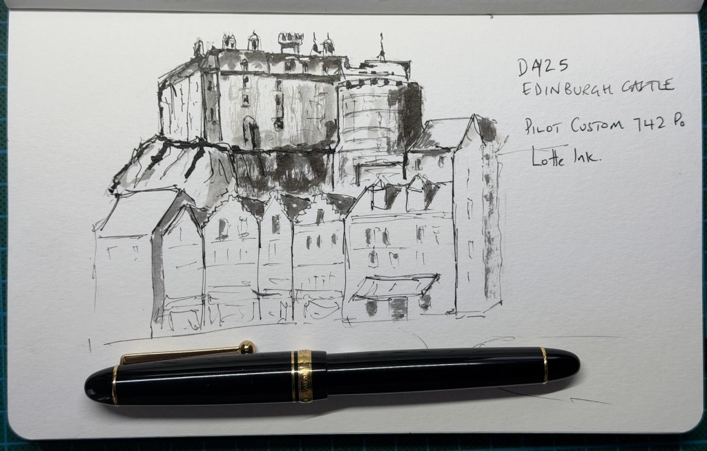
  • There are very few instructions today: I’m given a photograph of Edinburgh Castle and told simply to make it look like Edinburgh Castle as I now draw it. No suggested number of shapes, no instructions about where to put the darkest marks and, perhaps most dangerously, permission to leave out anything I don’t think the drawing needs.

    I use my Pilot Custom 742 with Posting nib and Lotte ink, keeping the foreground buildings very lightly drawn and allowing the castle above them to carry most of the weight and tone. I’m pleased with the result, although the heavy diagonal marks in the rocks beneath the castle attract rather more attention than I intended. Being a geologist, I immediately point out that rocks really can have strong parallel structures. Unfortunately, being geologically correct doesn’t necessarily make for a better drawing. That may actually be the lesson from today: accuracy is something I’m allowed to edit.

    The Verdict – The castle has real weight without being over-described, while the much lighter foreground buildings create a strong hierarchy and leave plenty of untouched paper. The little rooftop details are particularly effective and the limited ink-and-grey approach suits the subject. The rocks are the weak point: the dark parallel strokes may be geologically defensible, but graphically they compete too strongly with the castle. Most encouragingly, with very little guidance the drawing still has the fine lines, selective heavy marks, restrained tone and incompleteness that are becoming characteristic of my sketches.

    Score: 8.7/10

  • I started this in February 2026 and I had not completed it before starting my first workshop with Sketchloose later that month – talk about being unprepared!
    The course is at a beginner’s level and as well as Toby talks you through each exercise when it comes to actually doing the sketch and applying the watercolour, it is probably similar to asking someone to do brain surgery after watching a how to do it video on YouTube, but without the jeopardy.
    I must admit I usually made several attempts of each challenge before I was happy to post my work back for Toby’s comments.
    Toby must either be writing at such speed that the computer cannot keep up with him or he is doing his reviews at 2am, or his spelling is simply atrocious; I think it is the former! Once you have deciphered his response, his comments are spot on and positive. What I like about his reviews is that he is not training you to copy his style but point out things that will make your version better.
    The course is not just about sketching an urban scene, I sketched a seagull and a coastal line as well. This makes you think a bit more than just doing rectangles and straight lines; I liked this aspect of the course.
    This is a good little introductory course to sketching and as daunting as it was at the time, I could see progress in my work though I don’t think I have improved much since!
    My course work is below; this is largely just the work submitted. I have several pages of draft castles, pubs and seagulls.

  • Mayad’s Sketch School

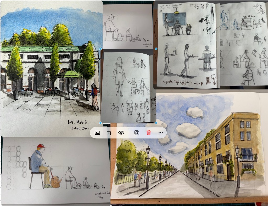
    I enrolled for Mayad’s (https://www.mayadssketchclub.com) beginner and intermediate classes as a package, which when bought together were considerably cheaper than buying separate. Both of these courses taught me a lot and most of all how to embrace watercolour.
    First of all Mayad and Claire are great – Claire with all the behind the camera stuff and Mayad with his style of tuition and the time he has for his students.
    Mayad’s work is not the loosest of styles so I would not be his usual type of student, I did query this with Claire before I enrolled but felt I would learn so much from his course that I joined anyway and I am really pleased that I did.
    The beginner’s course takes you through line marking and watercolour paints, it is for the beginner as you would expect and Mayad explains what to use, how to use it and provides reference material that assists the examples provided throughout the course. I had trouble applying a wash and Mayad gave up most of his Saturday night to help me, it was the night of the Champions League final which I couldn’t access so no harm done to my Saturday football! Anyway his technique for applying a wash is second to none.
    The Intermediate Course, surprised me somewhat as it focused a lot on people but drawing them in scenes. This was invaluable and again his technique for drawing people makes it very doable.
    Both courses have been meticulously planned and thought out. You can see that his examples have been tried, tested, rejected until Mayad is happy with the example he uses in the course.
    One other thing about the course is the use of WhatsApp and Instagram groups. The students sign up for these goups where they can showcase their work and ask Mayad for help; the support from other student’s is also wonderful.
    My main takeaway from Mayad’s course was the simple way he broke most processes down and especially his technique for doing washes. Mayad makes no bones that you need to practice a lot, then some more. Nothing is easy or free in this life!
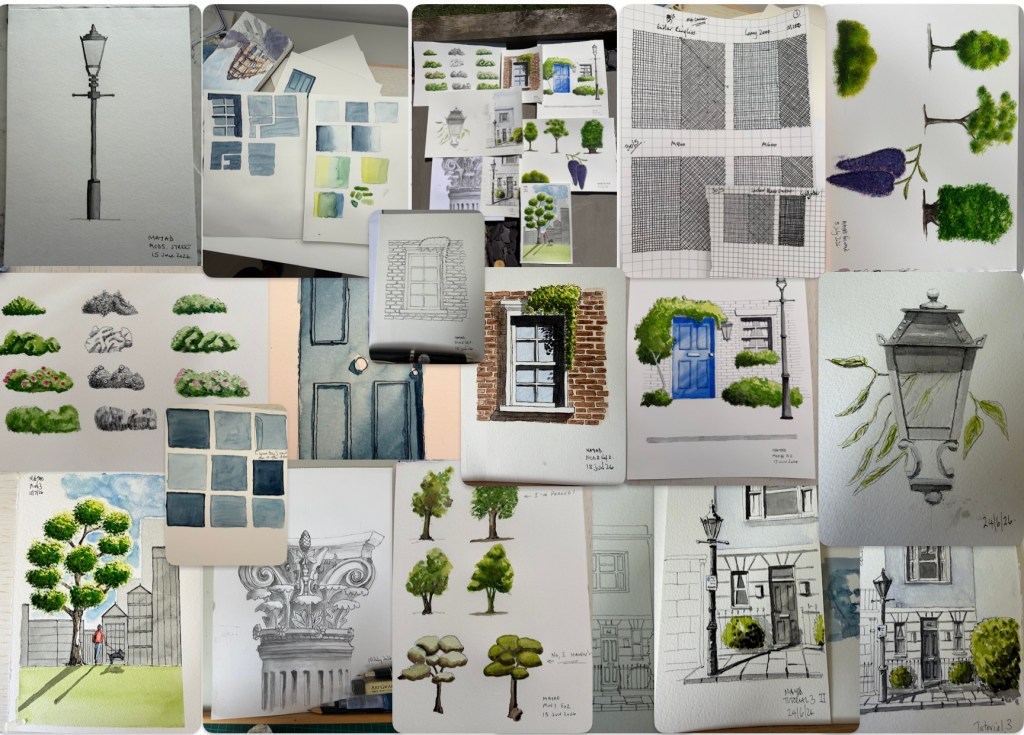
    Looking back on my work, I am surprised how much course content there is and my sketches below are just the ones I showcased.

    Some of my work from Mayad’s courses below.

    And from the Intermediate course:

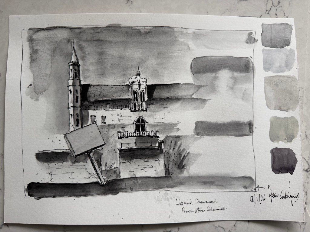
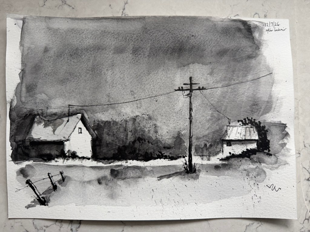
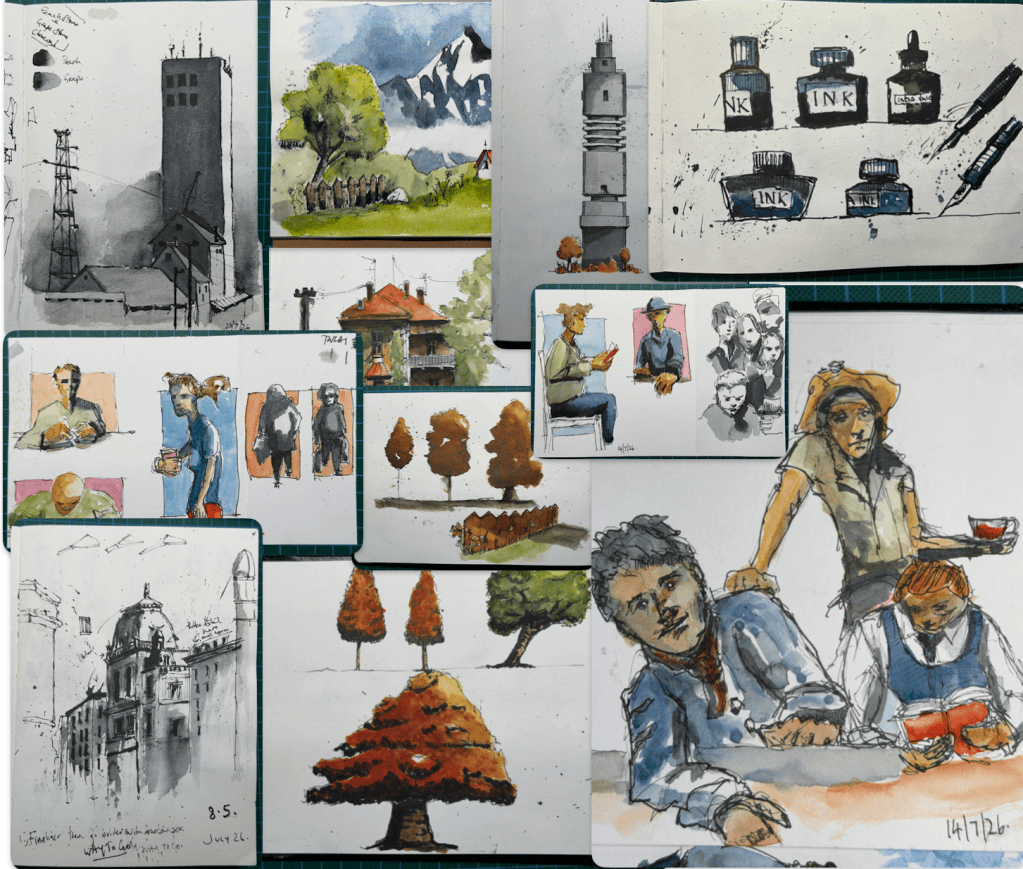
  • This is not really a course but more of a series of paint-along-with-me videos. I really like Martin’s work especially with his dip pens and liquid charcoal.
    I joined Martin’s Patreon after watching several of his videos on YouTube, where there is so much more. Yes, Martin does a lot of trees, fences and sign posts but the colour used for most of his sketches is sublime, as is the way he splatters with a dip pen – the how to video being worth the subscription alone!
    However, I do prefer his monotone work which is very doable and simplified by Martin in his step by step approach. I particularly like his Vienna street scene, which I attempted below. I am not so keen on his futuristic cityscapes but they do look good.
    He has a good technique for sketching people as well, though they can be verging on the playful side of sketching.
    I also bought the sketchbooks recommended by Martin. On the whole I find them good, although some of my finer nibbed pens do rip into the paper and get clogged up. For sketching and studies, though, they work well.
    Definitely worth a visit to his Patreon.
    The sketches below are my own attempts following Martin’s videos: