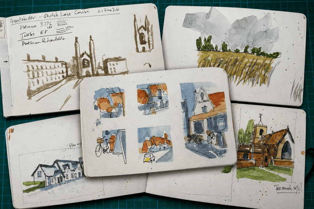
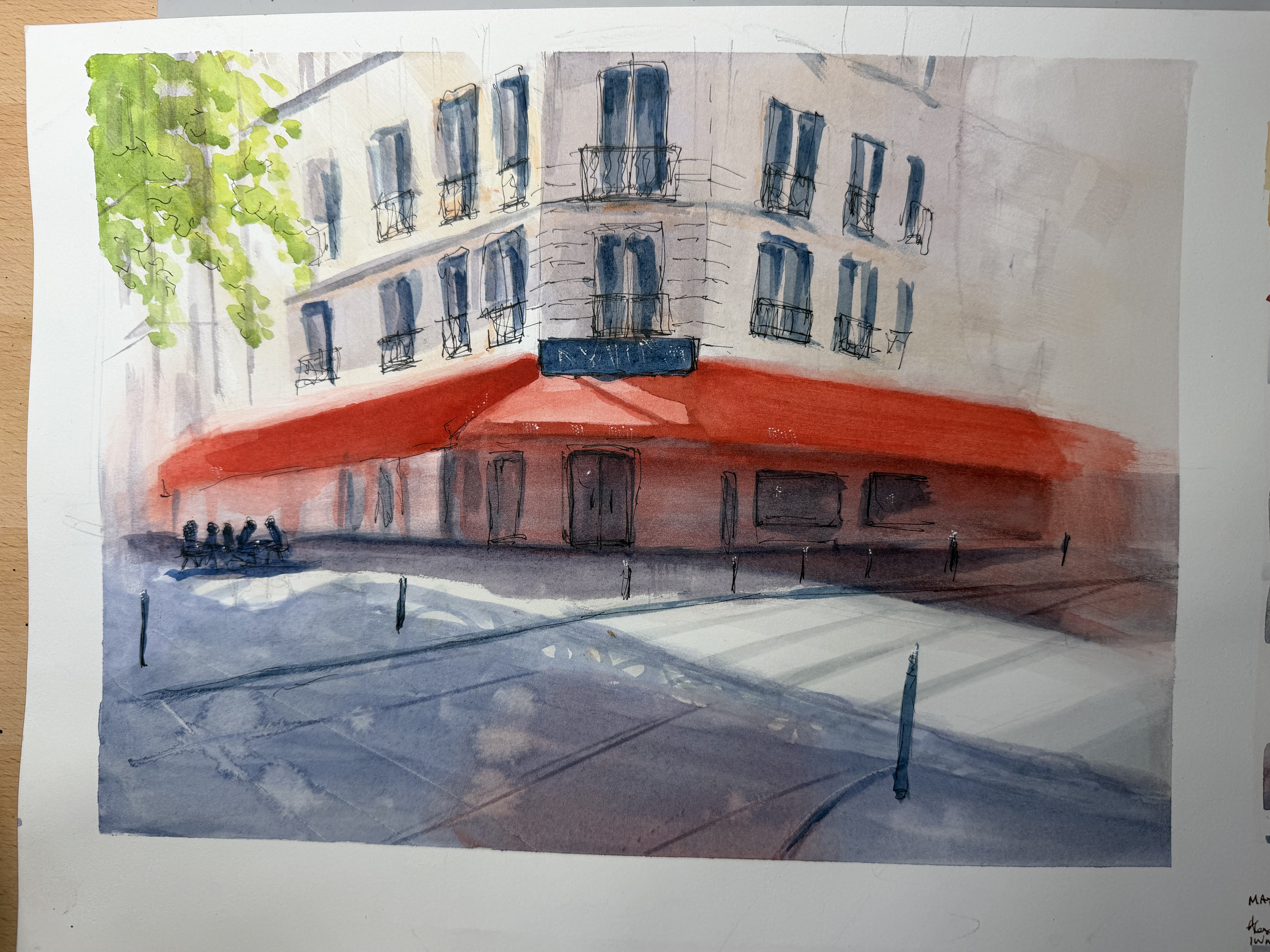
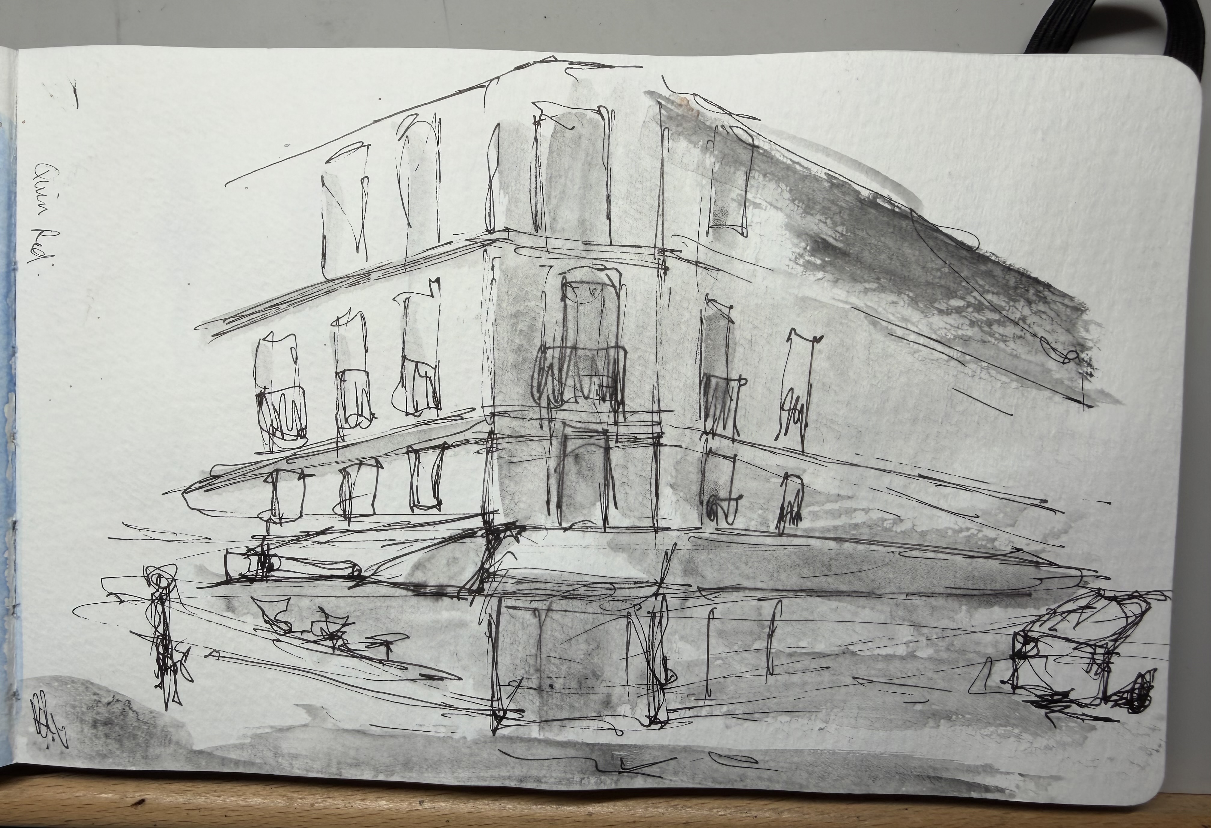
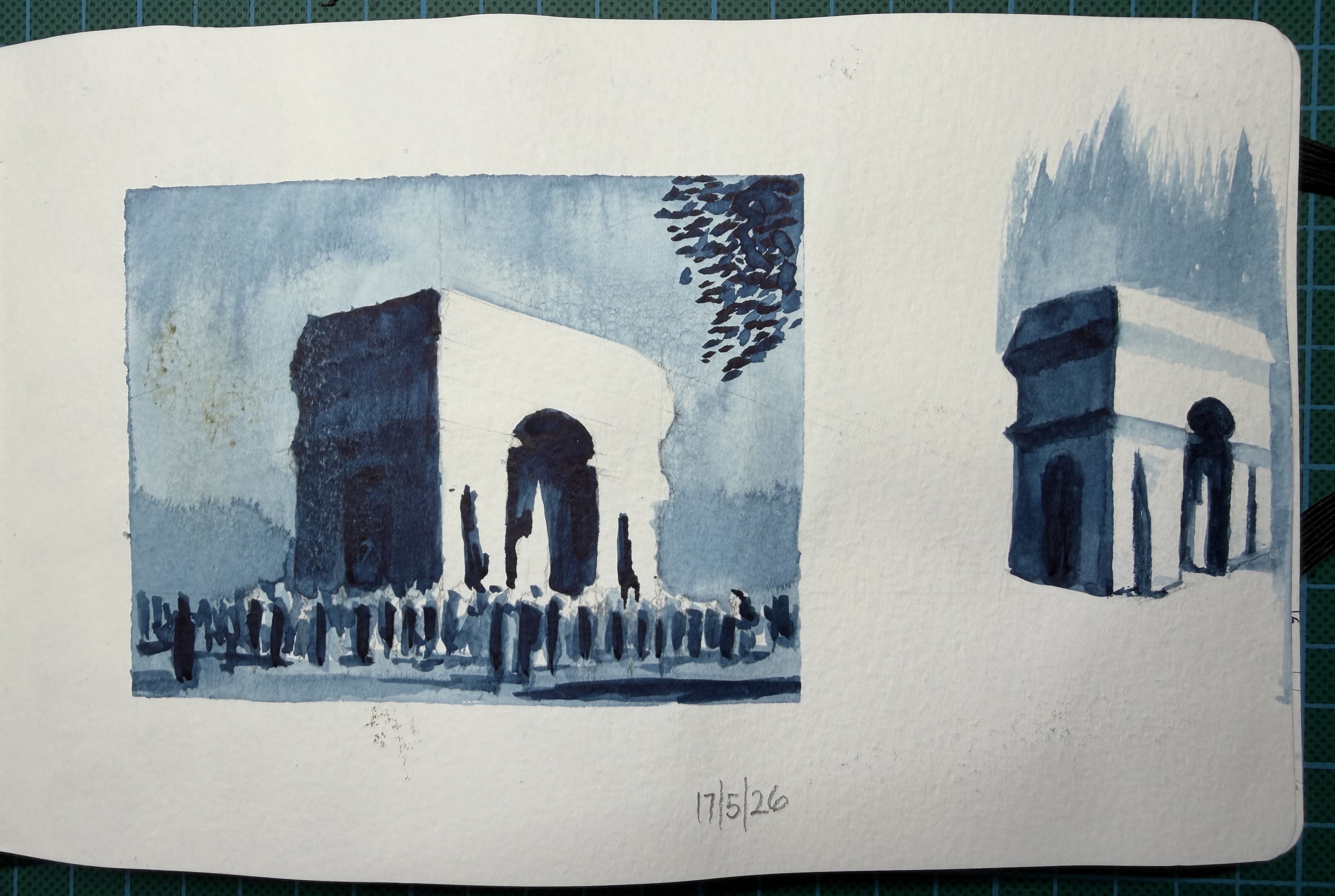
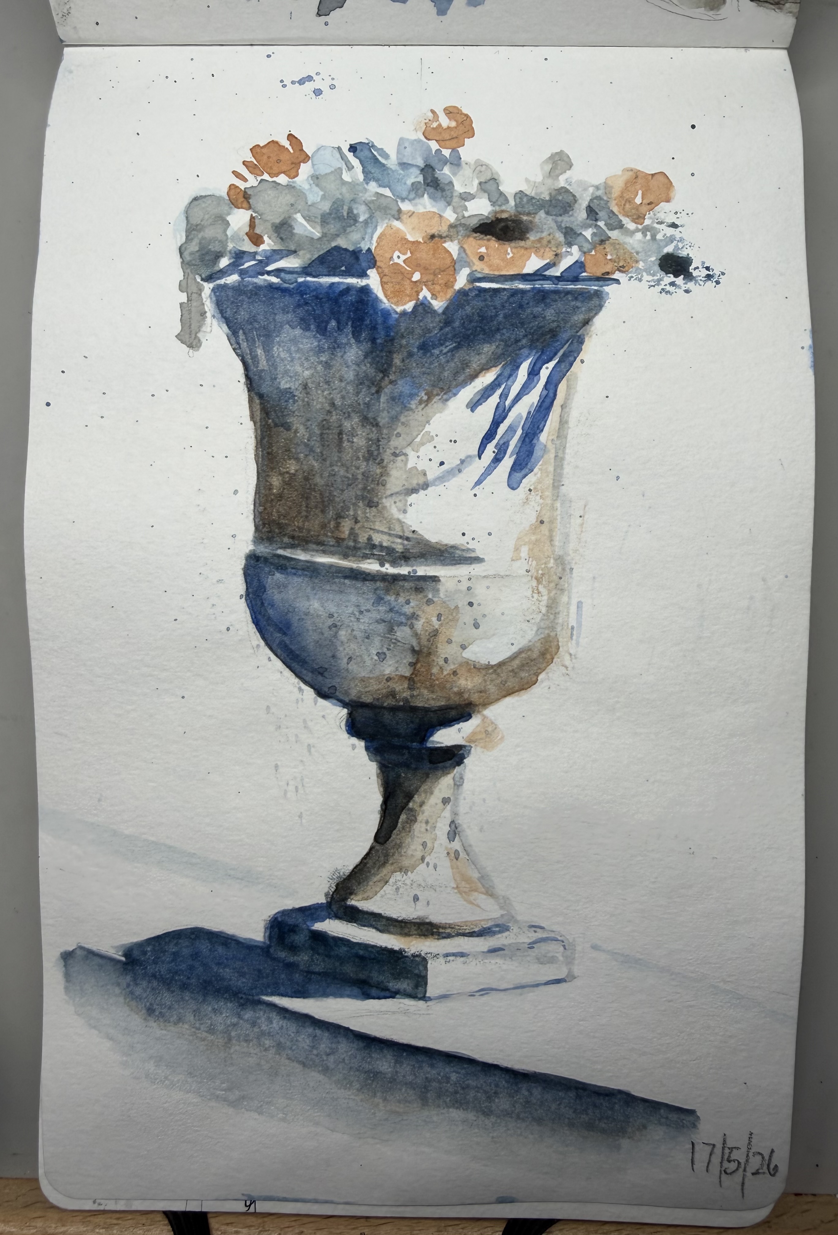
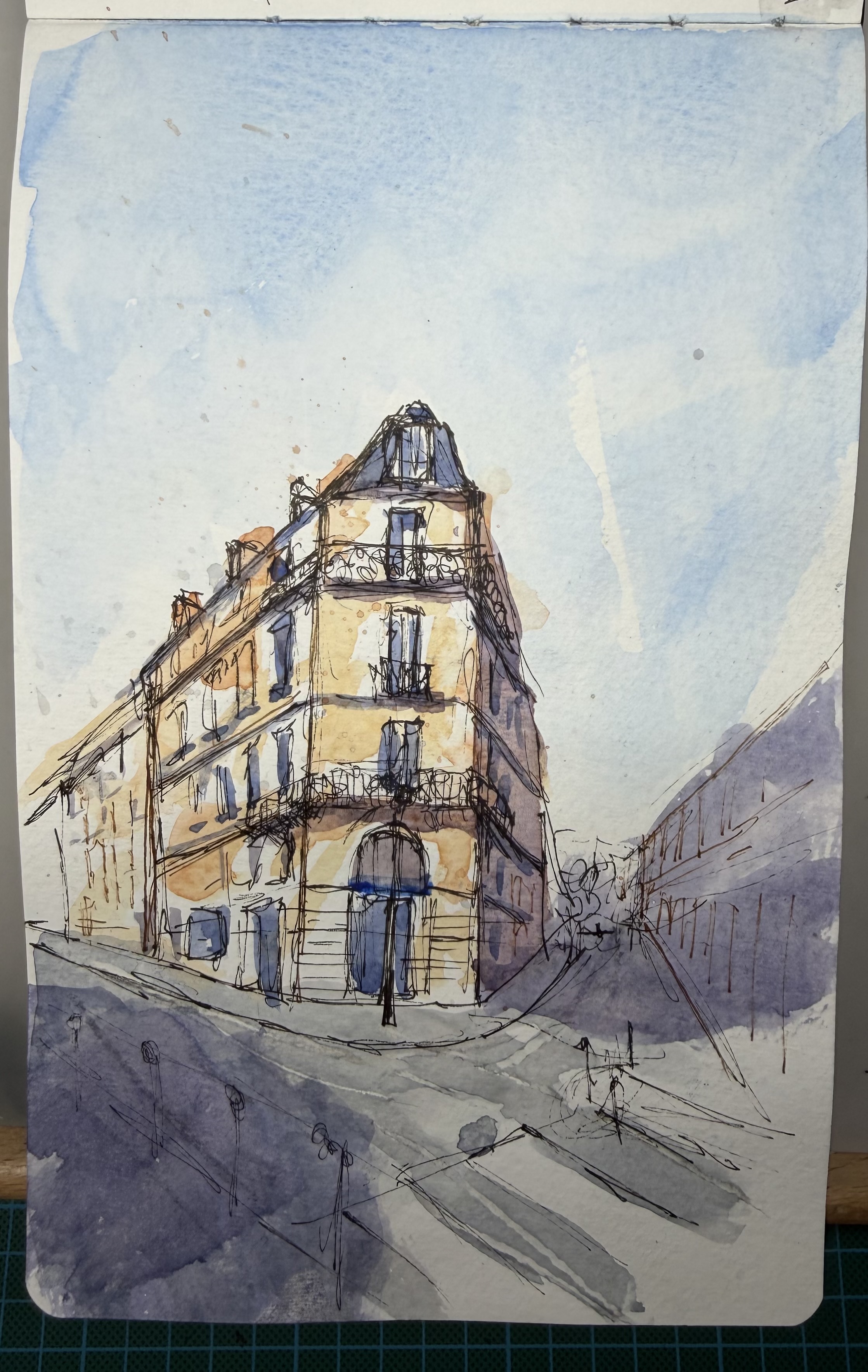
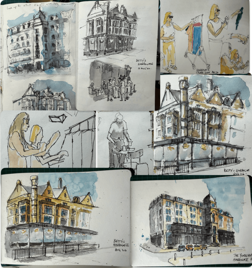
Grantchester was where things really started. The weekend was run by Toby from Sketchloose along with Colin from Woodward Watercolours, both lovely people and exactly as they appear on YouTube. I arrived as someone who occasionally drew and left considerably more enthusiastic — and dangerously interested in fountain pens. These are some of the pages from that first weekend in Grantchester.
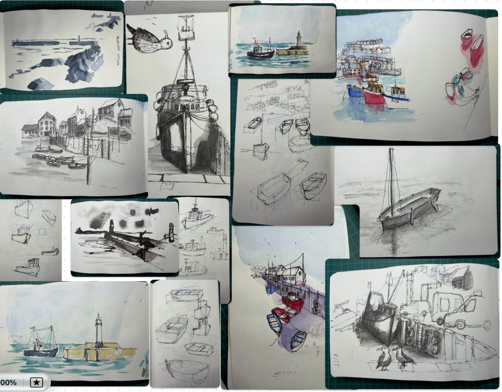
I signed up for another of Toby from Sketchloose’s workshops, this time in Mevagissey, sketching boats. Boats are difficult. I knew they would be difficult but in real life they are frightening. Mevagissey is also a lifetime away when driving — over eight hours from Conwy. The dog loved it: eight hours lying on his bed on the back seat in a temperature-controlled environment, interrupted only by the occasional toilet and treat break. Back to the course. Toby and Colin were on form as usual and introduced us to some new techniques, including painting with Indian ink using a broken piece of stick. Not for me, as it turned out, but definitely part of the process of trying things and finding out what works. It was an enjoyable weekend with a good group of people, and I continued my good rapport with Clive and Kevin, whom I’d met at the Grantchester workshop. Inevitably, much of our conversation returned to pens and art materials. I liked some of the work I produced and some of it rather less. More importantly, I discovered that I really liked working in monotone and particularly enjoyed using an ArtGraf water-soluble graphite stick. That was probably the most useful thing I brought home from Mevagissey.
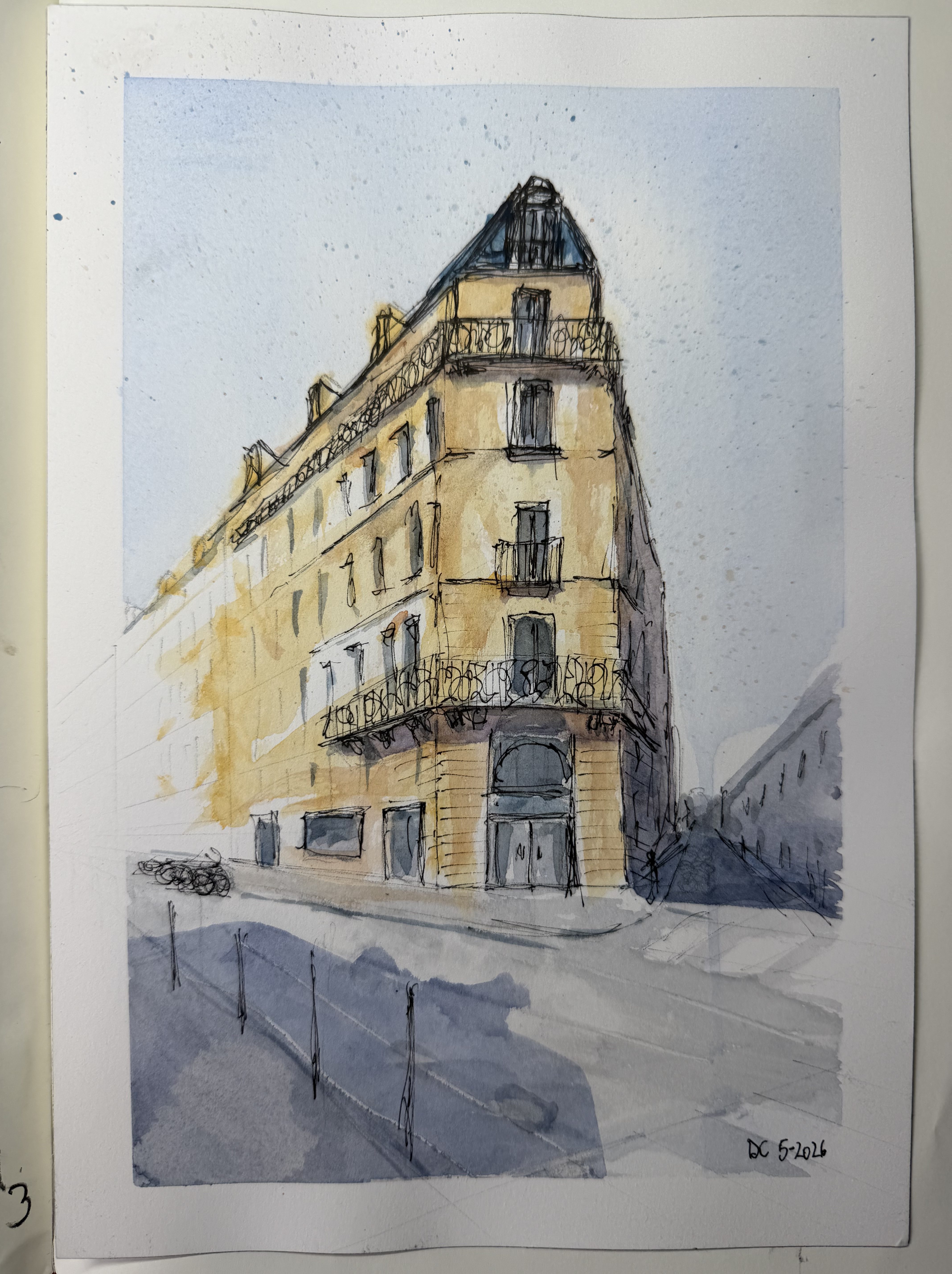
Do you ever get that feeling that you’re not quite good enough to be somewhere? I’ve had it throughout my life, but rarely more strongly than during the introductions at the start of this course. Nearly everyone seemed to be an experienced painter — and they were all so good. Alex and the others on the course could not have been kinder or more encouraging, and I was actually quite pleased with some of what I produced. But the larger paintings, with colour mixing and layered washes, completely threw me. I struggled so badly that I finished the first day wondering whether I would come back for the second. Fortunately, I did.
A very different second day The first thing I did when I got home, apart from blaming my wife for encouraging me to take the course, was to get my sketchbook out and re-do one of the exercises I did earlier in the day and I was pleasantly surprised with the outcome; may be not all was lost. I stopped worrying quite so much about everybody else and started enjoying myself. Alex is a master of what he does, but just as importantly he brought such warmth and enthusiasm to the course that it was impossible not to get caught up in it. What had felt rather intimidating at the beginning became a great experience. And Blade Runner was a favourite of his, so he could not be that bad.
I would encourage someone to take any course if they can, unless it says advanced and you are a beginner. I have mainly learnt by making mistakes and either working out or being told how to do it right. Any course tutor worth his salt will help you if you ask or he see’s an obvious error. So do it!
I went to Harrogate at the start of August on a jolly with my wife who was going to a Trade Show to buy more clothes, for her shop that is, not so she could just fill another wardrobe. I did attempt some plein air but most of the images were sketched in the hotel room in the afternoon. Still not specific line markings and very much just a draw, paint and hope approach.
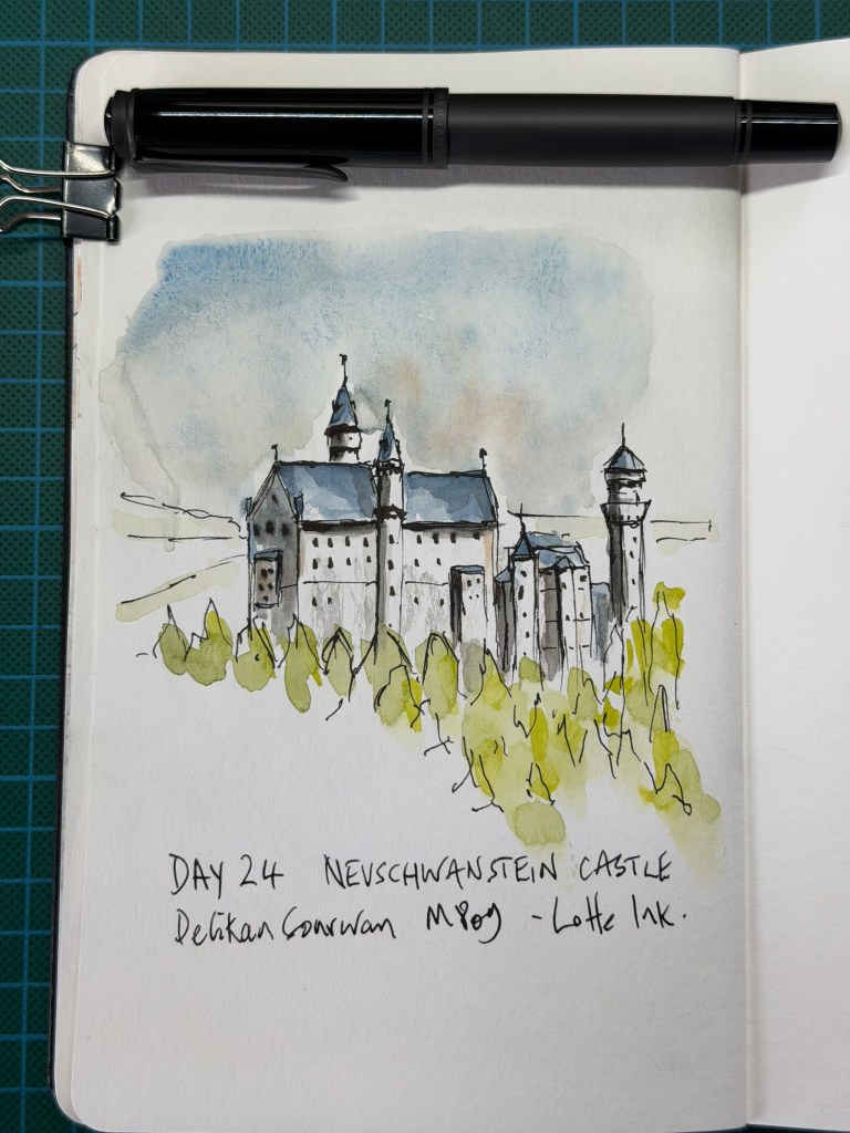
After twenty-three days I have been informed that I should be starting to decide for myself what is important and, perhaps more importantly, what can be left out. Not sure about this. Neuschwanstein Castle could easily become another exercise in drawing every window, tower and architectural detail, so I try to concentrate instead on the overall shape of the castle. The windows become little marks, the trees are mostly blobs of green with a few loose lines, and quite a lot of the reference photograph simply doesn’t make it onto the page.
For no particularly artistic reason, I decide that a German castle deserves a German pen and ink, so today’s sketch is done with my Pelikan M809 and Lotte ink. This is obviously an entirely sensible way to choose a drawing instrument and definitely not an excuse to own more fountain pens.
I probably worked the sky a little harder than necessary and the left hand side of the castle, but I’m pleased that the building itself remains relatively simple. More importantly, I’m beginning to feel less obliged to copy what is in the photograph and more comfortable deciding what the sketch actually needs.
The Verdict – Slightly ahead of yesterday’s Sagrada Família. Not necessarily because it is a better-looking drawing, but because I was given more freedom today and apparently didn’t make a complete mess of it. The castle is simplified, the trees are suggested rather than drawn individually and the edges are allowed to disappear. The sky could have been left alone sooner and one side of the castle is slightly heavy, but the important lesson seems to be sticking: I don’t have to draw everything I can see.
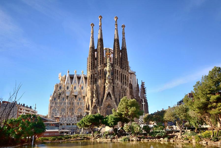
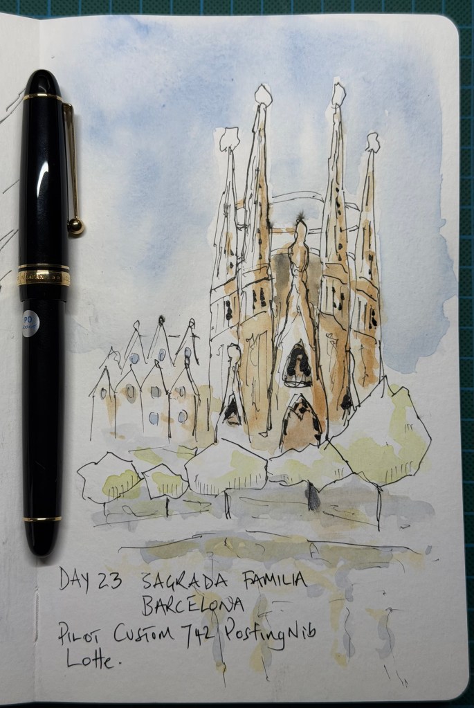
Today’s challenge is about simplifying something that really doesn’t want to be simplified. The Sagrada Família is covered in extraordinary detail, but rather than trying to reproduce it all, I concentrate on the overall shapes of the towers and use broken lines and small dark marks to suggest the complexity. I use my Pilot Custom 742 with Posting nib, turning the nib over occasionally to produce the heavier black marks. I am beginning to enjoy the contrast between the very fine normal line and the much bolder marks produced this way. I also make a deliberate departure from the reference photograph. The pond in front of the basilica is distinctly brown, but I decide that painting a large brown area across the foreground will do the sketch no favours, so I keep the water very understated instead. Perhaps the most useful lesson today is that the reference photograph is there to be interpreted rather than copied.
The Verdict – A substantial recovery from Day 22. The building is immediately recognisable without being over-described, and the restrained colour works particularly well. The loose group of buildings on the left shows how little information is actually needed to suggest architecture. Most importantly, I am beginning to make decisions based on what the sketch needs rather than simply following what appears in the photograph. Score 8.4/10
I like art materials. I have accumulated quite a lot over the last few years. I used to work away from home for extended periods and always found time to check out Cass Art and Jackson’s before heading home. I would walk through the door and my wife’s usual greeting was Christmas has come early, again … Surely, the next time I was home I would start sketching and painting. This never happened, buying them and actually using them were mutually exclusive. Then I retired and had no excuse. At the start of 2026 I went sketching on a weekend course in Grantchester and things took a turn. A few weeks later I found myself writing the following confession to the course group:
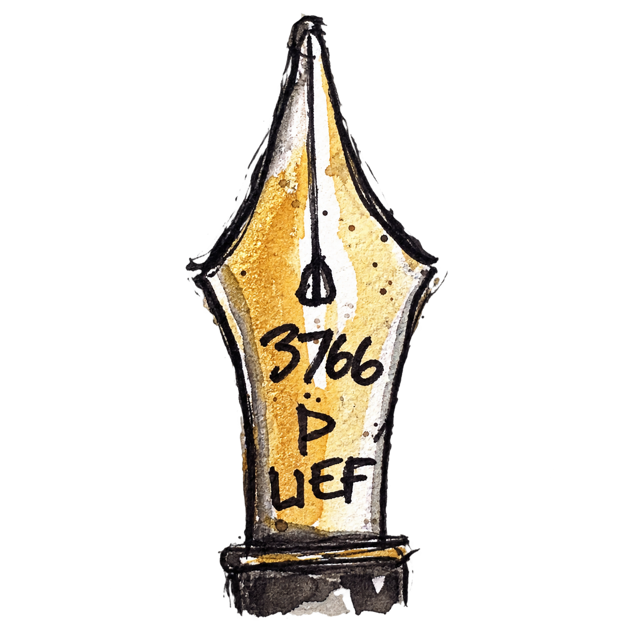
My name is David and I am a penaholic. It started four weeks ago in a church hall, of all places, in a sleepy Cambridgeshire village, where I met like-minded people; good and honest people. Or so I thought. I should have known better. The villagewas notorious in the 1960s for having a murder every week for eight weeks every year [geddit? Grantchester – see TV series]. I digress. Some of the people — and they know who they are — talked about pens. Pen collections. Pen shows. Capless pens. And not only about fine nibs, but ultra extra fine nibs. At that point they might as well have been handing out crack cocaine. One bloke, the ringleader obviously, spoke about Posting nibs and Music nibs, and casually mentioned where to get them. That was it. I was gone. Now here I am. Five days clean. It’s been hard. I tell myself I’ll be fine. My only advice? Stay away from these people… at least until June.
Things have not improved, just ask Cult Pens, my fountain pen retailer of choice. If I was a gambler the betting shop would not allow me to bet anymore given the money I have spent. Fortunately, for Cult Pens they have no such moral responsibility.
I did indeed buy those UEF and Music nib pens along with several more since. I intend to write about and show these pens and anything else in the way of paper and ink that the Loose Nib fancies. They will be far from technical reviews and are unlikely to discuss finials, tines and barrels and will be more about how they look and feel to write and sketch with. There are plenty of YouTubers who discuss the ins and outs of pens and do this very well too.
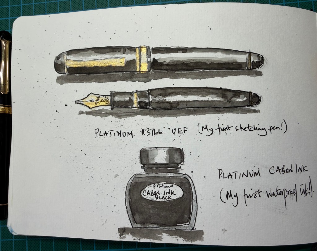
The Platinum Century 3776 with Ultra Extra Fine Nib and probably most peoples favourite water proof ink, Platinum Carbon Black.
This is a lovely pen with a lovely weight and balance. It is super fine; fine, generally, being the choice of most urban sketches which is also the size I prefer for general fountain pen writing – I am not a fan of bolder nibs. The nib is so fine it can almost tear into some cheaper paper and clog the nib up. But on 165gsm plus paper it moves really well with some feedback which I like to feel as the nib moves across the page. As I mentioned the Platinum was my first sketching pen. My first pen after leaving school was a Montblanc Classique, purchased when I formed my own one-man company in 2008, with the intent of signing big money contracts. This pen had a medium size nib, not that I was aware in 2008 that pens came with varying size nibs. My Montblanc was what they* call a wet writer, that is, it dumped a river of ink when the nib touched the paper and the line is a lot bolder in width than I like to write with, but who cares it was a Montblanc**. Needless to say I didn’t sign any contracts with it, let alone any big money ones, and I, sadly, didn’t really enjoy writing with it given its bolder, smoother (as opposed to a nib with feedback) and wetter line. There is also a difference in sizes between western and eastern manufacturers. Japanese nibs generally tend to write finer than their European counterparts, although there is no universal standard and individual manufacturers vary. As a rough rule of thumb, a Japanese Medium, for example, can often produce a line closer to what a European manufacturer might call Fine. So my Lamys and Kawecos, both German brands, were both purchased in the smallest nib sizes I could get, which at the time of purchase I thought they would not be far off the Platinum UEF, but they were and a lot off. I have been able to resolve my wider nib issues by purchasing standalone nibs and changing the bolder nibs with finer nib sizes. Both these companies make spare nibs for interchanging with pens, at a much cheaper price than buying a new pen with a different size nib. They are so simple to change that even I could do it. Well done Kaweco and Lamy!
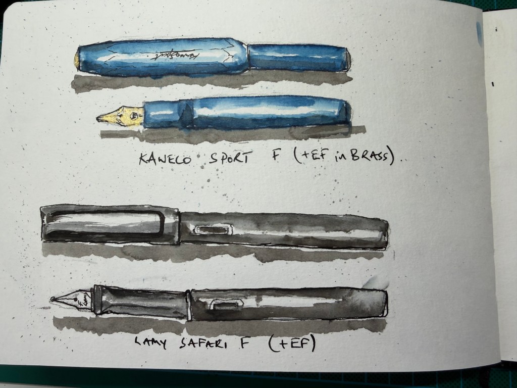
The Kaweco’s are very small in length and the plastic ones super lightweight. I love my brass version which has a great weight, as you would expect. The Lamy Safari’s are used by most Urban Sketchers or were at the start of many sketcher’s fountain pen journey. It is almost like a rites of passage for any Urban Sketcher. They are relatively cheap so in someways it is a no brainer to get one.
They are excellent pens and if you use the converters you can fill them with waterproof ink if your sketch is going to use any watercolour. Most of the Kaweco and Lamy cartridges I have used tend to be water-soluble.
As good as these pens are, you may have gathered I don’t tend to use these pens much now and being the founder/ CEO/ FD of The Loose Nib, social hierarchy dictates I use a more sophisticated pen(s) to reflect my social standing. Given my references to the word nib in the text above, you can probably understand my reasoning in calling this website the Loose Nib!
Onto the next pen …
*’They’ being pen officiandos of the fountain pen world. ** With all my recent purchases I have stayed clear of Montblanc pens, mainly because I hear that even their extra fine nibs are still pretty bold. Nevertheless if a MB 146 or 149 crossed my path at a fair price I would probably bite the hand that offered it.
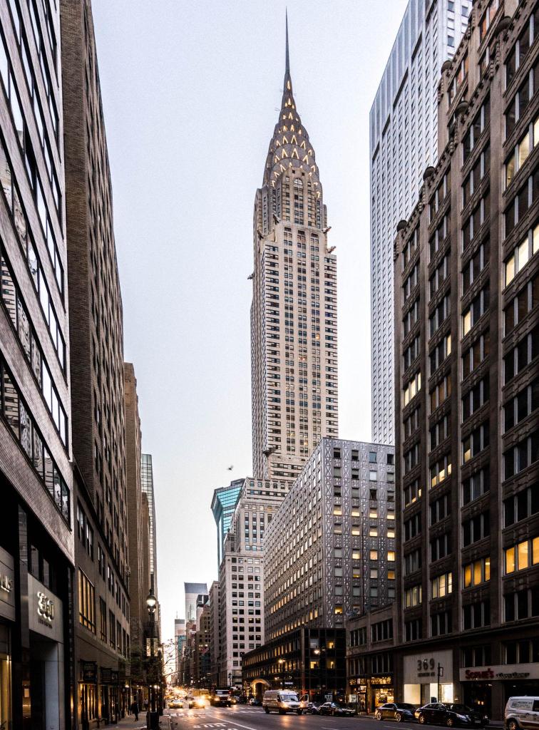
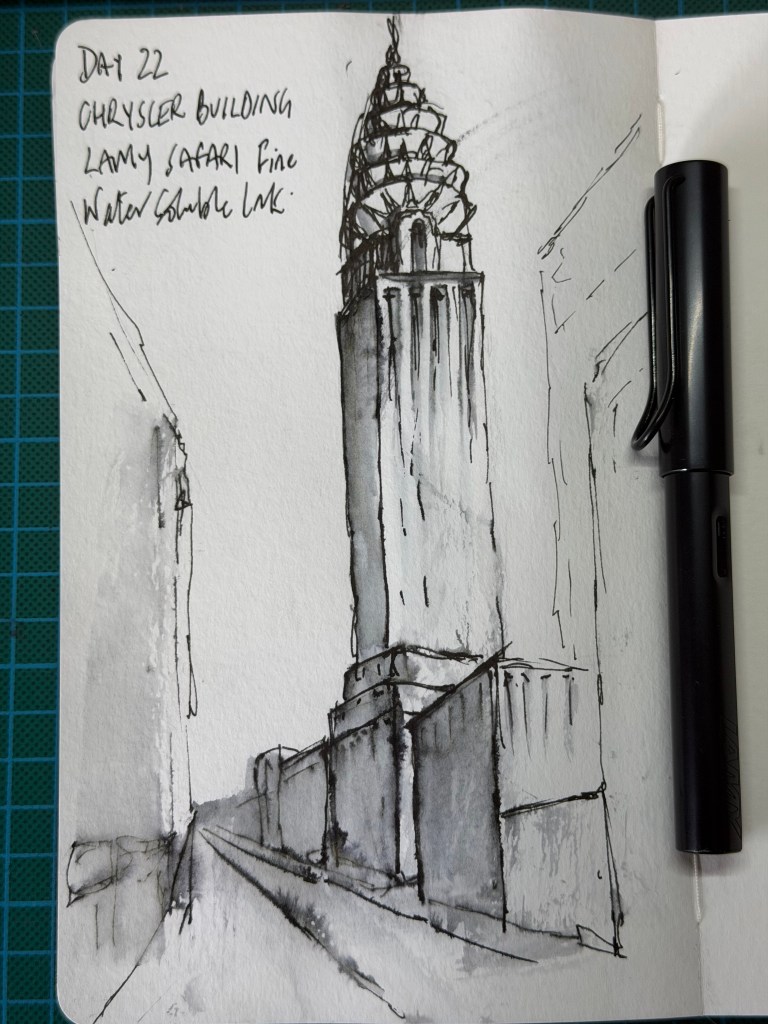
The Challenge Today’s challenge is about looking up. The Chrysler Building provides the focal point, but rather than trying to reproduce every window and architectural detail, the aim is to use perspective, selective line and tone to create a sense of height. I use a Lamy Safari with a fine nib and black waterproof ink, adding water with a brush to pull tone from some of the lines.
What I Learned This is not a sketch I particularly like, but perhaps that is part of the challenge. The crown becomes too busy and loses some of the elegant Art Deco structure of the building, while the main tower could feel more solid. There are, however, things here that I probably would not have done three weeks ago. Large areas are left almost untouched, the surrounding buildings are suggested rather than described, and some edges are deliberately allowed to disappear. The dark foreground shapes and converging street do much of the work in creating depth and directing the eye upwards. It may not feel like progress when I look at the finished drawing, but perhaps learning what to leave out is progress in itself.
Verdict – Not one of the strongest finished sketches of the challenge. The crown is overworked and the tower lacks some of the solidity and elegance of the reference. But there is considerably more restraint here than there would have been at the beginning of the challenge. The disappearing edges, largely empty surfaces and simplified foreground show increasing confidence in suggestion rather than description. The lesson is better than the drawing — and sometimes that is enough. Score — 6.8/10
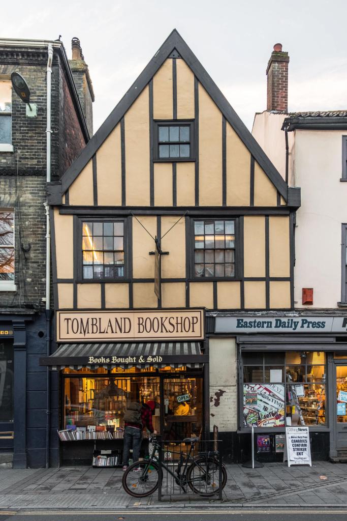
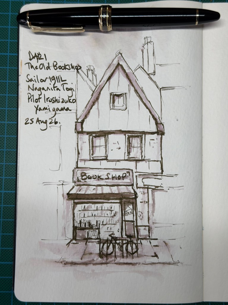
The Challenge Today’s challenge is an old bookshop, with the emphasis firmly on simplification and restraint. The instruction is to establish the main structure of the building without describing every architectural detail, using changes in line weight to create depth and allowing unfinished areas to suggest the surrounding street. And, specifically for me, not to draw every brick.
The Sketch I decide to keep this one monochrome and use my Sailor 1911L Naginata Togi filled with Pilot Iroshizuku Yama-guri brown ink. The Naginata allows me to vary the line considerably by changing the angle of the pen, with broader strokes used for the main structure and finer marks for smaller details. I also take some of the same ink with a brush to create darker areas and patches of tone (a trick I learned at @sketchloose), giving the drawing depth without introducing watercolour. I concentrate most of the detail around the shopfront, reducing the books to simple marks and allowing the neighbouring buildings, pavement and parts of the façade to remain unfinished.
The Verdict – simplification works particularly well around the edges of the drawing, where very little information is needed for the neighbouring buildings to be understood. The strong roof lines establish the building immediately, while the loose collection of marks making up the bicycle reads surprisingly clearly. The lower half of the sketch feels particularly relaxed. The upper façade is slightly more controlled and symmetrical, with the three windows becoming a little too carefully described compared with the looser shopfront below. A few stronger dark accents around the awning and doorway might also have anchored the bottom of the building more firmly. Most importantly, however, the drawing demonstrates increasing confidence in leaving areas unresolved and allowing the viewer to complete them.
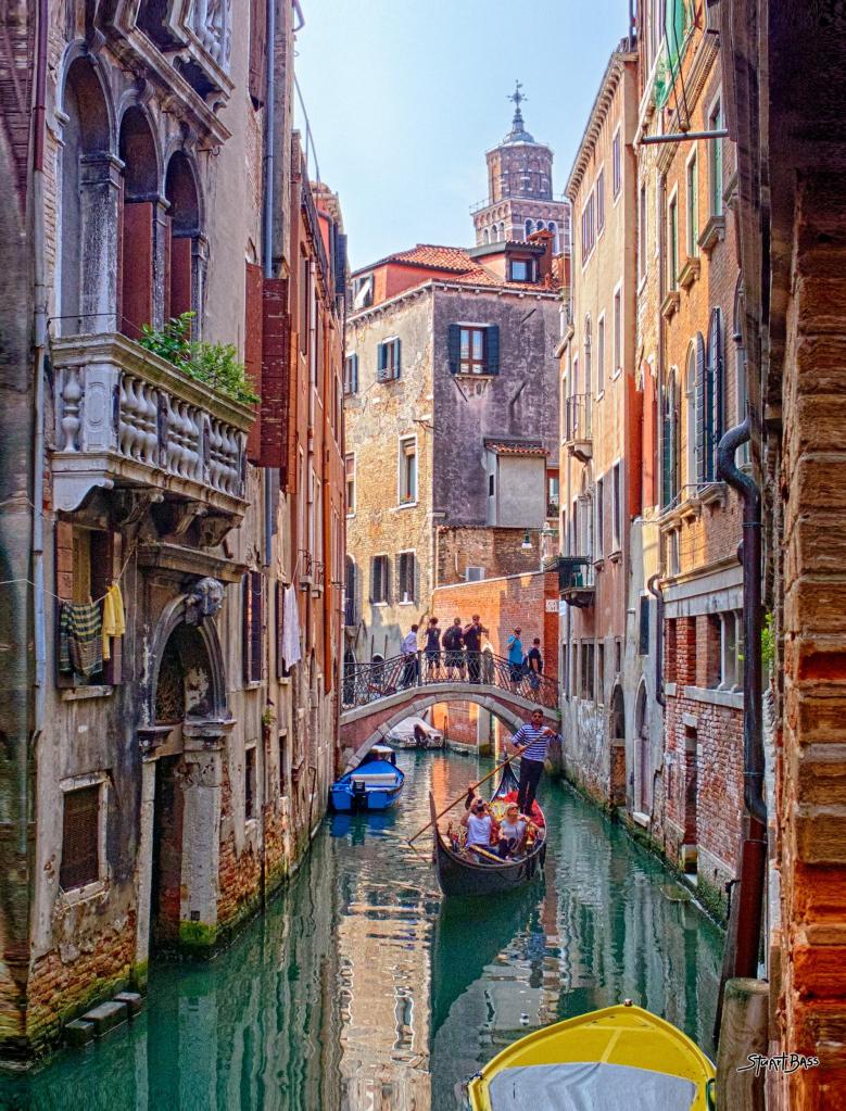
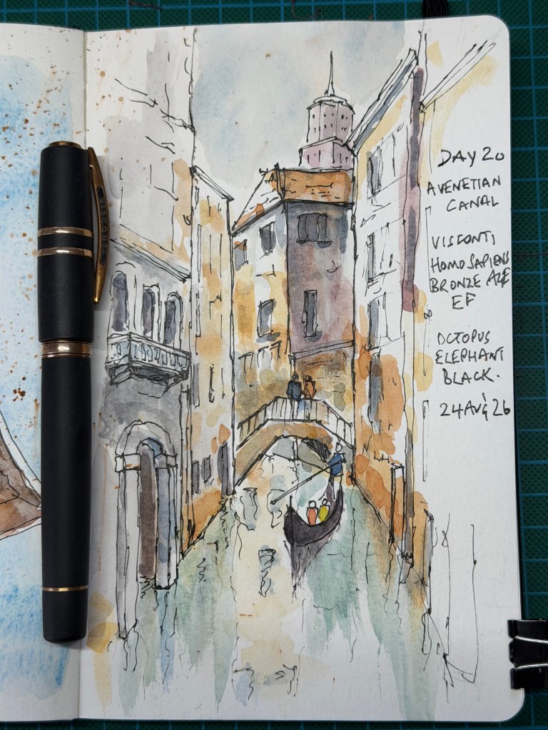
The Challenge Today’s challenge is a Venetian canal, with the emphasis on simplifying the architecture and, once again, tackling reflections. The instruction is to avoid drawing reflected buildings and instead treat the water as a collection of broken vertical marks, interrupted lines and patches of tone, while leaving plenty of untouched paper.
The Sketch When in Italy, use an Italian pen. Today I bring out one of the bigger guns from my arsenal, a Visconti Homo Sapiens Bronze Age with an EF nib, filled with Octopus Write & Draw Elephant Black. I establish the canal first before working upwards through the bridge and buildings, deliberately leaving parts of the architecture unfinished rather than describing every window and detail. For the water I try to follow the instruction literally, using loose broken marks and pale washes rather than attempting to draw recognisable reflections. The gondola provides the focal point and a little splash of colour.
The Verdict – The reflections work well because they remain broken and understated, with enough untouched paper for the water to breathe. The unfinished upper section of the building on the left is particularly successful: very little is actually drawn, yet the eye completes the structure. The central tower and darker building provide useful focus, while the bridge is described without becoming overworked. The main criticism is the gondolier’s pole, which creates a rather assertive diagonal across the canal and would have been better lighter or partially broken. There are also a few areas around the waterline where the marks become slightly fussy. Overall, however, the sketch feels lively rather than laboured and shows increasing confidence in leaving things out.