• Today I sketch the Temple of Portunus in Rome, an Ionic temple with freestanding porch columns and columns attached to its side walls. The challenge is to make that distinction clear while keeping the drawing loose. I use my Platinum Century 3776 UEF with Carbon Black ink and washes of ochre and ultramarine blue.
    My preliminary sketch captures the building’s presence, but separate washes fragment the side wall, while the doorway, masonry and column bases compete for attention. After the critique, I draw it again, concentrating on treating the side wall as one connected plane and reducing detail around the entrance. These changes help: the attached columns belong more clearly to the wall, the porch feels open, and the doorway recedes behind the pale columns. Unfortunately, I then start overcorrecting the steps and pediment—and recognise what I am doing while continuing to do it.
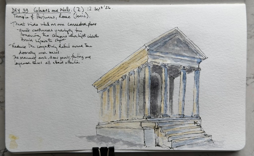
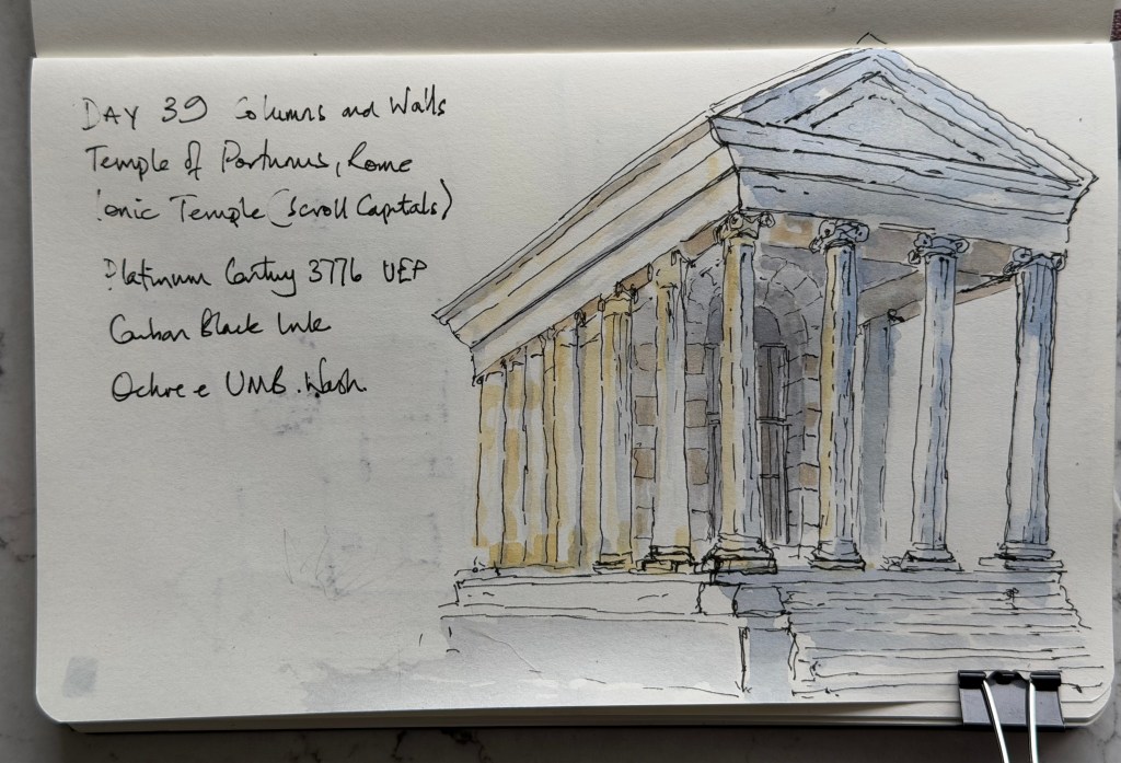
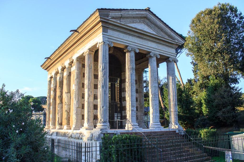
    The second version receives 7.5/10, with clearer depth and quieter detail, although the heavily worked pediment and inconsistent step angles remain weaknesses. It feels like one step forward and two back, but the improvements are there. The next discipline is to work on the agreed changes and leave other imperfections for another sketch. Understand → select → suggest—and resist repairing the entire temple.
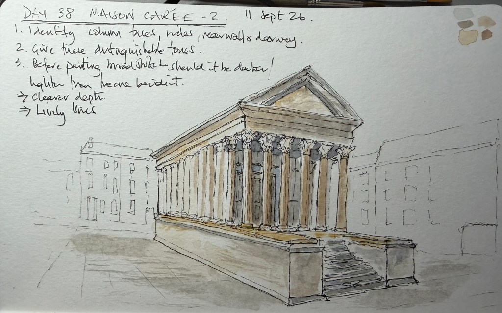
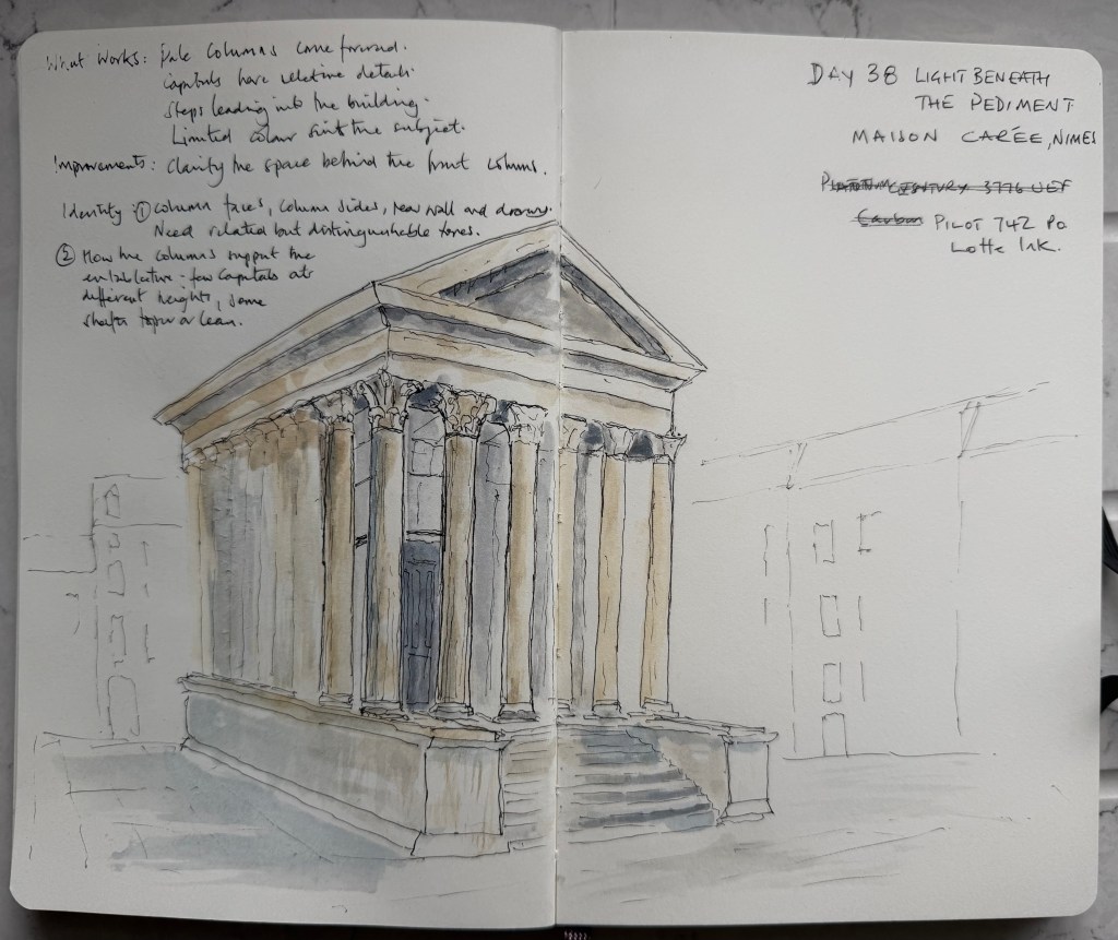
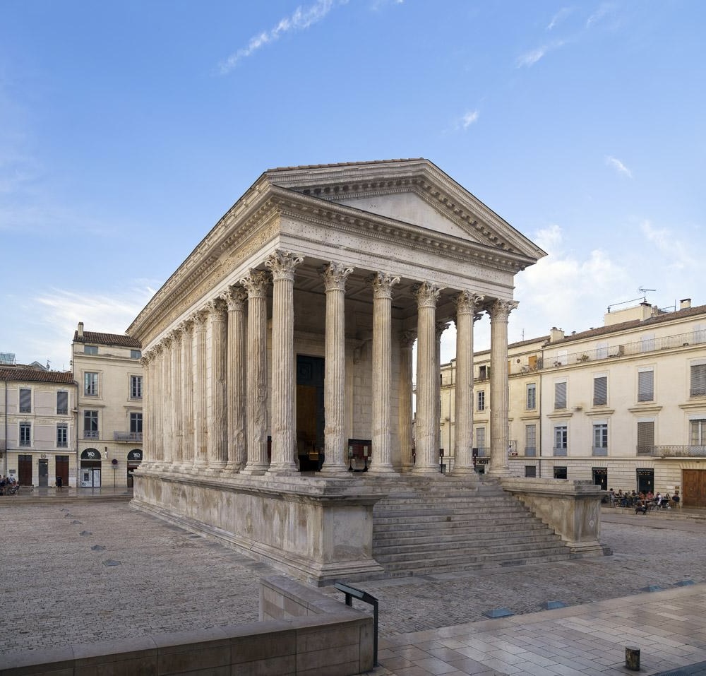
  • Today I sketch the Maison Carrée in Nîmes, concentrating on its pale columns and the shaded space beneath the portico.
    My first attempt captures the building’s height and presence, with selective detail in the Corinthian capitals and quiet outlines of the surrounding buildings.

    The main difficulty is separating the column faces, their shaded sides, the rear wall and the doorway. A little additional pen work helps: door panels and a few masonry joints give meaning to areas that initially read as rather ambiguous grey washes. After the critique, I draw a second version, this time pausing before painting to identify what each shape represents. The warm columns stand more clearly against the cooler rear wall, and the building feels more solid. The entrance becomes busier than I intend, but I am pleased with this drawing and consider it one of my strongest so far.
    The first attempt receives 7/10 and the second 7.5/10.
    Our discussion also helps clarify what I want from looseness: recognisable, believable architecture with lively lines and selective washes. Small irregularities can belong in that approach; clarity matters more than making every edge mechanically precise. I hope to continue with an instinctive first sketch followed, when time allows, by a study addressing one or two points from the critique. Knowing what needs improving is one thing; remembering to pause before placing another brushful of grey is another.

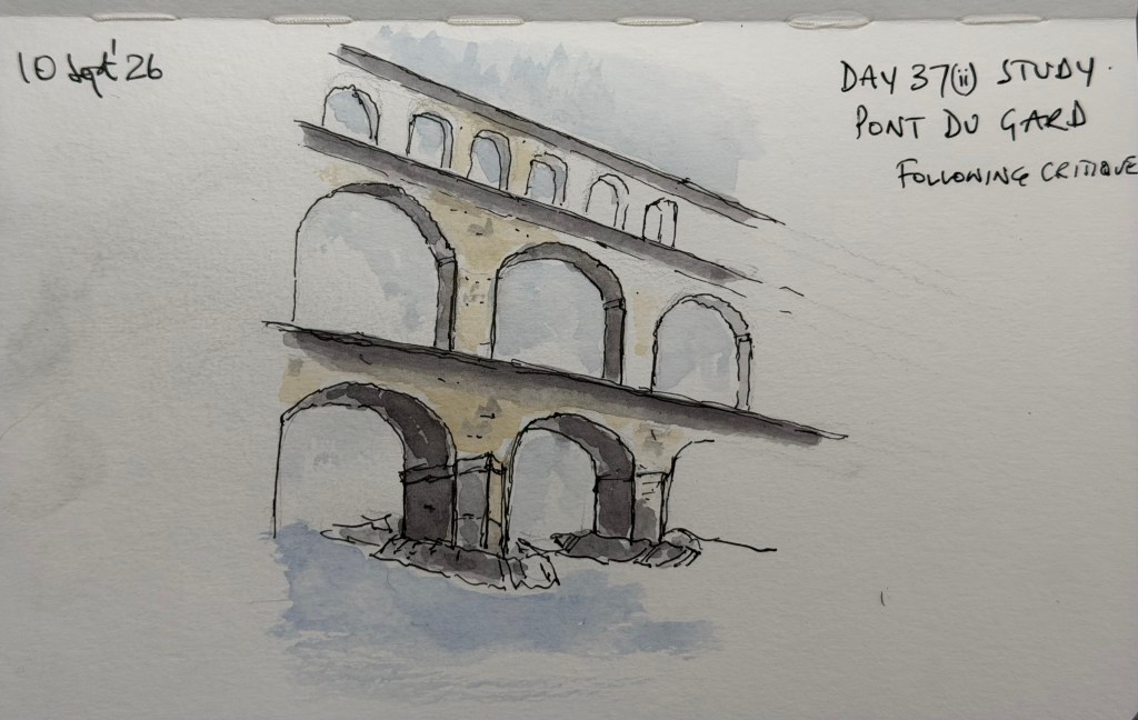
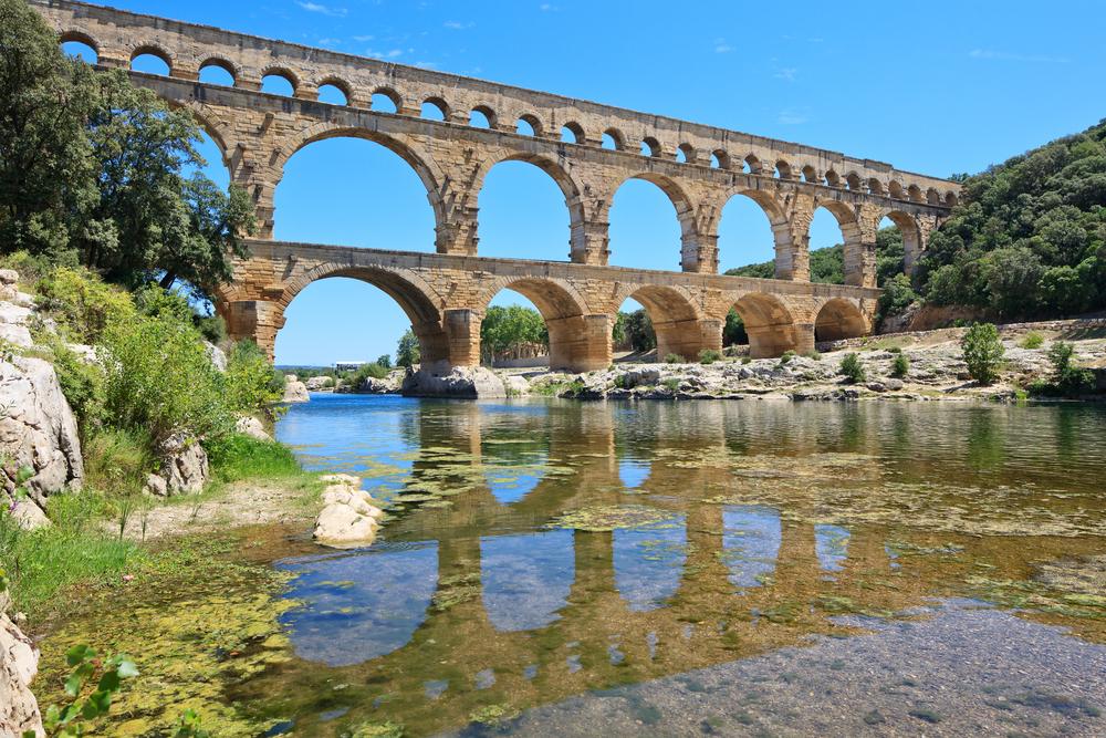
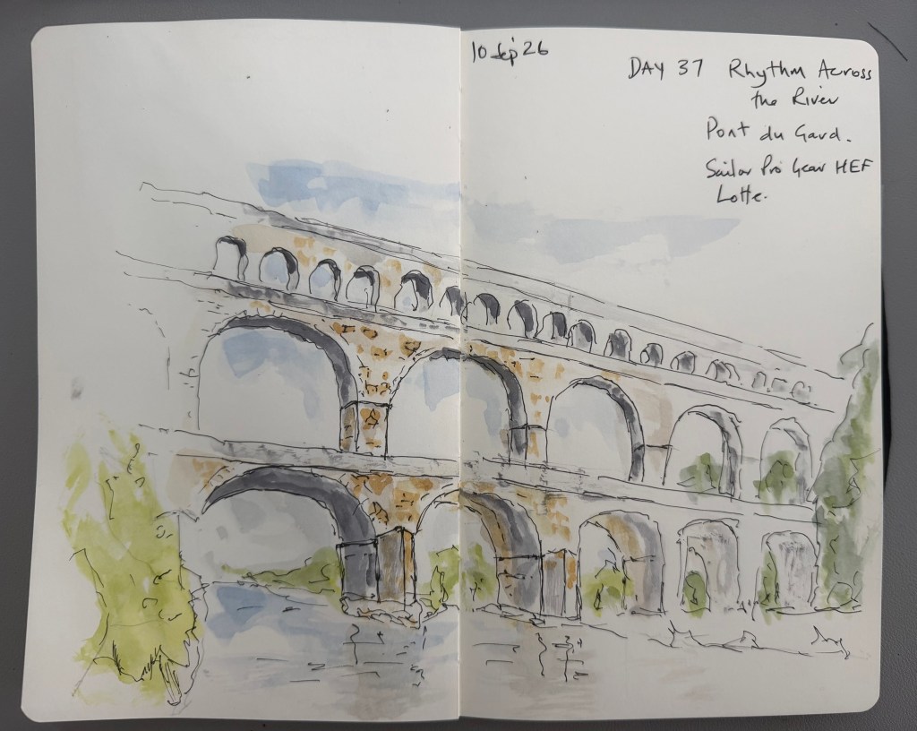
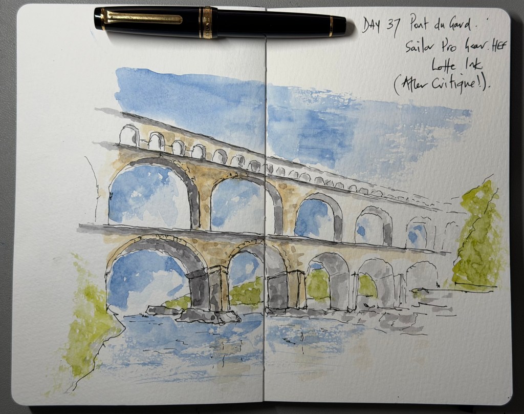
  • Today’s challenge takes me to the Pont du Gard, exploring the rhythm of its arches and how much detail is needed to describe the structure. I enjoy this one enough to keep going after the first drawing. The initial critique highlights uneven connections between the tiers, scattered stone texture and some rather angular reflections, so I make a smaller study to concentrate on the supports and use broader, connected washes. That helps, although a shadow beneath the ledge becomes so assertive that it starts looking like a ski ramp. I initially read it as a change of stone; understanding what I am actually looking at makes a difference. The suggestion is one more small study of a single arch, but I cannot help myself and draw the whole scene again. Using my Sailor Pro Gear HEF with Lotte ink and a limited watercolour palette, I bring more warmth into the stone, simplify the river and let the distant arches become quieter.

    The final version receives 7.5/10 from the Reasonable Tyrant, compared with 7/10 for the first.
    There is still work to do on the supports and the hard-edged blue patches within the openings, but I can see the benefit of acting on the critique while the drawing is fresh in my mind. I tend to finish hoping to hear that it is fantastic, then get reminded of everything I can improve. Today, though, I am pleased with both the drawing and the process. Understand → Select → Suggest—and perhaps pause occasionally before drawing another entire aqueduct.

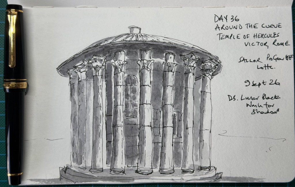
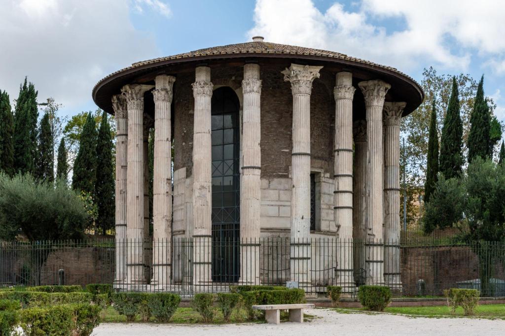
  • Day 36 – Around the Curve. Today’s subject is the Temple of Hercules Victor in Rome, and the challenge is to make its circular form read through overlapping columns and shadow. I use my Sailor Pro Gear HEF with Lotte ink and Daniel Smith Lunar Black watercolour for the shadows. The light in the reference photograph is quite flat, so I invent a stronger direction to bring the columns forward.

    I am less sure about this one. It feels loose enough, but I suspect there is too much detail, and some of the capitals look a little cartoony. I do like the black watercolour and the highlights that separate the columns from the darker spaces behind them. I also run out of page, leaving the base rather squeezed against the bottom edge.

    The critique recognises the lively linework and effective contrast between the pale columns and grey recesses, but the main objective is only partly achieved. The roof and platform suggest the curve, while the fairly similar gaps and equally clear outlines across the middle make the columns read more like a flat screen. Almost every capital, joint and base receives equal attention. Giving a few front columns the detail and allowing the others to emerge from the wash would create more depth and a clearer focus. The lesson is to trust the wash to describe more, so the pen can say less. Understand → select → suggest.

    Score: 6/10.

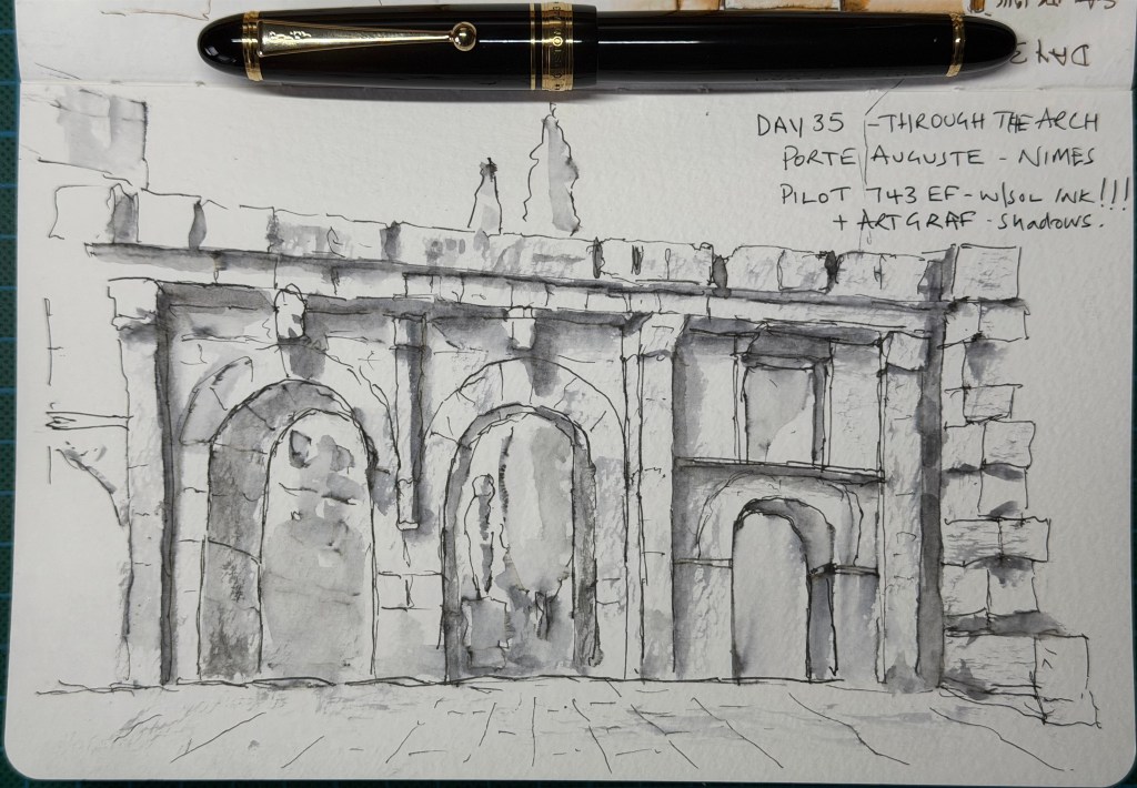
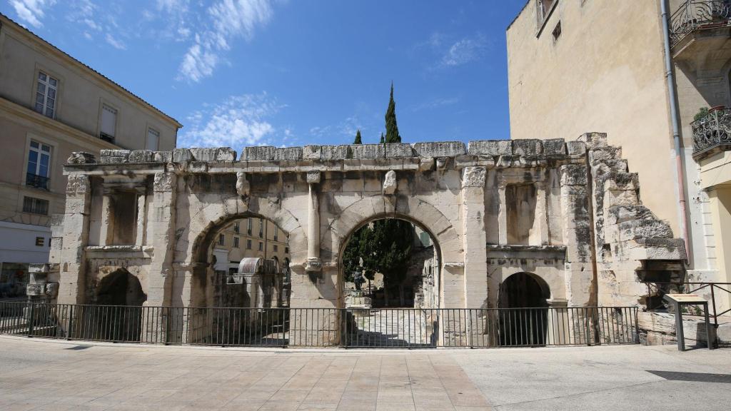
  • Day 35 – Through the Arch. Today’s subject is the Porte Auguste in Nîmes, a Roman gateway whose large central passages accommodated vehicles while smaller side openings served pedestrians.

    The objective is to understand how the wedge-shaped stones carry the arch around an opening and to suggest the depth of the passage through the masonry. Although the suggestion is to concentrate on one arch, I choose a wider view, as I hope to record places I visit, and I enjoy bringing a substantial part of a building together on the page. I use my Pilot Custom 743 EF with water-soluble ink, ArtGraf graphite for the shadows and a final pass with my Pilot Posting nib filled with Platinum Carbon Black.

    The soluble ink produces soft washes, while the final waterproof lines re-establish selected edges. The rhythm of the large and small arches gives the composition weight, the long shadows beneath the projecting stonework connect the façade, and lightly suggested paving grounds the building. The smaller right-hand arch conveys the depth particularly well; in the larger openings, the background tones compete with the surrounding masonry, and the statue through the central arch is more prominent than intended. Quieter background shapes would help distinguish the passages without simply making them darker. Nevertheless, I am very pleased with this drawing and regard it as one of my best so far. It also suggests a worthwhile direction for future pages: smaller studies of architectural details culminating in a view of the whole structure.

    Score: 7/10.

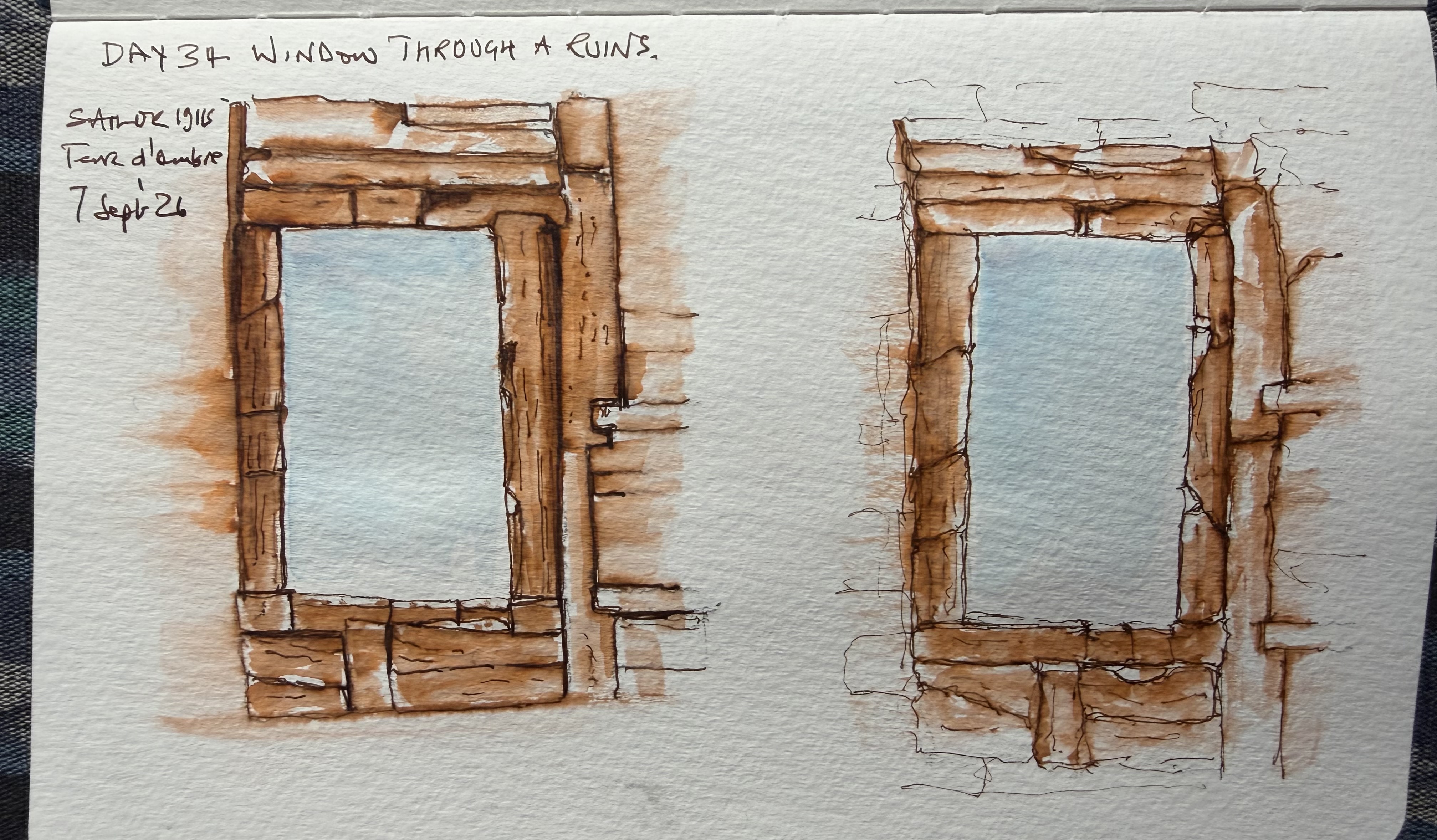
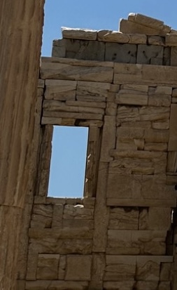
  • Day 34 – A Window Through the Ruins. Today I return to my own photograph of the Erechtheion on the Acropolis in Athens, concentrating on a small window opening and the stone immediately around it. The objective is to suggest the weight and thickness of the wall without describing every block.

    Using my Sailor 1911 and Terre d’Ombre ink, I draw the left-hand study first. It feels solid, but the strongly outlined stonework is more enclosed and detailed than I intend. In the right-hand study I make a conscious effort to leave more unresolved, allowing broken edges and softer washes to suggest the surrounding wall. I add faint lines afterwards to indicate continuing masonry, followed by blue in the opening because I feel it needs that separation from the warm stone. The projecting blocks and narrow shadows help establish that the immediate window surround sits back from parts of the wall. The right-hand study achieves a better balance of structure and suggestion, although a few peripheral marks contribute less than the edges already left incomplete.

    A useful exercise in discovering that suggestion can come from where a line stops or a wash fades; it does not always require another mark.
    Scores: left-hand study 7/10; right-hand study 7.5/10.

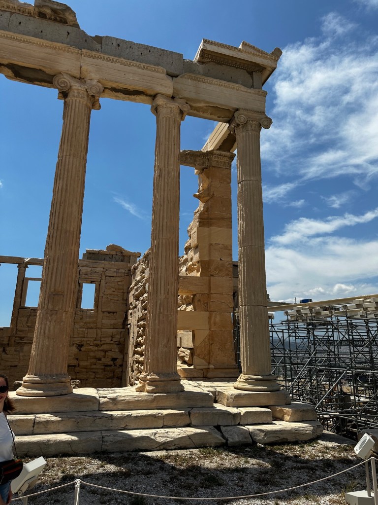
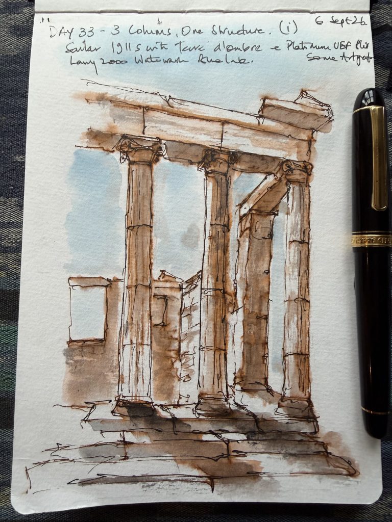
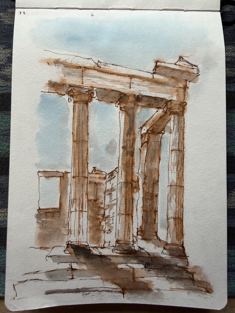
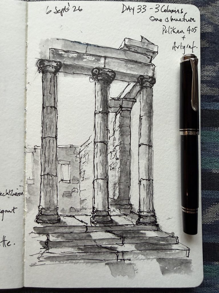
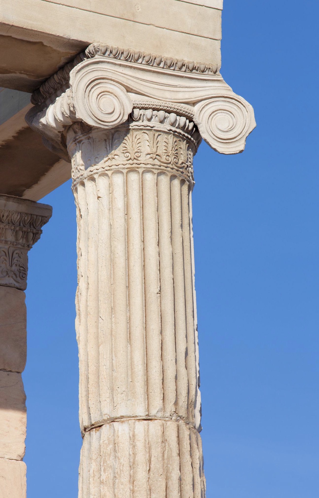
  • Day 33 – Three Columns, One Structure. Today I use my own photograph of the Erechtheion on the Acropolis in Athens, bringing yesterday’s Ionic capital study into the wider structure. The objective is to make three columns feel connected by the stonework they support, using selective fluting, simplified capitals and the spaces between the columns to describe their shape.
    I begin with a colour experiment, choosing my Sailor 1911 Standard Fine nib pen filled with Monsieur Herbin’s Terre d’Ombre ink for its warmth and resemblance to the local stone, with blue ink for the sky and ArtGraf graphite to deepen the shadows. The warmth works, but some of the overlapping brown and graphite becomes muddy, particularly around the middle capital and foreground. I then make a separate sketch with my Pelikan Souverän M405 and ArtGraf graphite. Here the column bases give me trouble: attempts to correct their alignment lead to stronger outlines, and the pen gradually takes over as I try to clarify the columns and volutes. A further pass with fine black linework on the colour version makes parts of the architecture clearer but sacrifices some of its softness. The colour study remains the stronger picture, with warm stone, pale blue gaps and disappearing edges giving it atmosphere; the graphite study reads clearly as a structure, although the dark column joints and crowded capitals interrupt its lightness.

    This is a difficult session involving materials, perspective and, trying to put things right, but each correction invites another line until the pen starts taking over. The lesson is to establish the positions of the bases and capitals before developing the details, test how the ink and graphite behave together, and recognise when a correction helps the whole drawing rather than simply restating an edge.
    Scores: graphite study 7/10; colour study 7.5/10, both before and after the added black linework, with a slight preference for the softer earlier version.

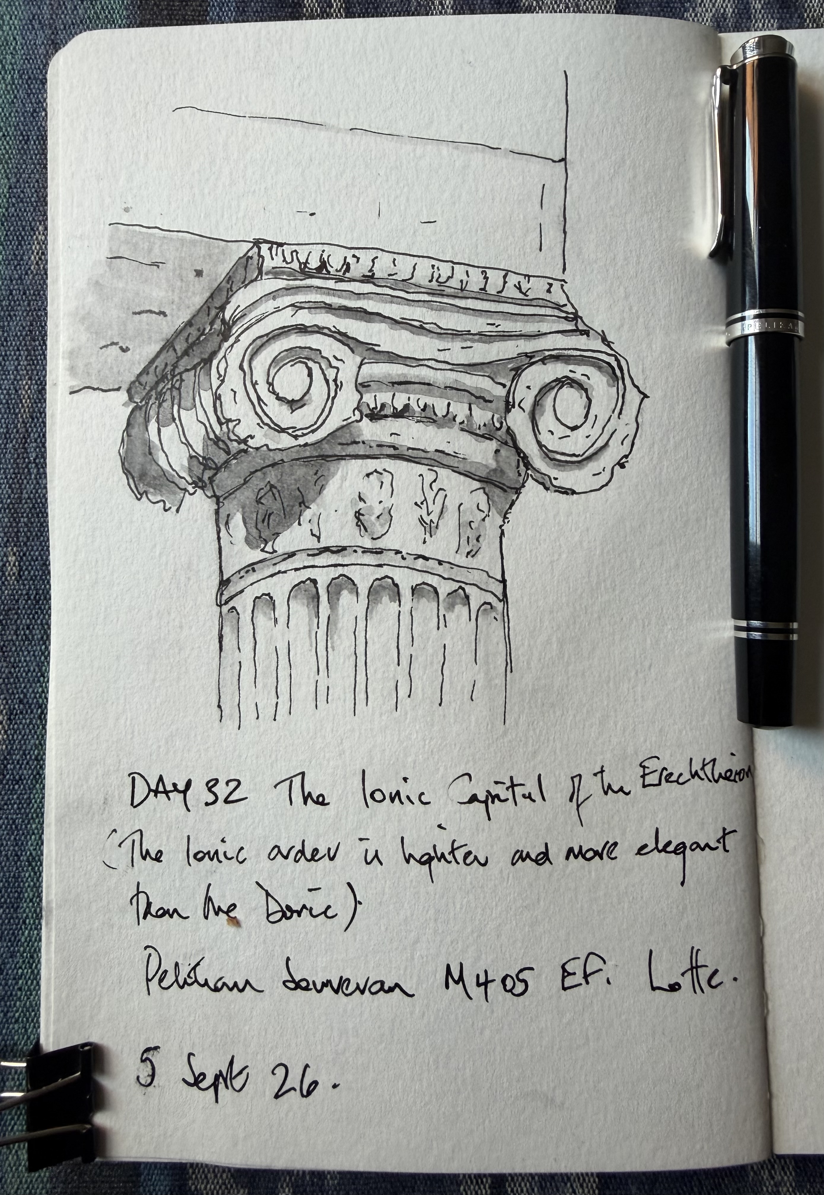
  • Day 32 – Ionic Capital

    Day 32 brings a change of scale, moving away from the whole temple to study an Ionic capital from the Erechtheion on the Acropolis in Athens. The Ionic order is lighter and more decorative than the sturdy Doric order explored yesterday, and is most easily recognised by its paired spiral volutes. The objective is to understand how the capital is constructed—the tapering column, broad horizontal members and two dominant spirals—before deciding which of its many carved details actually need to be drawn. I use my Pelikan Souverän M405 for the linework and an ArtGraf water-soluble graphite stick for the shadows, combining the pen’s searching lines with softer areas of tone to give the capital depth.


    Verdict – The volutes are particularly successful: the repeated searching lines give them life, while the darker centres and shadows beneath the projecting ledges create convincing depth without making the capital feel diagrammatic. Much of the smaller decoration is suggested rather than fully described, although a few carefully placed accents would make some of those passages easier to understand, particularly on the less resolved left side. The upper horizontal member could also be a little more deliberate in its width and angle, but the proportions remain broadly convincing.
    Score: 7/10.

    This proves to be far more demanding than expected—rather like a particularly unpleasant mathematics examination—but I like it.

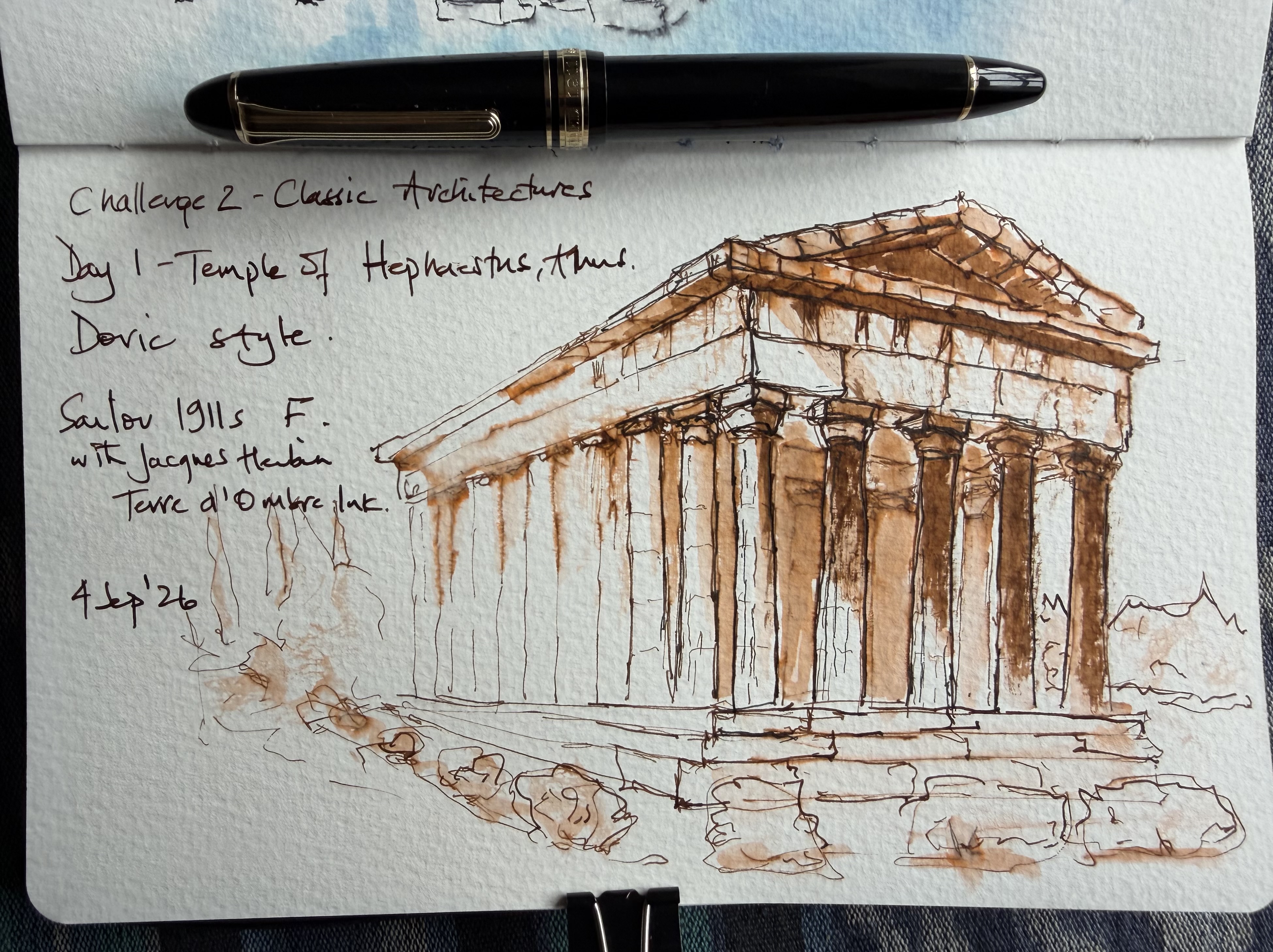
  • Welcome to Day 31 of my sketching journey—and Day 1 of my second 30-Day Challenge: Classical Architecture. Yes, classical architecture!

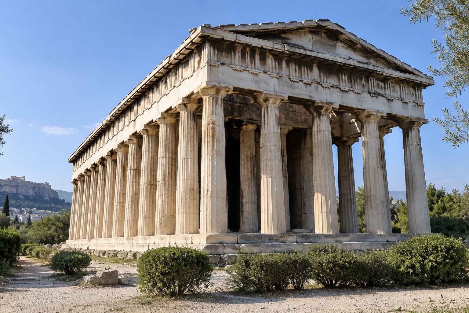
    Challenge 2 begins with a new 30-day journey through classical architecture. The aim is not to produce polished architectural illustrations or painstakingly record every stone, column and decorative detail, but to use what I understand about these buildings to decide what matters and what can merely be suggested: Understand → select → suggest. Day 1 takes me to Athens and the Temple of Hephaestus, one of the best-preserved ancient Greek temples and a particularly fine example of the Doric order. Doric architecture is the simplest and most robust of the three principal classical orders, with sturdy columns, plain capitals and a sense of strength and permanence. I drew this with a Sailor 1911 Standard fountain pen with a fine nib and Jacques Herbin Terre d’Ombre ink, adding a little black ink to strengthen parts of the foreground colonnade. The ambitious viewpoint gives the temple a strong sense of depth, while the disappearing columns along the left side are left incomplete and suggested rather than fully described. The front of the temple becomes rather congested, however, as the capitals, columns, shadows and repeated lines begin to compete with one another. The added black ink helps bring some of the columns forward, but the more useful lesson is to preserve a few light areas and establish the pattern of light and dark before adding further detail. A lively and recognisably personal beginning to the new challenge, with the next step being to carry some of the restraint seen along the side of the temple into the main focal area. Score: 7/10.

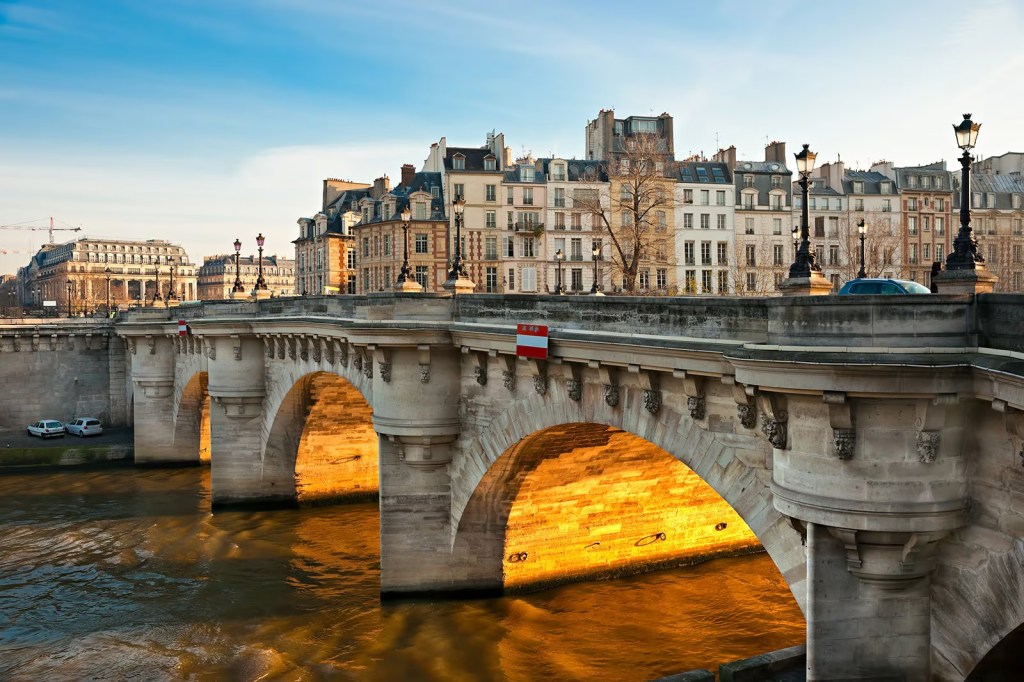
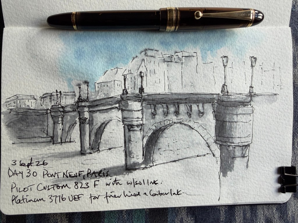
  • The final challenge was deliberately different: draw Pont Neuf without step-by-step instructions and make the sketch my own rather than reproduce the reference photograph.


    I used a Pilot Custom 823 F with waterproof ink for the main drawing and a Platinum 3776 UEF for some of the finer lines and stonework. I also included the buildings beyond the bridge, even though they weren’t necessary to the exercise, because I felt they gave the bridge some context. I am pleased with the result and, perhaps more importantly, it feels like my drawing.


    The repeated and broken lines around the arches are becoming part of the way I naturally sketch, although I can still see places where I went further with the pen than I needed to. The shadow on the far side of the river is too heavy; taking ink directly from a nib with a wet brush makes the strength difficult to judge, and this time I picked up too much. The lesson from the final day is not that I need to become looser, but that I need to become more selective: knowing which parts deserve another line and which have already said enough. 

    Score: 9/10.

    However, a new scoring system was introduced today and my sketch only achieved a 6.0/10! See the new scoring system here.