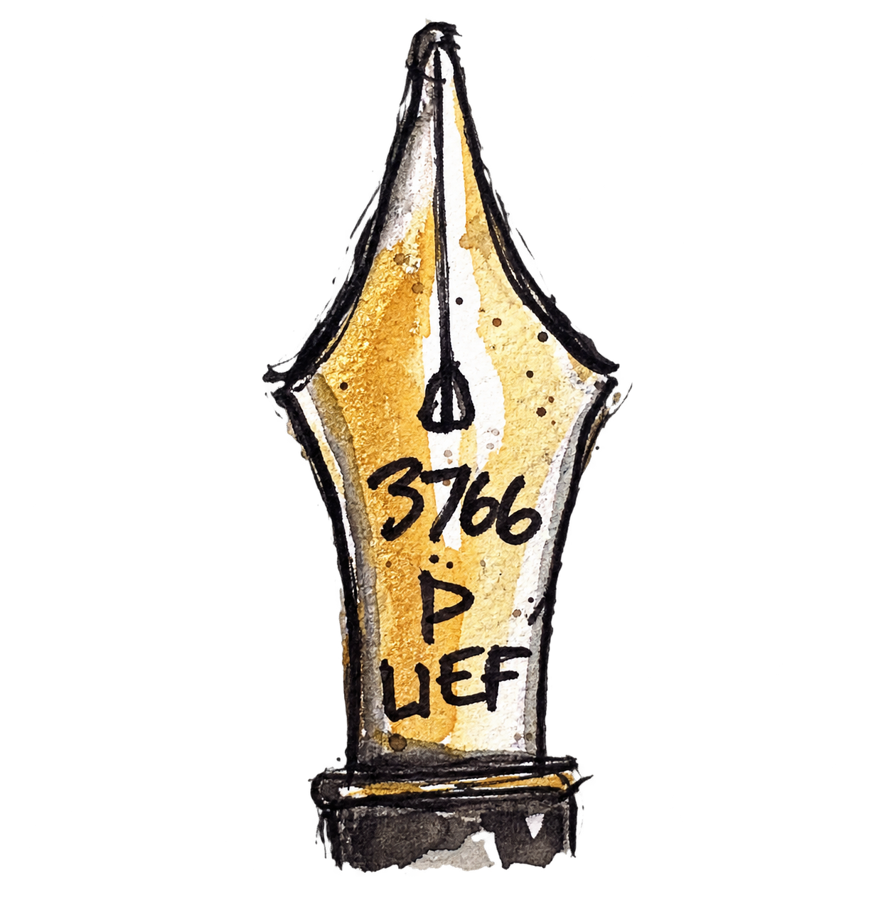
Day 33 – Three Columns, One Structure. Today I use my own photograph of the Erechtheion on the Acropolis in Athens, bringing yesterday’s Ionic capital study into the wider structure. The objective is to make three columns feel connected by the stonework they support, using selective fluting, simplified capitals and the spaces between the columns to describe their shape.
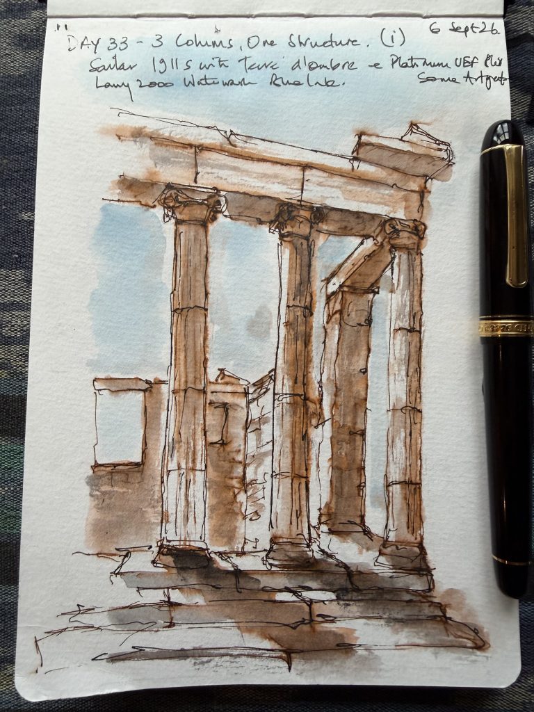
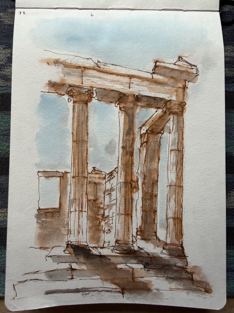
I begin with a colour experiment, choosing my Sailor 1911 Standard Fine nib pen filled with Monsieur Herbin’s Terre d’Ombre ink for its warmth and resemblance to the local stone, with blue ink for the sky and ArtGraf graphite to deepen the shadows. The warmth works, but some of the overlapping brown and graphite becomes muddy, particularly around the middle capital and foreground. I then make a separate sketch with my Pelikan Souverän M405 and ArtGraf graphite. Here the column bases give me trouble: attempts to correct their alignment lead to stronger outlines, and the pen gradually takes over as I try to clarify the columns and volutes. A further pass with fine black linework on the colour version makes parts of the architecture clearer but sacrifices some of its softness. The colour study remains the stronger picture, with warm stone, pale blue gaps and disappearing edges giving it atmosphere; the graphite study reads clearly as a structure, although the dark column joints and crowded capitals interrupt its lightness.
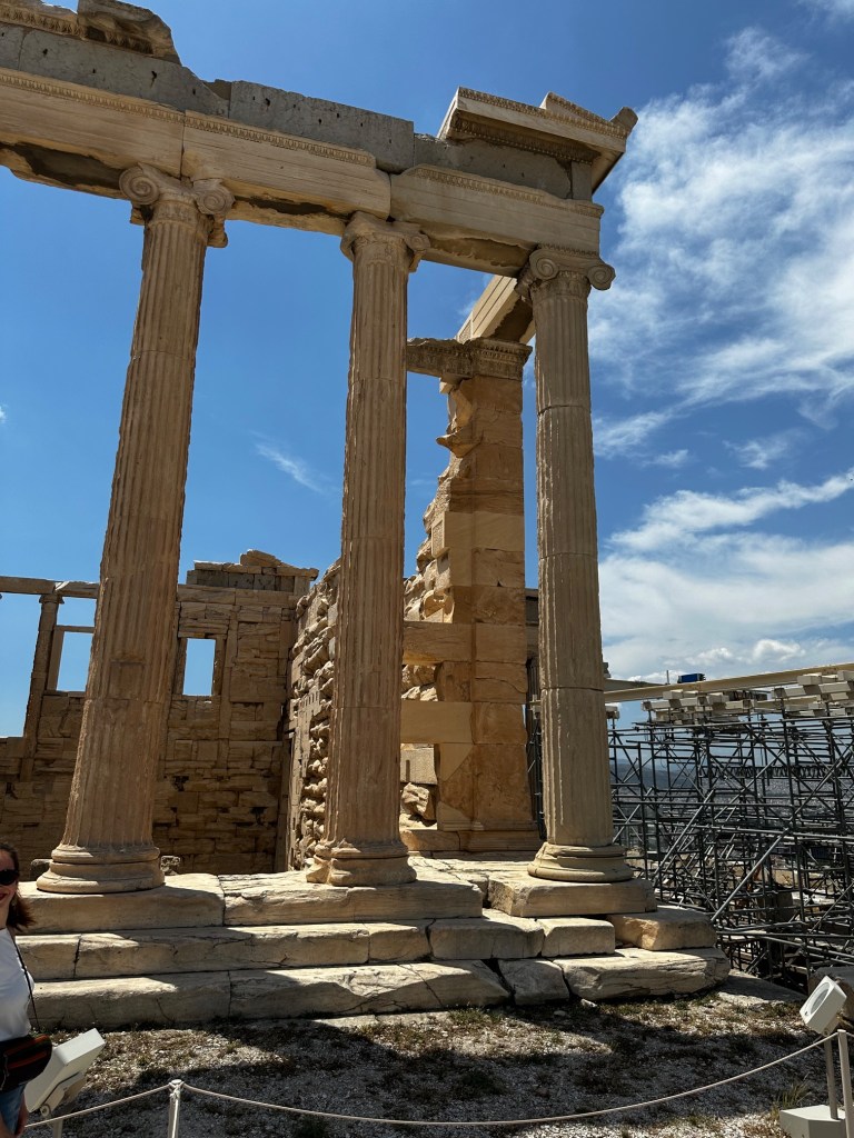
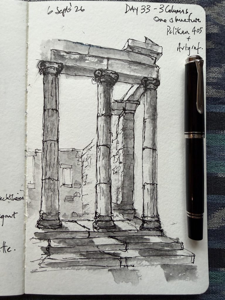
This is a difficult session involving materials, perspective and, trying to put things right, but each correction invites another line until the pen starts taking over. The lesson is to establish the positions of the bases and capitals before developing the details, test how the ink and graphite behave together, and recognise when a correction helps the whole drawing rather than simply restating an edge.
Scores: graphite study 7/10; colour study 7.5/10, both before and after the added black linework, with a slight preference for the softer earlier version.


Leave a Reply