Day 36 – Around the Curve. Today’s subject is the Temple of Hercules Victor in Rome, and the challenge is to make its circular form read through overlapping columns and shadow. I use my Sailor Pro Gear HEF with Lotte ink and Daniel Smith Lunar Black watercolour for the shadows. The light in the reference photograph is quite flat, so I invent a stronger direction to bring the columns forward.
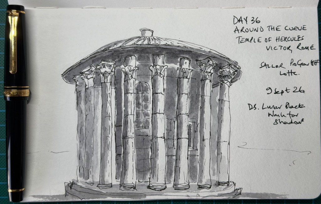
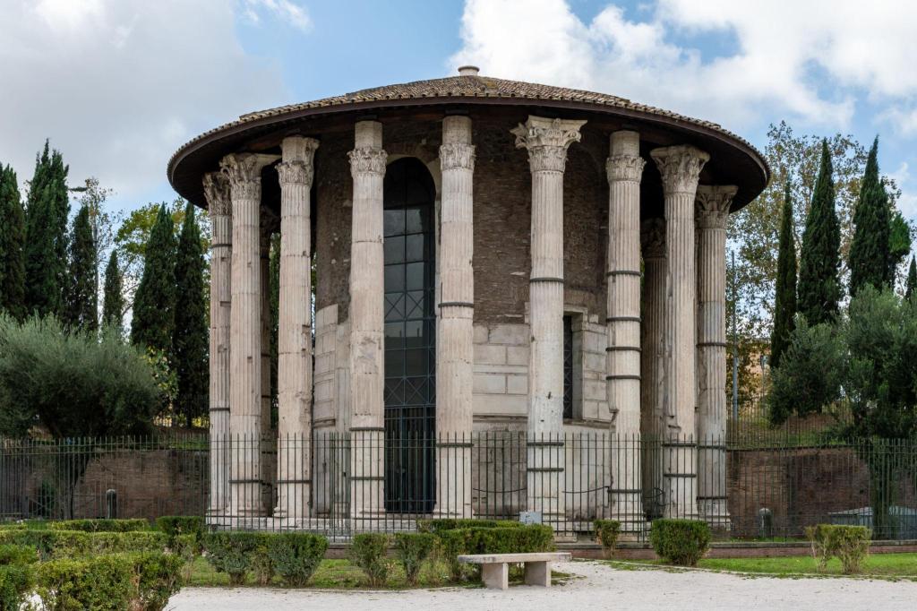
I am less sure about this one. It feels loose enough, but I suspect there is too much detail, and some of the capitals look a little cartoony. I do like the black watercolour and the highlights that separate the columns from the darker spaces behind them. I also run out of page, leaving the base rather squeezed against the bottom edge.
The critique recognises the lively linework and effective contrast between the pale columns and grey recesses, but the main objective is only partly achieved. The roof and platform suggest the curve, while the fairly similar gaps and equally clear outlines across the middle make the columns read more like a flat screen. Almost every capital, joint and base receives equal attention. Giving a few front columns the detail and allowing the others to emerge from the wash would create more depth and a clearer focus. The lesson is to trust the wash to describe more, so the pen can say less. Understand → select → suggest.
Score: 6/10.


Leave a Reply