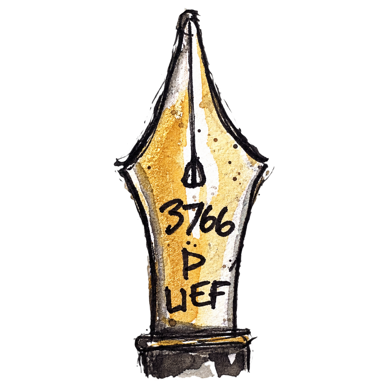
Today I’m given several photographs of Florence and a very short brief: draw Florence, not the decoration. I choose a view where the dome and Giotto’s Campanile are squeezed between the surrounding buildings and draw straight in with my Visconti Homo Sapiens Bronze Age EF and Lotte ink. Italian architecture apparently requires an Italian fountain pen designed in Florence.
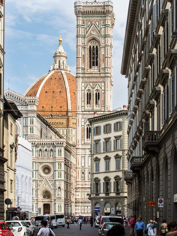
I easily resist colour this time and use only grey wash, concentrating on the dome, campanile and the scale of the cathedral against the much smaller buildings around it. There is an extraordinary amount of architectural decoration here, but most of it never makes it onto the page. Inevitably I still go a little too far in places. The top of the campanile becomes heavier than I intended and I start explaining rather too much around the lower cathedral and the building on the right. The interesting thing is that I know this before the critique arrives. Knowing when to stop and actually stopping, however, are apparently two different skills. A course or workshop can teach me what to look for, but only practice — followed by considerably more practice — is going to make those decisions instinctive.
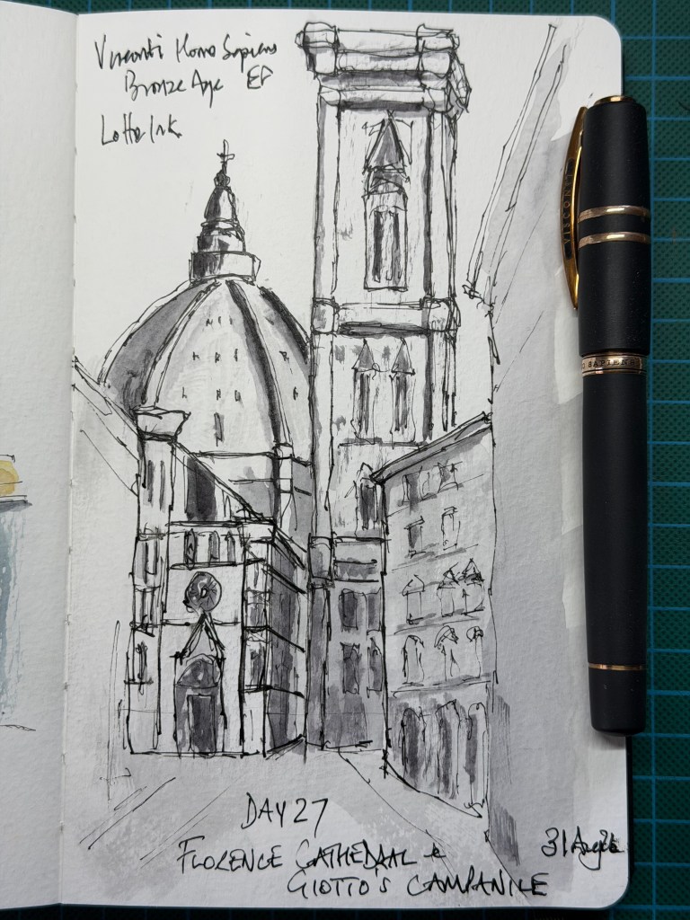
The Verdict – The composition makes the cathedral feel monumental without relying on its extraordinary decoration. The dome, campanile and surrounding buildings are enough to make the scene unmistakably Florence, while the loose grey washes, broken architectural lines and disappearing edges give the drawing atmosphere. The top of the campanile is slightly overworked and parts of the lower cathedral become congested, but these are increasingly errors of knowing when to stop rather than not knowing what to do. Most importantly, the drawing feels personal and was produced with very little guidance.
Score: 9.0/10


Leave a Reply