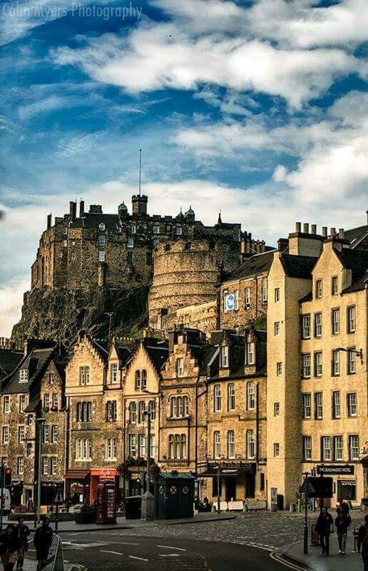
There are very few instructions today: I’m given a photograph of Edinburgh Castle and told simply to make it look like Edinburgh Castle as I now draw it. No suggested number of shapes, no instructions about where to put the darkest marks and, perhaps most dangerously, permission to leave out anything I don’t think the drawing needs.
I use my Pilot Custom 742 with Posting nib and Lotte ink, keeping the foreground buildings very lightly drawn and allowing the castle above them to carry most of the weight and tone. I’m pleased with the result, although the heavy diagonal marks in the rocks beneath the castle attract rather more attention than I intended. Being a geologist, I immediately point out that rocks really can have strong parallel structures. Unfortunately, being geologically correct doesn’t necessarily make for a better drawing. That may actually be the lesson from today: accuracy is something I’m allowed to edit.
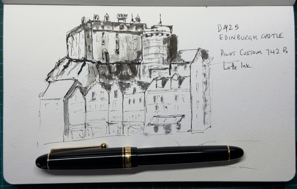
The Verdict – The castle has real weight without being over-described, while the much lighter foreground buildings create a strong hierarchy and leave plenty of untouched paper. The little rooftop details are particularly effective and the limited ink-and-grey approach suits the subject. The rocks are the weak point: the dark parallel strokes may be geologically defensible, but graphically they compete too strongly with the castle. Most encouragingly, with very little guidance the drawing still has the fine lines, selective heavy marks, restrained tone and incompleteness that are becoming characteristic of my sketches.
Score: 8.7/10


Leave a Reply