• The Challenge

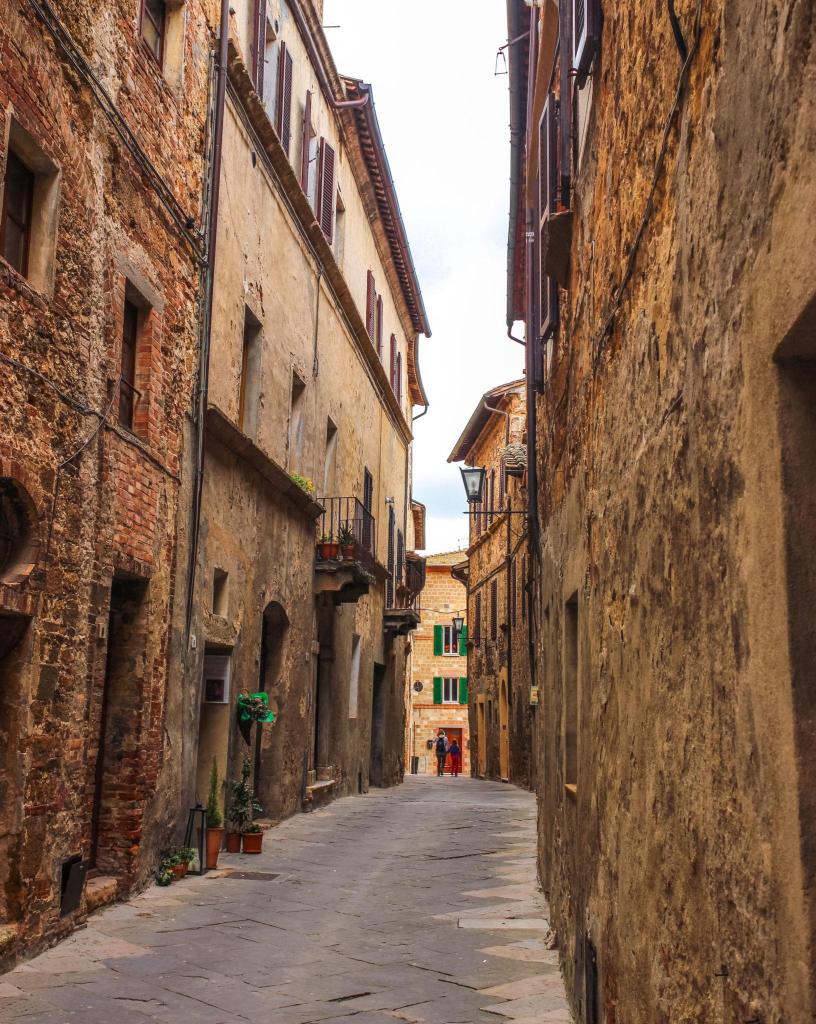
    Day 15 was a narrow Italian street, with the challenge of creating a convincing sense of depth without becoming too concerned with perfect perspective. I was to begin with the large shapes and the direction of the street, then choose only a few architectural details to describe properly while allowing the rest to remain loose or disappear into shadow. Stronger lines and darker washes were to stay towards the foreground, becoming lighter and less definite as the street receded. A single connected area of strong shadow would hopefully do more work than lots of small details and, inevitably, I was reminded not to draw every window, brick and drainpipe and to leave some of the paper untouched.
    The Sketch

    This felt like a useful step forward. I concentrated on getting the street to lead the eye towards the small building and figures at the end rather than trying to construct perfect perspective. I also began to leave parts of the architecture deliberately unresolved. The right-hand wall in particular contains surprisingly little information, yet still seems to work as a building. I was less restrained with the road, where I put grey washes down and then apparently decided they needed explaining with quite a few additional black marks. The upper-right building also became rather enthusiastic, with the roof, balcony and windows all competing for attention. I still find it difficult to believe that leaving something unfinished can sometimes make it look more convincing, but I am beginning to see it happen.
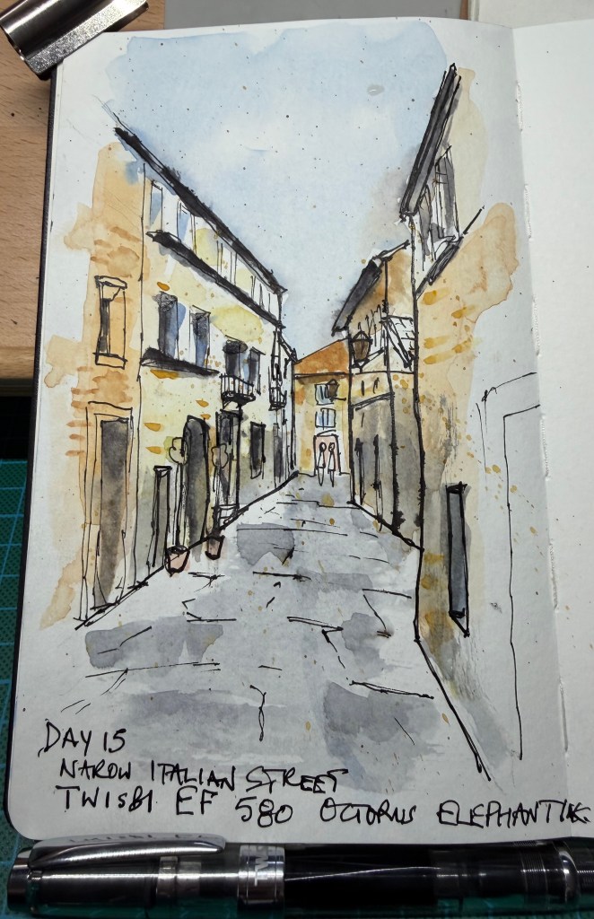
    The Verdict -The depth is excellent. The eye goes straight down the street towards the little building and figures at the end, and the converging architecture works without feeling mechanically constructed. The left-hand buildings are particularly successful: there are enough windows, balconies, doors and bits of masonry to establish their character without describing every damned thing. More importantly, parts of the drawing are finally being allowed to remain unfinished. The road is slightly too busy; the grey washes already describe the uneven surface and perhaps a third to half of the additional black marks could have been omitted. There is also a small battle taking place in the upper-right building, where several strong elements compete for attention. And the familiar complaint remains, although it is getting smaller: some foreground windows and doors have received one line too many — no longer ten lines too many, just one or two. 
    Score: 8.5/10. I certainly didn’t agree with the Reasonable Tyrant and would have given myself a few marks less, those bold lines at the bottom of the buildings.
    Reasonable Tyrant’s instruction: If the wash has already said it, the pen doesn’t need to say it again.
  • The Challenge

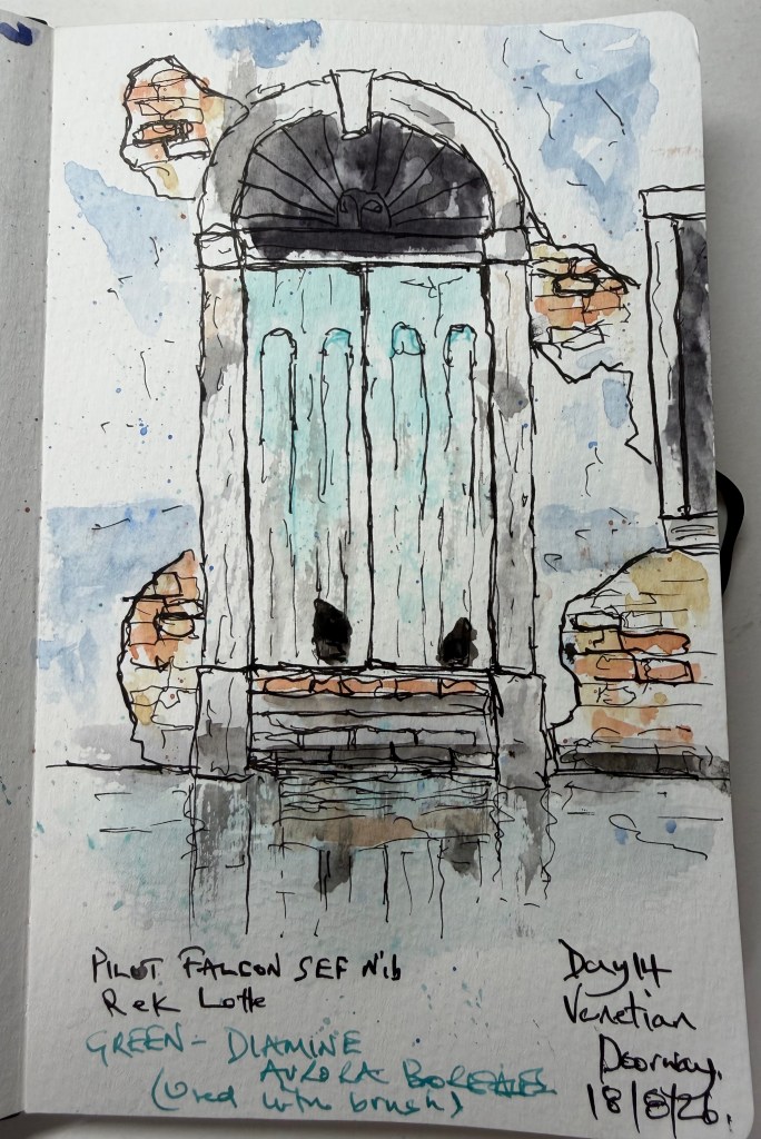
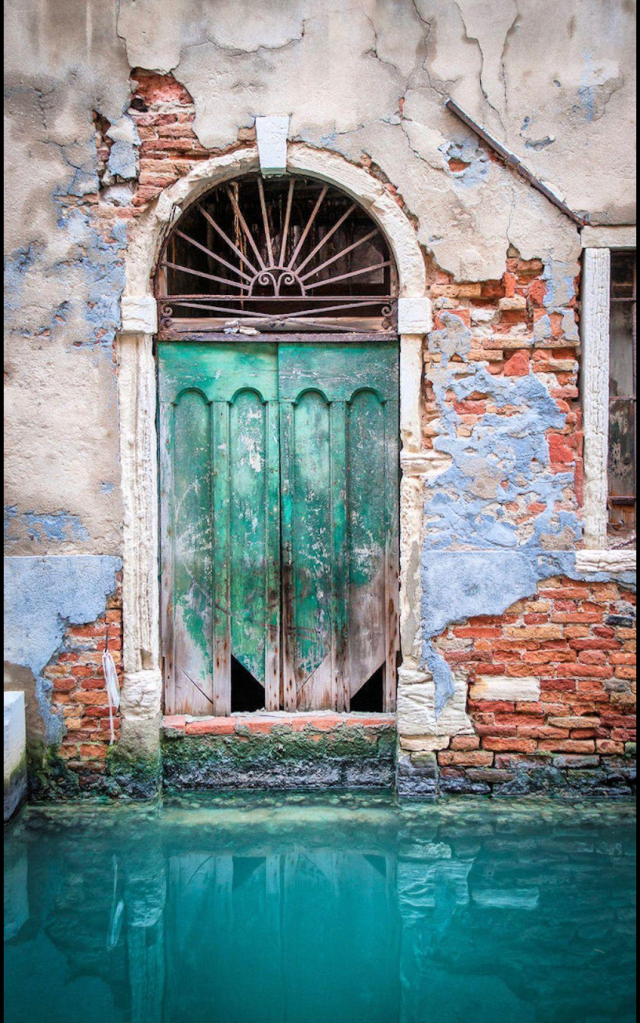
    Today’s challenge was deliberately different. No grand building, skyline or famous monument — just one battered Venetian doorway. I was no longer allowed to make drafts or use pencil first: straight in with the fountain pen. I found this uncomfortable because every mistake would be permanent, and initially it actually made me feel less loose. One useful lesson from my Sketchloose workshops came back to me, though: start light and go bolder. That works remarkably well, provided I remember to do it. The Reasonable Tyrant wanted me to concentrate on the character of the old wall without simply copying every crack, brick and patch of peeling plaster. The green door was to remain relatively pale, with the dark semicircular opening above providing the strongest tonal contrast. There were also two particularly important instructions: “Do not paint a swimming pool” and “You are not allowed to draw every brick.”

    I went straight in with the pen, without a preliminary pencil drawing, and used watercolour afterwards. The doorway itself worked reasonably well and I was pleased with the strong dark above the door against the lighter green. Working directly in ink was uncomfortable at first, but it forced me to accept marks rather than continually correcting them. Unfortunately, faced with all that wonderful old Venetian brickwork, restraint deserted me somewhat.

    The verdict – This is a successful sketch, but it revealed something important about where my style appears to be heading. My natural instinct is towards expressive, slightly irregular, energetic linework, and that is beginning to become recognisable. The danger comes when I encounter texture — bricks, stonework, windows or tiles. At that point I have a tendency to stop sketching and start recording. And yes… I went a bit brick mad. The lesson from Day 14 was therefore not really about drawing a Venetian doorway. It was about learning that texture can be suggested rather than catalogued. 

    Score: 8/10.

    Reasonable Tyrant’s instruction: You do not have to draw every brick for the viewer to know that it is a brick wall.

    8/10 – I am more than happy with that!

  • The Challenge

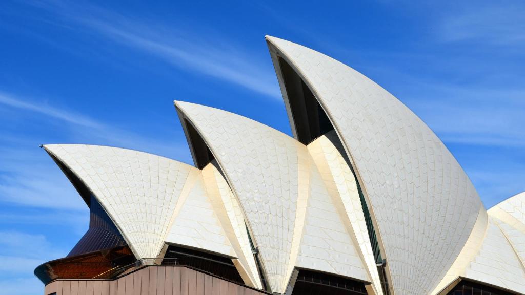
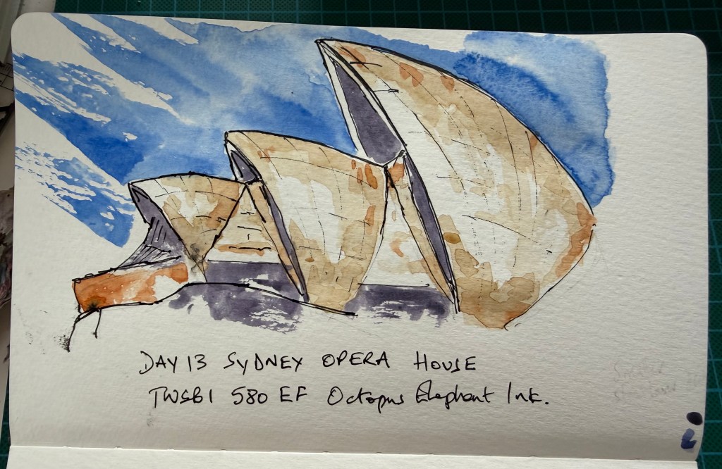
    Day 13 was the Sydney Opera House and the instructions sounded simple enough: use one fountain pen and my normal watercolours, draw the Opera House rather than a diagram of it, and keep the wash restrained. There was also an additional rule that at least 40% of the page had to remain untouched, with no splatter simply because an empty bit of paper was looking lonely. The Reasonable Tyrant was not looking for architectural accuracy but for confidence, simplification and rhythm — particularly whether those repeated sail shapes felt as though they belonged together. Finally, I was supposed to stop when the drawing was finished rather than when I had run out of things to add. Yeah Right! 


    The Sketch

    This was supposed to be a practice sketch. Unfortunately, halfway through I started to like it and persevered to the end. I am not naturally drawn to lots of colour and generally prefer monotone work, but on this occasion I used watercolour and, despite subconsciously ignoring a fair proportion of the instructions, I was pleased with the result. The repeated sails were the real challenge: there is enough similarity between them that getting one badly wrong could upset the rhythm of the whole building. The exercise also reinforced something that keeps cropping up in this challenge — leaving untouched paper is not the same as leaving something unfinished. Sometimes the white paper is doing part of the drawing for me.


    The Verdict – Despite the rather casual relationship between the instructions and what actually happened, this worked. The sail forms have enough rhythm and variation to read convincingly as the Opera House without becoming a careful architectural rendering. The drawing has energy and confidence, and the restrained areas of colour work better because they are surrounded by untouched paper. Where it begins to lose some of that confidence is when I continue working an area after it has already said enough. That familiar temptation to add another line, another wash or another bit of information is still there. The lesson from Day 13 was therefore less about drawing the Sydney Opera House and more about recognising when a sketch has already done its job. 
    Score: 8.4/10. Where the .4 came from I have absolutely no idea.
    Reasonable Tyrant’s instruction: When the sketch has said what it needs to say, stop talking.

    I particularly like that final instruction for this one because “learning when to stop” is becoming one of the recurring themes of the entire first challenge.

  • The Challenge

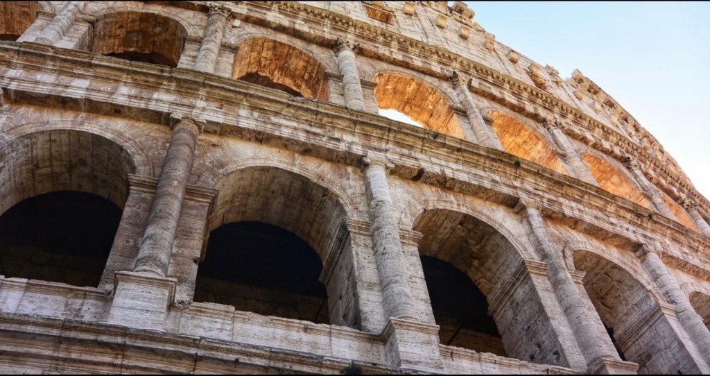
    Day 12 was the Colosseum, but rather than choosing the familiar postcard view I took a gamble on a much more unusual angle. The challenge was to continue what I had been trying to learn over the previous eleven days: simplify rather than describe everything I could see, use fewer marks and stronger shapes, and most importantly allow some of the paper to remain untouched. The Colosseum could very easily become an exercise in drawing hundreds of arches, stones and architectural details, so the real challenge was deciding how little I actually needed to put on the page.


    The Sketch

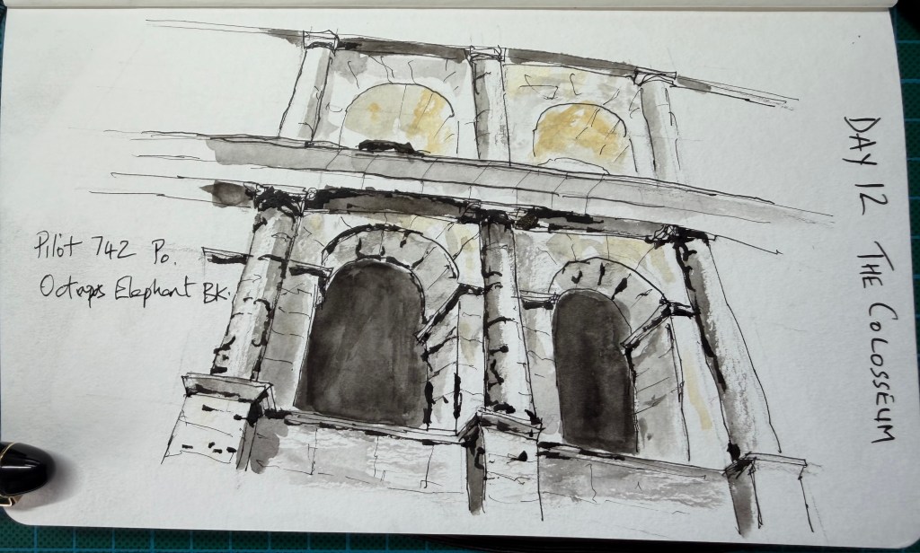
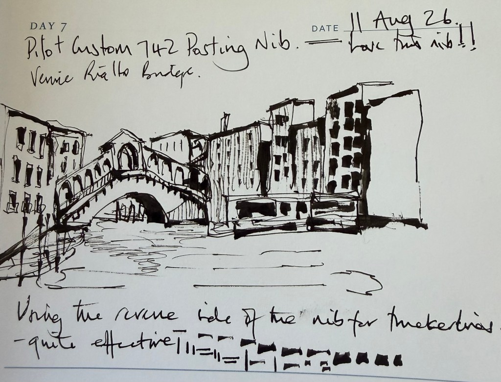
    I used a Pilot 742 with a Posting nib and Octopus Elephant Black ink. During the drawing I discovered that turning the Posting nib over produced wonderfully heavy black marks, which gave me a completely different line from the normal side of the nib. Predictably, once I discovered I could make those marks, stopping was another matter. I am happy with this drawing. It is certainly not perfect, but it feels considerably closer to the sort of sketching I am trying to achieve. It is also significant for another reason: this is the first drawing in my new dedicated sketchbook, the point at which the scattered first eleven days became The Loose Nib.

    Loose ink and wash sketch of the Colosseum in Rome, Day 12 of The Loose Nib sketching journey.

    The Verdict – This was the strongest drawing of the challenge so far. Choosing the unusual viewpoint was a risk, but it paid off because the Colosseum feels monumental without needing to show the whole building. The heavier reverse-nib marks give the drawing real authority and work particularly well against the finer architectural lines. More importantly, there is evidence here of genuine simplification: areas are left unresolved, the paper is allowed to provide light and the building is suggested rather than exhaustively described. There is still a tendency to become enthusiastic once a new mark or technique starts working — particularly those delicious heavy blacks — and knowing when to stop remains part of the lesson. But Day 12 feels like a step forward, both technically and stylistically. 
    Score: 9/10. 
    Reasonable Tyrant’s instruction: The fact that a pen can make a wonderful mark does not mean you have to make it everywhere.

    I particularly like that last instruction for Day 12. It connects directly to what happened with the Posting nib andforeshadows the recurring theme that has emerged all the way through to Day 17: discovering something that works, then learning not to overdo it.

  • I didn’t set out to start a website. I simply decided to give myself a 30-day challenge: one loose urban sketch each day, using fountain pens, ink and the occasional wash.

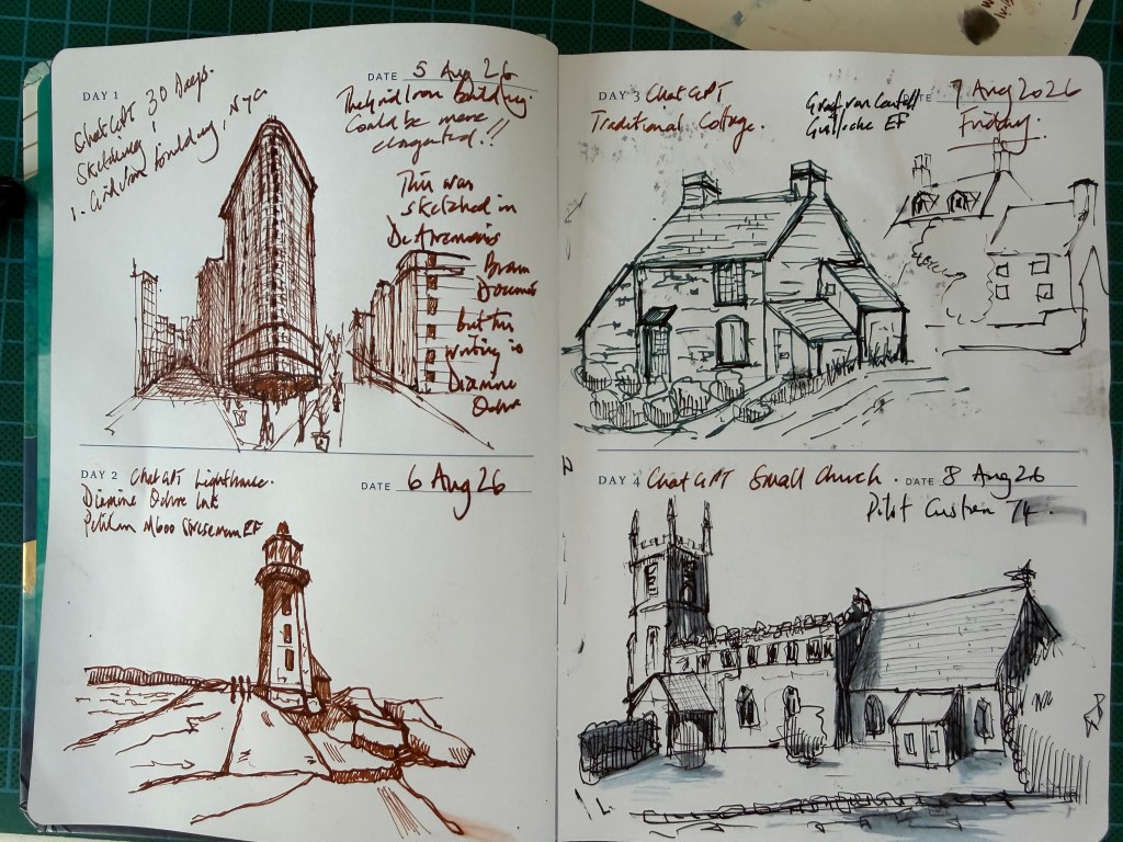
    Day 1 was the Flatiron Building in New York. The idea was simple enough — look carefully, draw more loosely, stop worrying about every line being correct and, perhaps most importantly, learn when to put the pen down. That last bit may take a while.

    These first eleven days happened before The Loose Nib existed. They were spread through sketchbooks I already had, alongside notes, experiments and whatever else happened to be on the page. Most of them are in a Draw Every Day sketchbook, the sort you get in garden centres, which my wife gave me for Christmas in 2024. The fact that I didn’t start using it properly until 2026 either demonstrates my procrastination or lack of motivation, or both. The book is only A6 in size so each square was A7, which makes each drawing rather cramped.
    I had no idea I would eventually put any of them on a website. So rather than tidy them up retrospectively, I’m leaving them much as they were. This is where the journey actually started.

    Looking back at the first few pages, I was clearly still trying to develop a loose style, which I continue to struggle with. There are rather a lot of lines — and apparently I felt the need to write notes to myself everywhere.
    I didn’t know it then, but these rather crowded sketchbook pages would eventually lead to The Loose Nib.

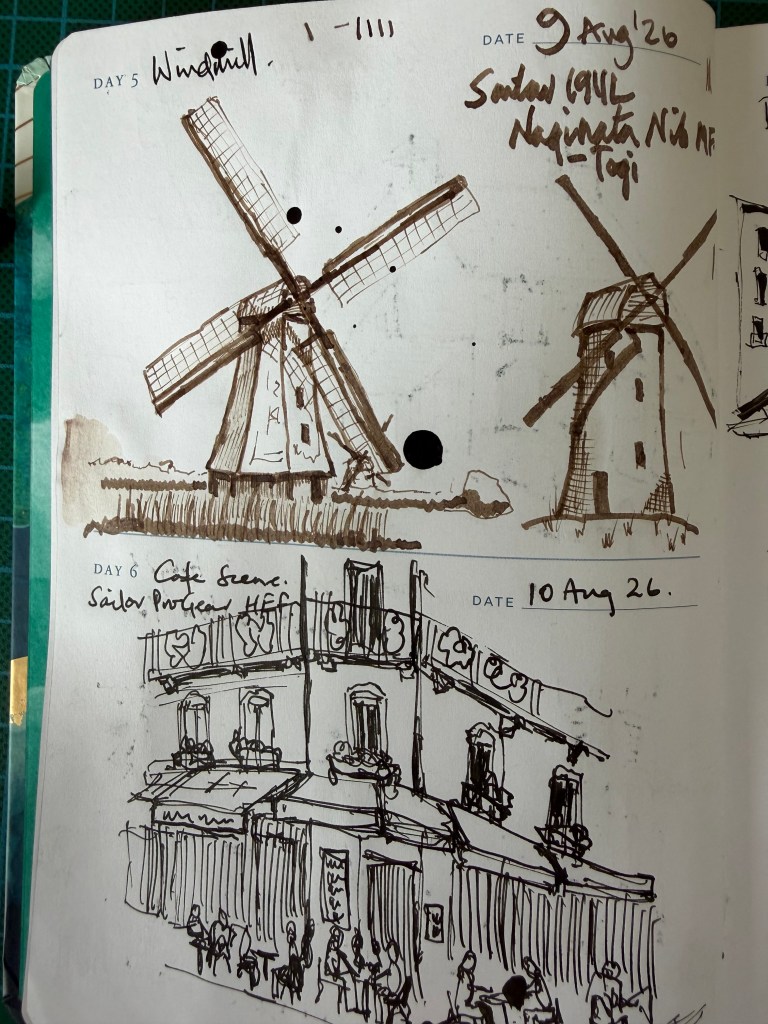
    Sketchbook page showing Day 5 windmill and Day 6 street café ink sketches.

    Days 9 to 11

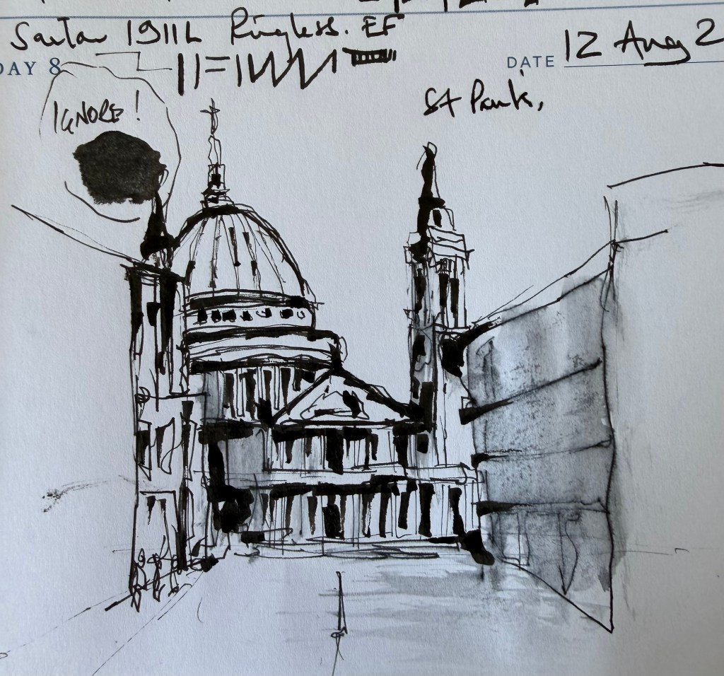
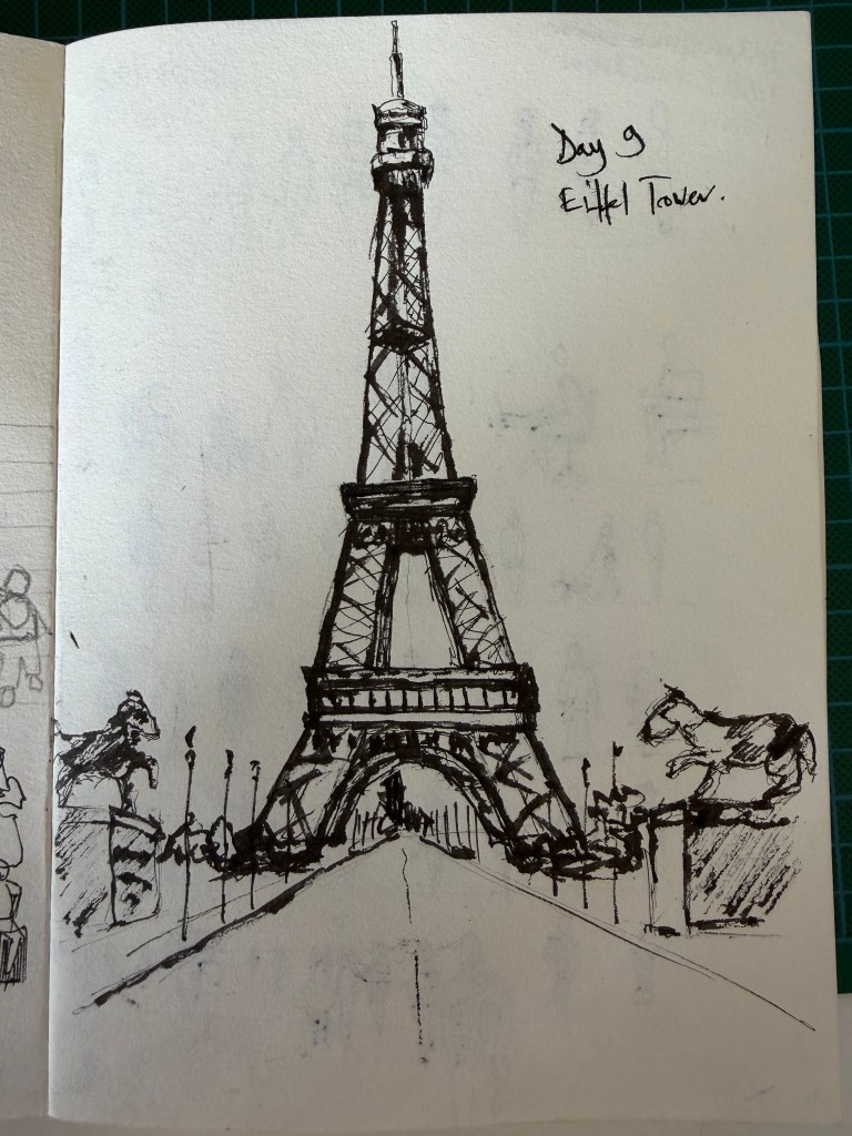
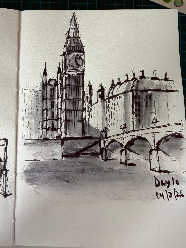
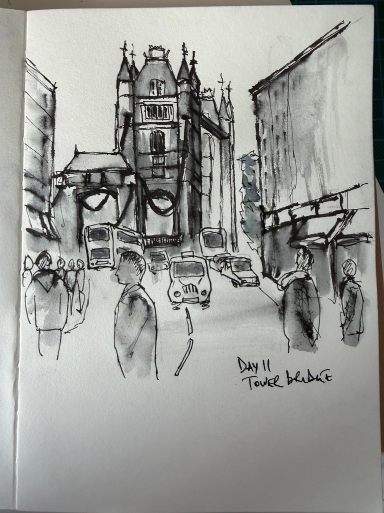
    Let’s not talk about the Eiffel Tower, clearly still learning a style. Lowest score by The Reasonable Tyrant – 6.5. I liked Day 10 and 11 and doing daily sketches with feedback was helping me develop what I think may well be my style. I was also enjoying the process as much as the finished sketches — choosing the pens, experimenting with different nibs, making mistakes and gradually working out what I wanted my drawings to look like.

    Somewhere around here, the idea for The Loose Nib appeared. I asked ChatGPT if The Loose Nib was a good title for a website and, following some to-ing and fro-ing, here we are four days later with a website.

    I decided to start a new sketchbook dedicated to my Loose Nib journey. Not because the drawings suddenly became better, but because I wanted a record of where they went next.

    Day 12 would be the first page.

    Onwards.