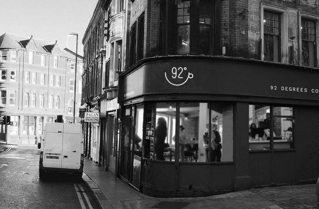
Today’s challenge was a café on a street corner, with the emphasis on simplifying a busy urban scene rather than trying to record everything. The main things to think about were the sweep of the perspective around the corner, keeping the distant buildings subordinate, suggesting rather than describing the people inside the café, and using changes in line weight and tone to create depth. Most importantly, the challenge was to decide what could be left out.
The Sketch
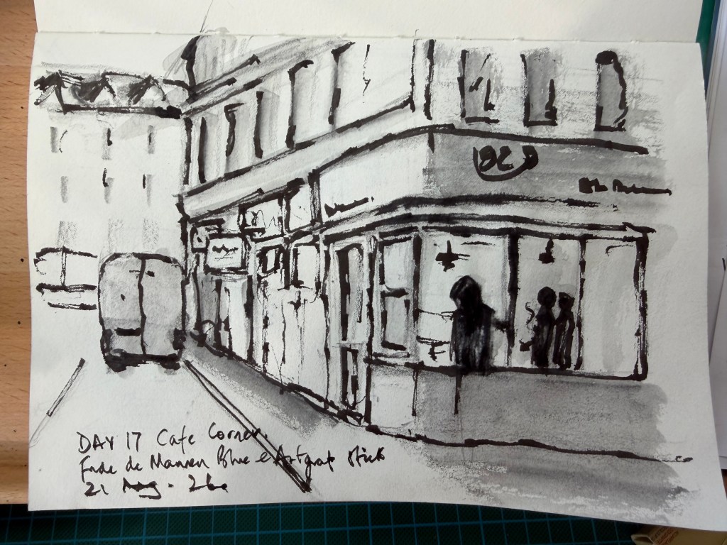
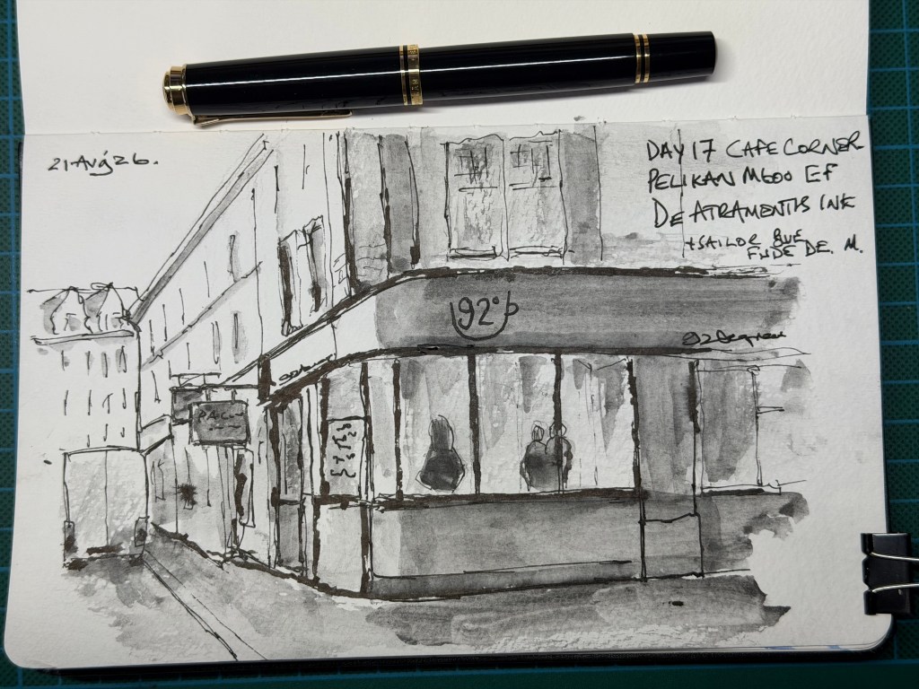
I started with a quick preliminary sketch while waiting for guests to arrive, which helped me work out the main shapes and decide what was important before attempting the finished version. For the final sketch I used my Pelikan M600 EF for the finer lines and a Sailor Fude de Mannen Blue fountain pen for the heavier marks. Rather than adding colour, I used an ArtGraf water-soluble graphite stick for the shading, keeping the whole sketch monochrome. Preliminary drawing with loose Nib sketchbook below
I deliberately simplified the distant building and vehicle and treated the two figures inside the café as little more than dark shapes. The graphite gave me a quick way of establishing the large tonal areas without becoming involved in colour. I am beginning to realise that loose sketching is as much about deciding what not to draw as it is about drawing what is there.
The Verdict – This is a considerable improvement on the preliminary sketch, not simply because it is more finished but because the decisions are better. The café frontage sweeps convincingly around the corner and gives the drawing a strong sense of perspective. The pale vehicle and loosely indicated building on the left establish the street without demanding attention, while the large graphite fascia provides a strong tonal anchor.The two figures inside the café are particularly successful. They are barely described, yet immediately read as people. Likewise, the distant architecture is reduced to a handful of lines and marks rather than laboriously explained. These are both signs of increasing confidence in allowing the viewer to complete the drawing.The combination of the fine Pelikan line, heavier Fude de Mannen marks and soft graphite works extremely well. The uneven graphite is an advantage rather than a defect; it gives the sketch atmosphere and prevents the tonal areas becoming flat.There is still a tendency to add more information than necessary around the café glazing, where some of the vertical divisions and smaller marks could have been omitted. That is now the next lesson: having discovered simplification, push it a little further. Score: 8.5/10 Reasonable Tyrant’s instruction:Stop explaining everything. Give the viewer enough information — then trust them.


Leave a Reply