The Challenge
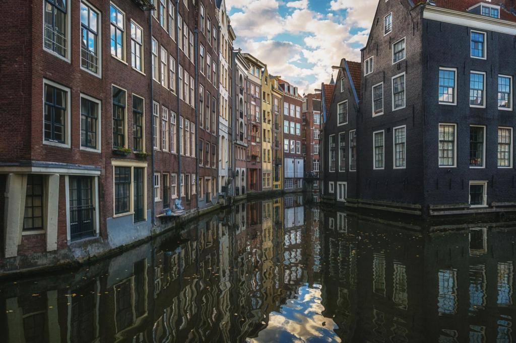
Day 18 was Amsterdam canal houses, with the challenge concentrating on the rhythm of the tall narrow buildings, perspective and reflections. I was supposed to choose where the detail lived rather than treating every building equally, avoid carefully drawing every window and allow some of the architecture to merge together. Reflections were to be suggested with broken marks and shapes rather than drawn as upside-down copies of the buildings. The other important instruction was to keep the colour restrained and leave plenty of untouched white paper. As it turned out, I managed some of those instructions rather better than others.
The Sketch
I tried to concentrate on the overall shapes of the buildings rather than individual architectural details, allowing some windows to become little more than marks. The two banks create a strong perspective into the distance and I used warmer yellows and oranges on the left against cooler blue-greys on the right. In the water I tried to suggest the reflections rather than reproduce the buildings accurately. Unfortunately, once the watercolours came out, my interpretation of “restrained colour” became increasingly liberal and considerably less white paper survived than intended. Nevertheless, I like the liveliness of the result and I think I am becoming more comfortable allowing lines, windows and buildings to remain incomplete rather than explaining everything.
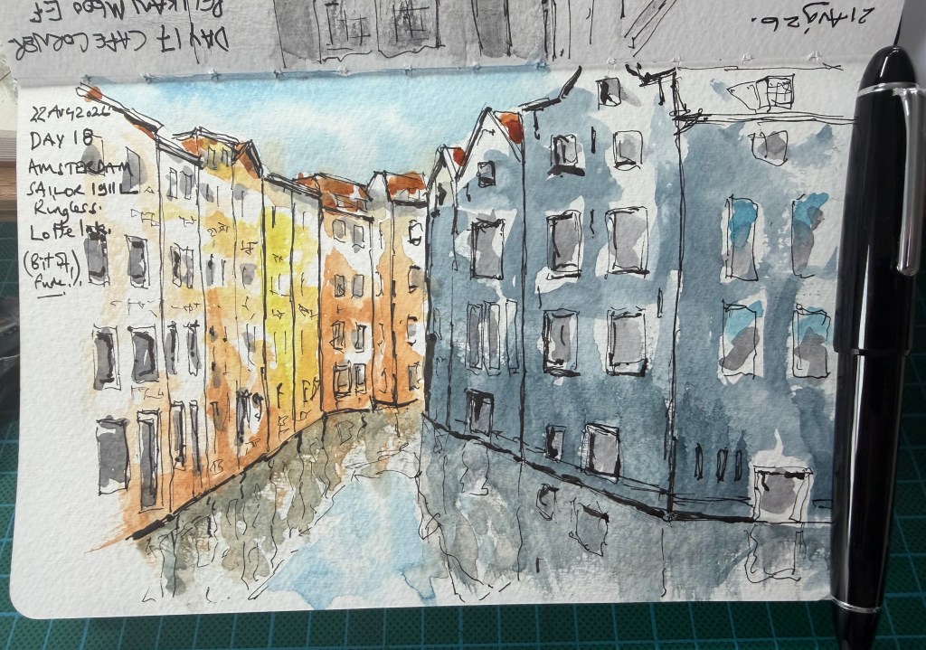
The Verdict – there is increasing confidence in the drawing. The irregular façades, broken windows and wandering rooflines feel much more like a sketch than a careful architectural record, while the two banks create a convincing sense of depth. The warm buildings on the left work particularly well against the cooler mass on the right and the reflections are suggested rather than laboriously copied. However, the brief specifically asked for restrained colour and plenty of untouched paper, and apparently Amsterdam proved too tempting. The right-hand buildings in particular have become a fairly continuous blue-grey mass and leaving perhaps 25–30% more white paper would have introduced considerably more light and sparkle. This is more ambitious than Day 17 but not quite as controlled.
Score: 8.5/10.
Reasonable Tyrant’s instruction: Colour isn’t the problem; knowing where not to put it is. And now stop — don’t touch it again.


Leave a Reply